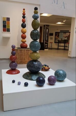
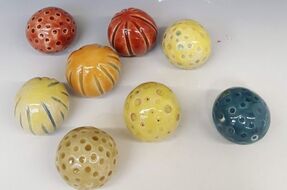
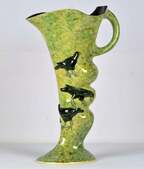
 Well not quite..... this picture shows it prior to my repainting the plinth, and before the Health and Safety Expert pointed out that the basket of toppers, though attractive, could act like a set of ball bearings if they got knocked onto the floor. The final version of my main display has a lot of white tack to prevent this. Huge thanks to the UCLan team: Rob, Cath, Dave and Geoff; to my previous teachers especially Annie, Gordon, James and Rebecca. Also to all my fellow students Mary, Patricia, Steph, Johanna, Rachelle, Kate, Janne; to my friends and family and all the others who encouraged me on the way. Biggest thanks of all go to my husband Simon for his help and support and who hopes to see me at home more! Of course its not quite over. I have an assessment on Wednesday and moderation by the external examiner on Thursday. They will also look at my supporting information What would I do differently? This is a short list of my recent reflections. 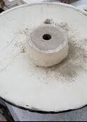 Put buttresses in the bases. the bases have a support ring built in, as shown, in the area where most of the weight of the totem rests. I have used this ring to create a further concrete infill to add stability to the central pole. This ring has been sufficient to prevent the piece splaying out and cracking through as my earlier ones did. It has not been sufficient to prevent small cracks on the underside of the piece on glaze firing, which for the blue dotted base went all the way through. Buttresses from the central ring to the edge should prevent both these crack and the slight warping that occurs. Further develop glaze recipes -as in my previous blog entry. Dont use same base glaze for all colours -as detailed in my previous blog What will I do now? Learn to use Instagram and get professional. I now have a stock of pieces and an ambition to make more. I need to publicise, decide on prices and sell. I dont use Facebook to post but have registered with Instagram and should explore Etsy. I maybe need to talk to garden designers and independent garden centres. I will use the tile board (thank you Rob!) to show colours both on line and in person.
Consider monochrome assemblies especially in cream/stone colour because some people like neutrals and my test totem, shown on my poster and virtual show, has attracted some positive feedback.
0 Comments
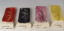
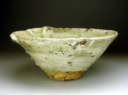
I had hoped that UcA6 would be my final base glaze but there are a number of minor problems with it. Firing Temperature. Ideally I would prefer to fire them all at cone 7 or even 6. The clay is still well within maturation range. Ashraf Hanna fires between 900 and 1280 deg C and James Oughtibridge only takes his large outdoor pieces to 1100. Lower temperatures are better for the environment, kinder to heating elements ( I am thinking about my own kiln here!) and give a slightly lower risk of cracks, though most of those are at the bisque stage. In addition some colours (8red, 22yellow, 11b purple, still look slightly under fired at cone 8 despite adding lithium, whilst 3(teal) needs only cone 7. Rather than fire them at different temperatures I think I need to abandon the idea of using the same base glaze for all. A small change in recipe (UcA7), back towards version 5, with a little more whiting and 1% less china clay has reduced the firing temperature for the yellow glaze; now I will adjust the others as I make more. Colour. 9(Chartreuse) has had a tendency to look a bit thin and brown so I added more yellow stain. Interestingly this does not seem to have affected the firing temperature. 22 (High temp yellow from CTM) has looked really custard like on pieces. As I had to make a new batch I replaced the stain with 'sunshine yellow' from Northern Kilns, reassured by the label stating it fired to 1280. 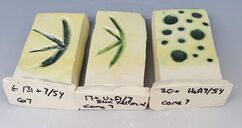 Tin and other oxide content remained the same but I also added 1% bentonite as explained below. these are fired to cone7, 1250 degC Settling All of the glazes settle a bit, but some, especially yellow, purple and chartreuse do it really badly. When discussing a different base glaze, Dave had previously recommended using bentonite 5%, but I found that glaze clumped even as it passed through the sieve. This time I looked it up, and cautiously replaced 1% of china clay with 1% bentonite.
A new pot of purple is required so I have made a further adjustment and used 2%. The test tiles are in the kiln.... I suspect my adjustments to glaze will continue. Its a good job I made plenty of test tiles!  Making so many forms has used a lot of glaze, so a need to make some more. I adjusted my purple glaze to contain a slightly larger proportion of cobalt and the test tiles (11 and 11a) looked fine, so I made a pot. 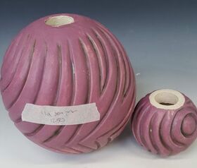 I really dont know what I did with this one (6/11a), though it must have been a weighing mistake. It was fired at the top of the trolley kiln at cone 7. It is clearly very underfired, so went in again. The cone 8 was well over (so a little above temperature) but the surface, though interesting, is still a little too matt. It is shown below. It was not my only glazing problem. 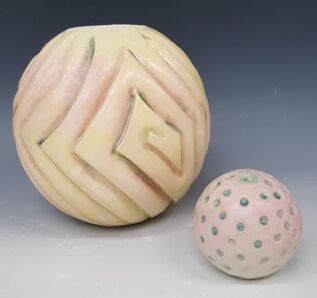 I had tested the tin containing glazes over those rebisqued with a chrome containing one and had thought that the combination did not create a risk of chrome tin pink. How wrong I was. 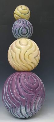 refired again at cone 8 the purple glaze (11a) is attractive if still a little matt. The yellow blushed with pink looks good with it -though this is not a combination I will be attempting to reproduce! Unfortunately these are not really in keeping with my colour range so I will have to try again with purple. 11b is on its way..... I am still having problems with crawling. This is despite using a fine slip at greenware stage, scrubbing each piece with soapy water prior to glazing then applying a thin layer of glaze followed by two or three thick layers. In deeper grooves or dots the glaze can trap a bubble which is difficult to shift; using thinner glaze initially definitely helps with this but it sometimes requires some mechanical disruption. Unfortunately this does not explain crawling on flat(ish) surfaces. 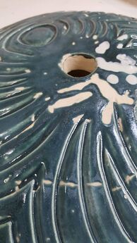 This is an extreme example with the glaze most prone to crawling (teal), applied to a large convex base plate. The piece was fired at cone 7. The glaze has pulled away from a surface crack even where the application is thinner but there are no cracks or gaps at the centre of the large bare areas at the apex. It has been possible to rescue some of these pieces by heating up and then adding a thick dab of glaze in the gaps. The white areas on the picture show the beginning of this process. 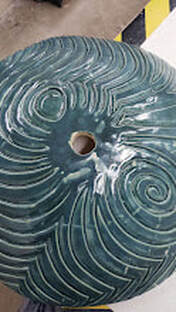 I have been please to see that the surface cracks did not open up more and have been at least partially covered. Re-firing does add extra 'heat work' to the glaze which becomes glossier and more translucent. I have tried various ways of brushing the glaze on to reduce the incidence of crawling. Physically attacking any hint of bubbles seems to help. Thinner glaze applications also do. Some times the glaze appears to 'bubble' as it goes on, though the liquid in the pot seems smooth. Is it the brush? I have not tried changing it but that would not explain why test tiles have been largely free of the problem and the largest pieces most prone. It must be my application. Retouching with a thick dab of the same glaze is not quite straightforward. Some of the glazes have been settling really quickly, so more oxide or stain is at the bottom of the pot. There is then a risk that the repaired area is a different colour. Glaze settling is a problem which is time consuming and risks uneven colour even during glazing of a single piece. I needed to try changing the base glaze. Following advice, I had previously tried adding 5% bentonite and found that the glaze clumped as is went through the sieve. I needed to look again
We seem to have done plenty of preparation for shows. There was the 'work in progress' in the PR1 gallery that did not happen. There was UCLan Talent, on line, that fizzled out. We have been writing Blogs (like this one) available for assessment. We have been asked to input into a 'virtual ' MA show, a personal webspace accessed through scanning a QR code and to produce a poster. Now we are to have the REAL THING - a physical show - with a formal opening by Halima Cassel and an external assessor. The catch is that there will be over 100 of us over 3 sites, each with a relatively small space.. This means that my plan to physically show a range of my work may not be carried through. I will have to get some really good photos and go online.
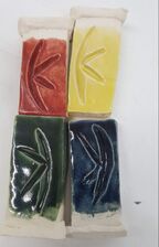
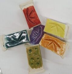
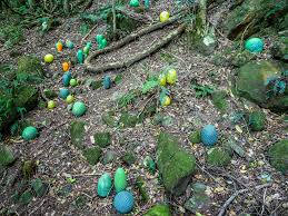
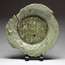
Meanwhile there is a water feature to construct. I have the wood, the pump, even the pond liner but need to find the time to make it and of course, finish off the final pieces. No pieces no pictures. We decided I should make a series of large tiles, like fabric swatches, to demonstrate the colour range along side the water feature in my final MA show. There was an option to carve 16 or more individual tiles from 15cm sq rolled blocks. That sounded challenging as I am used to carving around a convex surface, not a flat one. 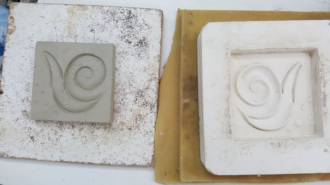 In the end I carved several tiles, chose the best, and made a plaster press mould . The design shows the effect of both carving and dotting, two in one. This picture shows the 'first one out' -rather rough but demonstrating good potential. Another skill!
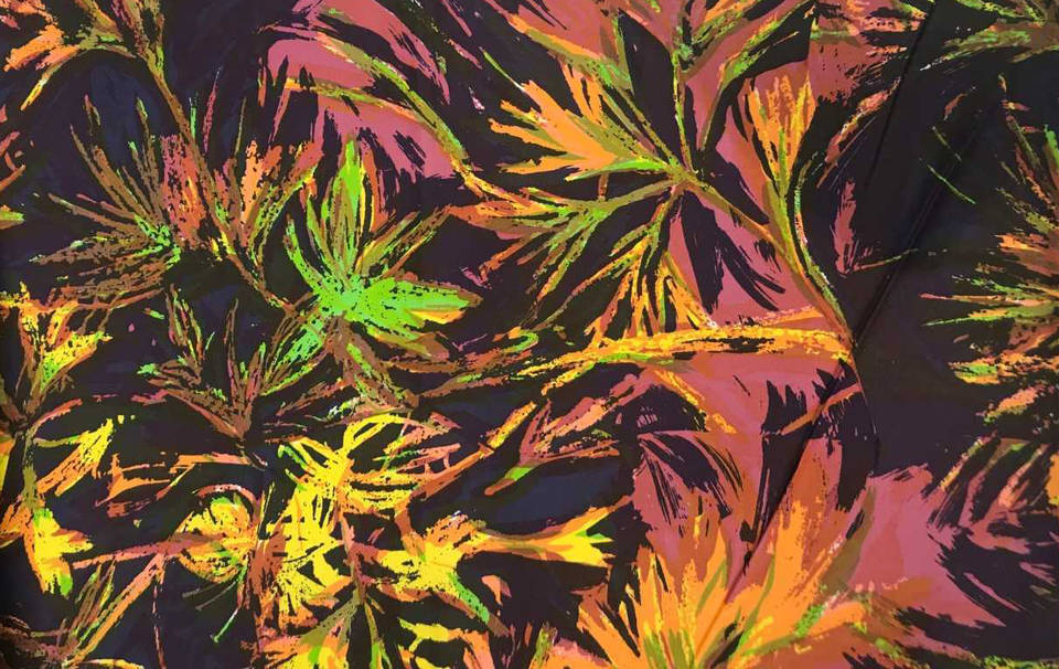
Here are the results of what I hope will be the final glaze tests of this MA.! I dont intend to use every colour on every composite piece, but anyone will be free to. Instead I am likely to group them thus
All but the dark green, the dark blue and maybe the teal will have a darker colour in the grooves /dots to emphasise the pattern. The results of testing copper containing glazes (one thin layer brushed on and sponged off) then the glaze colours on top, fired to 1260C were good, but the corresponding tests using the dark blue (cobalt, manganese and tin) glaze were disappointing. Here is an example using glaze 30; it contains CTM stain no.1, rutile, tin and lithium. 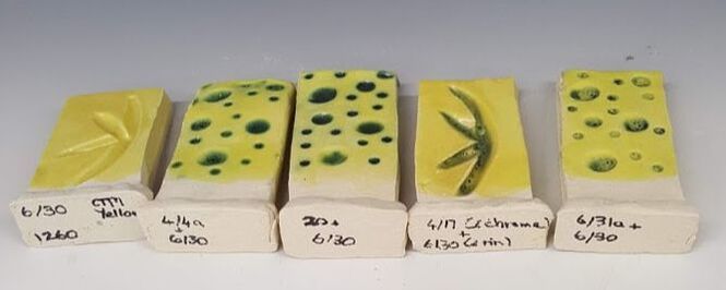 The glaze test furthest right (in both sets, above and below) is over a dark blue. Glaze 4/17 contains chrome 0.2, 30 contains 5 of tin, so I was surprised not to see a colour change, but although there is no hint of pink or brown, its not a successful glaze combination. Glaze 4a has copper and just a small amount of cobalt carbonate; 20 is 17 with three times as much copper. The problem observed in the two test tiles on the right could of course be caused by the tin oxide content. 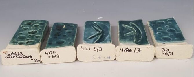 However this set of teal (6/3) does not show a problem over 6/31a which also contains tin; though none of them show a significant difference to the 6/3 (second from right) by itself.
The base glazes containing copper all appear to work well, so I will not be pursuing cobalt as an alternative. I had already experimented with the effect of using two glaze colours on the dotted pieces. It creates more immediate close up interest though adds another stage to the process; When not fired on (rebisqued) the first colour, whether oxide or glaze tends to smudge and risks looking muddy. I had also been encouraged to use an oxide wash on the carved forms to enhance the texture. I was concerned about this for two reasons. Firstly a strong fluxing oxide such as copper or cobalt can react with the overlying glaze as in this piece, which is bisque fired craft crank, with copper carbonate suspension brushed on then wiped off, rebisqued then glazed in yellow.
The copper carbonate was difficult to wipe off, partly because the crank surface is very rough. As seen, after glaze firing, the piece is a pleasant green but not yellow. I have tried again recently. 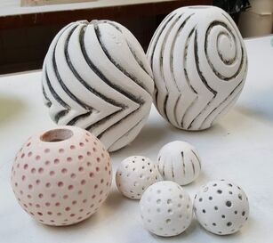 The back left test piece has UcA4 /17 (a green glaze made with copper carbonate and chrome oxide) brushed on and wiped off. The one to the right has a more dilute green glaze with extra copper. The copper settles very quickly in this more watery dilutant and is difficult to apply evenly. All these pieces have been re-bisqued. 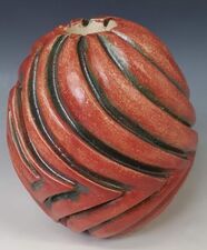 This image shows the back left form with two layers of the latest red glaze, fired to a little below cone 8 or 1260 degrees C.
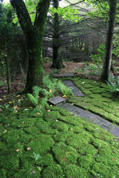
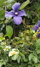
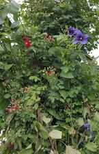
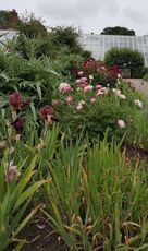
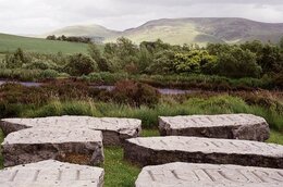
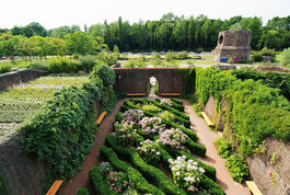
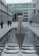
I really like this effect. Unfortunately it was not a good test of this glaze combination because there is evidence the kiln underfired as the cone was not fully over. It should be rested. I have not visited this garden (Covid 19!) in Herefordshire but have read about it in several books and articles. It was the 4 acre private garden of Sir Roy Strong and his wife Julia Treveleyan, created over 40 years from a field they could no longer let out. It has now been gifted to the gardening charity Perennial and is open to visitors. Sir Roy published a book about the Laskett in 2003 in which he described his research into garden history through which he realised that " any great garden was not only an arrangement of plants and artifacts in terms of its design and composition but is also a tissue of illusions and ideas" 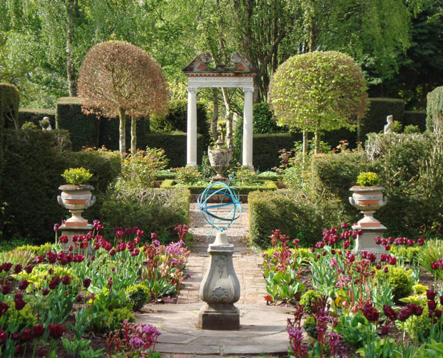 The pictures look great, with gorgeous plants, well maintained shrubs and topiary and some variety. Its all very balanced -pairs of matching urns, columns and placed classical statuary. I want to visit but am hoping for a few more surprises. From the pictures its not too obvious where the 'autobiographical' aspect manifests, though the naming of various parts of the garden, like those of 'Little Sparta' are clearly personal. One garden I have visited several times is Arley, in Cheshire 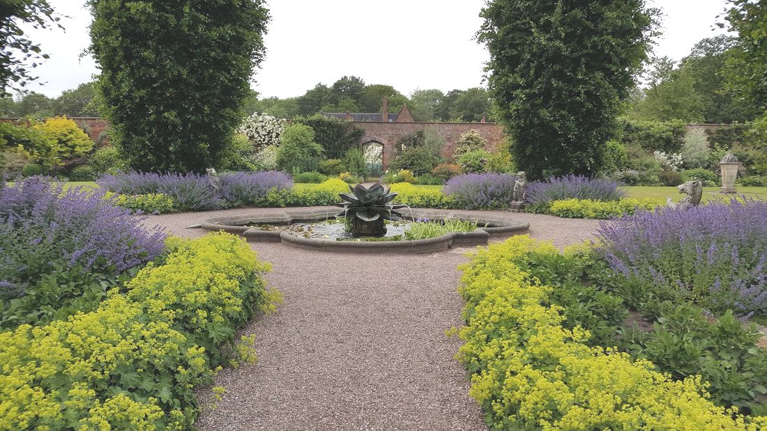 This garden also has its formal areas, such as the walled garden above, and areas of luscious colour such as the carefully planted formal borders that change through the seasons. My favourite areas however are the informal Rose Garden in June, full of foxgloves, and the Woodland Walk. 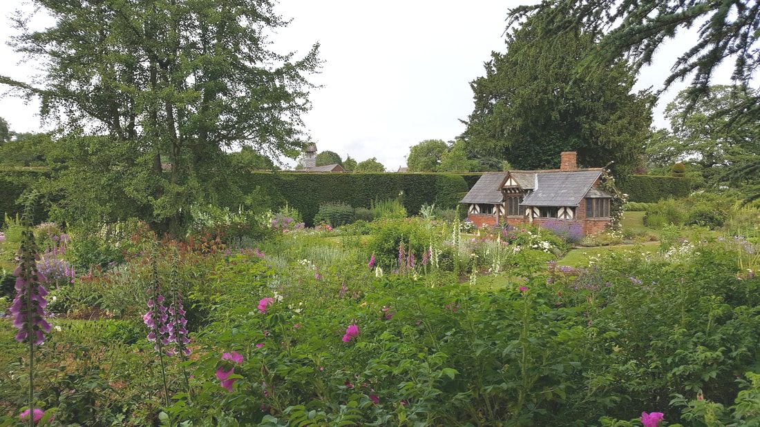 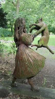 Spring, with its bulbs and flowering shrubs, is the best time for the Woodland Walk but throughout the year this sculpture adds interest, lifts the spirits and and evokes memories. 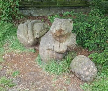 These wooden carved chipmunks, many times lifesize, raise a smile. As seen by the worn areas round them, they also invite investigation. The colour combinations at Arley are also inspiring:
Arley is gem in Cheshire!
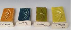
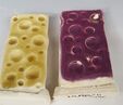
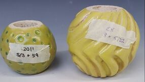
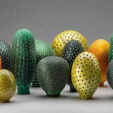
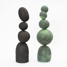
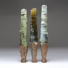
Strong, R. (2003) The Laskett -the story of a garden. Transworld Publishing: Bantam Press The two new 2 part moulds are now dry enough to use. I have been busy making editions of these larger spheres to 'fill in' the size range between the majority of my existing shapes, Which are up to 20 cm diameter, and the larger 'pumpkin'. Where I can, I am now rolling the clay to create soft slabs (around 2cm thick) with which to fill the moulds, reinforcing the joints on both the inside and out. Those reinforced joints need to dry and firm up before the piece is refined, smoothed, semi burnished, carved/ impressed then covered with a layer of sieved slip made from the same clay. The green ware piece then needs to dry slowly for several weeks before firing to bisque and glazing. this whole process needs time and I am running out of it...... I also have made more test tiles as I need to test each larger glaze production batch before using on a final piece so need more and more. I have made and tested version 6 of my glaze range, some over oxide, and some with slightly different stains or oxide combinations, though due to a lack of test tiles some colours have had to wait for a later firing and are not yet available to assess. I did find that applying a layer of oxide into the shallow impressed areas was difficult to do evenly and that when I then brushed on a glaze, the oxide was picked up and moved. I was aware of being more tentative with my glaze application because of this. The way round that problem would be to rebisque fire to fix the first layer of oxide or glaze, lengthening the production process further. Here are the test tiles of my version 6 glaze fired so far. All are Ashraf Hanna clay, with a final glaze firing at cone 8  glaze 17 is a reliable green, containing copper carbonate and chromium oxide. It is more glossy than others in the range and might be worth adding 1% tin glaze 28 was a new trial colour using an orange stain and 'yellow ochre' iron oxide. Its a nasty muddy colour though looks better over copper (below) 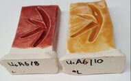 Glaze 8 uses red stain, and in this version small amounts of red iron oxide, light rutile and lithium. Glaze 10 has been named 'toffee'. It is based on a High temperature yellow stain with a little red and rutile added. In future I will add lithium too. 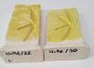 CTM had no High Temperature Yellow when I last ordered. The tile on the left trials on alternative, Sunshine yellow from Northern Kilns, and on the right the standard CTM yellow stain. Both seemed to work well 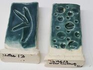 These tiles show the UcA6 /3 glaze (Teal), the right one over copper oxide 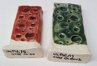 Both these dotted tiles had a layer of copper applied and wiped off. I had been too tentative with the application of the second colour, red and green. 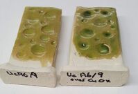 Chartreuse (UcA6/9) on a plan dotted tile and over copper 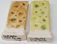 Toffee and yellow both over copper. 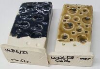 The left hand tile here has no slip and the glaze has crawled. The colour is a dark blue/grey so I have tried this glaze again with less tin and more cobalt. On the right is the orange ochre over copper. 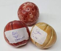 Three cane toppers.
The toffee 'growth topper had copper brushed into the indented grooves then two coats of glaze. the copper has been moved by the glaze application and is mainly at the apex. Refiring is essential. Yesterday we had a group discussion with Rob about our progress, during which I received helpful feedback from everyone. We talked about the results of the UcA5 test tile firings
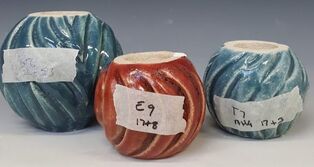
 and the combinations of colours on various cane toppers and totem components. As time goes on I m appreciating the value of careful notes and clear labeling more and more! The masking tape notes on these forms refer to the identity of the individual piece as well as the glaze applied
My review conclusions are:
and I need to make lots more pieces -especially the larger ones! More clay is on order. I had not come across this Australian Artist until yesterday. Thank you Micaela for finding her through Instagram! Maybe I should have been more aware, as her work is held in museums and galleries in Europe - she has even exhibited in the V&A! Not only that, but she makes sculptures for outdoors, though 'outdoors' in New South Wales may not place the same demands on ceramics as the UK.
We have been allowed back in to the studio! Its been well over 4 months and so time to take stock of what has been done. I had had a feeling of having achieved nothing but on reflection that was more a product of lockdown disruption and frustration. Just prior to, and during lockdown 3 I had
Since coming back I have
 I am much happier with these. both the application and the glaze itself is better especially on the red, to which I added Lithium as recommended by CTM on their website. The dark grey has a blue tinge and that has given me an urge to develop yet another colour, a navy blue, as an alternative to both the denim blue and grey. I also
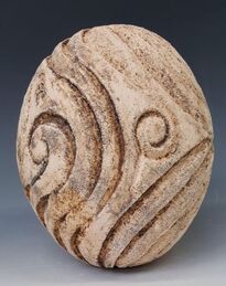
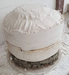 This monster is shown pre trimming. It required 20 pints of water for the plaster mix. I hope it will get a lot lighter as it dries!
I was pleased to get both the top and bottom flat and level, and to have no problems getting the basketball out. I also purchased a size 5 ball (about 22 cm diameter) but need to work up enthusiasm for another plaster session. Time seems very tight, but its too early to panic. I have been a member of the V&A for over 4 years and, till now, only been able to realise the benefits occasionally. One of the best bits about lockdown has been the museum's increased online accessibility and Membership Mondays. This weeks focus included a piece on Althea McNish, a painter and textile designer who moved to London from Trinidad as an adult. She brought colour with her!
These images are from the V&A collection. They inspire me to explore different patterns and colours on my impressed pieces -but I need access to my glazes.
Cant wait to get back in the UCLan studio.  Anna was a previous MA student and then a lecturer at UCLan. Invited by Dave, she kindly came into the studios to talk to us when I had just started the MA, and subsequently gave took part in the Arts and Media Friday Lecture programme. You'd think she'd had enough of us but no - like the star she is, she joined a Teams meeting last Thursday to answer questions. Anna had outlined her career path to us, describing her training, influences, memorable advice (good and bad) and the development of her practice. She hand builds in earthenware and uses coloured slips made from stains and oxides. She is influenced by the local landscape around her, the natural world, climate change and environmental concerns, and uses her library of sketches accumulated over many years. She described her path from functional wares such as these, made by coiling, pinching and modelling
through slab building and more landscape vessels with texture and complicated forms and using the slips in a more abstract way 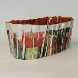 to these more recent pieces with much simpler shapes, using the pot as three dimensional canvas . This also allows her to alter the design as she goes along.
Anna's work is very different from my current MA project but she was generous in sharing insights and knowledge -all of that always comes in handy! She made some comments which resonated with our group's discussions: "Its important for all artists to connect with people.......thats the point of art" When asked to elaborate she explained that the work needs to be seen in order for it to be taken forward and that " its deadening not to get any feedback" "Make what you enjoy ...and be prepared to say no to commissions that you dont want to do" During the MA she experimented "a lot" with colour in slips and now has a library of annotated test tiles. She has settled (as I have with glazes) on a combination of commercial stains and oxides. People can be put off by climate change messages - they like it kept light. At present she seems to be using grey a lot but thinks that as Covid restrictions lift, people need cheer and will want brighter colours. Memorable (positive) advice she handed on : start by approaching the best galleries with your work - they can only say no. More practical tips:
Thank you Anna! 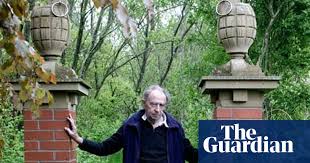  This may be my last blog inspired by my reading of Udo Weilacher's book. Ian Hamilton Finlay (1925-2006) was a Scottish writer then 'concrete' poet and artist, best known perhaps for 'Little Sparta', the garden around his home near the Pentland Hills. He and his young family moved to Stoneypath (later renamed 'Little Sparta') in 1966, as their previous home north of Inverness had no water supply. Stoneypath was little better but did have one and a half hectares of bleak moorland. Finlay set about digging two ponds and Sue, his wife, dug out flower beds, weeded and planted the garden. The house was very basic and they had little money so the garden was developed gradually, initially with donated plants and cuttings, learning as they went along and adding garden structures such as windbreaks, paths trellises and walls. As a poet, Finlay added words; poems, quotes and aphorisms cut into stone or wood in addition to sculptural pieces. Some of these arose in response to experiences in the garden such as hearing the curlew or wind in the trees; others to classical literature or to the turmoil of the French revolution. Later he was commissioned to design outdoor spaces and sculpture elsewhere. Weilacher (p90) says 'the works which Finlay has realised throughout the world....increase our perceptive ability also in as far as our own cultural history is concerned'. Finlay was consciously rebelling against what he saw as a decline in cultural values- by which I assume he meant classical education and referencing. Indeed the renaming of 'Stoneypath' as 'Little Sparta' was apparently a direct response to conflict with the art establishment in Edinburgh -the 'Athens of the North'. His references were not all classical however; the capitals on the gateposts above look remarkably like hand grenades. Finlay started his artistic career as a Concrete Poet. I had to look up what this is and for those similarly ignorant, here is one of his as an example. Unfortunately I still don't understand the the difference between concrete and visual poetry which Finlay said was 'completely different'. Little Sparta is now (usually ) open to the public 4 afternoons a week over the summer months. I do plan to visit and make up my mind 'in person' and maybe I will find more meaning in the multiple words with a guide book in my hand. I start from a position however of disliking labels on visual art, or on clothing, though factual labels (discreetly) giving the name of a plant are always welcome! I first read about the garden in 'The Making of Place'. I found the classical referencing (emphasised by Hunt) a real bar to appreciation; it struck me as elitist and pretentious. Since then I have come across the official guide book, critiques and accounts by Weilacher and by others. The one I found most helpful was a YouTube video by the Tate galleries. In it, his son Alec, also a poet and artist, talks about how his parents created the garden together, and about his father's poetry. The (written) poems he said were minimal because the garden itself (the flowers, the fall of the light, the sounds) was part of them. The placement of each piece is therefore crucial. This is taking concrete poetry to a new level. Alec went on to say that the house and land had been gifted to his parents by his mother, Sue Finlay's family, and that in response his parents had created something for everyone, not simply to appreciate it as it is, but that 'anyone with even a small garden can think of it and experience it as a work of art'
 Little Sparta was clearly an intensely personal creation for Finlay, who suffered from agoraphobia. Though he could work in the garden he rarely went elsewhere. From that base he could write and design other gardens and installations. He is quoted as saying that one really has to understand the landscape before making a garden; the accounts of his wife and son however do not suggest any advance deliberations or a fixed overall plan for Little Sparta, more a willingness to respond and develop. Although Finlay composed the poetry, the lettering whether on stone or wood was executed by others; a collaboration. Little Sparta is not a sculpture garden, or simply a personal domestic space of retreat. It seems to me to be a piece of concrete nature poetry. I am looking forward to that visit. Campbell, J 'Ian Hamilton Finlay:The Concrete Poet as an Avant Gardener'. The Guardian, Manchester . Published online 16th November 2012
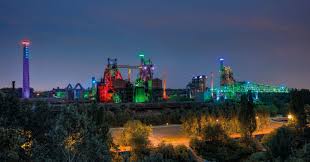
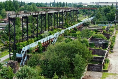
Finlay, S. 'The Planting of a Hillside Garden' New Arcadian Journal (No 61/62, 2007), also now on the Little Sparta website Hunt, J. D. The Making of Place: Modern and Contemporary Gardens. United Kingdom: Reaktion Books 2015 Tate Shots Ian Hamilton Finlay:Little Sparta. Youtube. Published on line 8th November 2012 Weilacher, U, "Between Landscape Architecture and Land Art". Birkhauser. Basel Berlin Boston 1999 This blog entry is again on one of the practitioners highlighted in 'Between Landscape Architecture and Land Art'. Professor Peter Latz (b 1939) is the son of an Architect and grew up in the ruins of postwar Germany. This, together with the imperative to grow food for the family (he developed an orchard then sold it to fund his studies), has clearly influenced him. This is a landscape architect truly interested and knowledgeable about plants. His work could be seen as merely rehabilitating industrial sites, but is it more transformative than that. To quote Weilacher (p121)he 'rejects ideas which seek to portray in terms of a bygone Arcadian ideal. Instead he points out the value of everyday nature, claiming it has much to offer our day to day life -more than cultivated sterility which forever has to fulfill functional criteria' Latz claims to embrace natural processes -for instance the erosion of a slag heap rather than preserving the form, and in two of his most prominent early projects (' Hafeninsel' or 'Harbour Island' and 'Duisburg North Landscape Park' has actively incorporated remaining structures and materials as well as celebrating the (sometimes quite rare) plants that had come to flourish on the contaminated sites. The latter was a 200 hectare iron and steel plant which closed in 1985. During its redevelopment former employees and their families were employed and involved. It opened 25 years ago and has now become an international attraction, included by Rowan Moore in his 2015 'Guardian' article as one of the ten best urban gardens, alongside parks in Sao Paulo, Paris, Florence and the Summer Palace gardens in Beijing. 'Duisburg Nord' however also includes a climbing wall, cycle tracks, a scuba diving pool and a concert venue. Most of the many visitors are there to enjoy the varied garden areas within the historical site. In the 2020 interview Latz said that keeping those traces of the past was important "there are many stories from the past, all very different....this gives them room to be told"
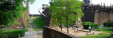 These images are all of 'Duisburg Nord' . This park is not, at over 400 acres, on a domestic scale but it is made up of a number of smaller areas (almost garden rooms). He has worked within these to create a huge variety of spaces responding to what was already there - the 'syntax of landscape'. I particularly liked his discussion with Weilacher, when he refers to "using the whole repertoire of garden art", and his use of temporary planting whilst another (such as a ribbon of roses) matures and takes its place in the design. There are over 700 plant species in the park - this is no manicured landscape where plants are incidental. He quotes influences such as Italian Renaissance gardens - good examples of both structure and planting - in his work. No wonder 'Duisburg Nord' has also featured in BBC Gardeners World, when Peter Latz was interviewed and gave the second quote above. I look forward to visiting. Gardeners World BBC 2. broadcast 3rd October 2020, now available to view on Facebook.
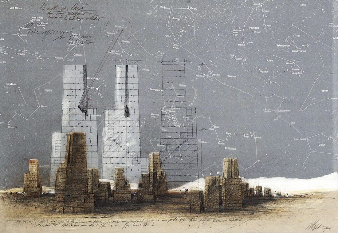
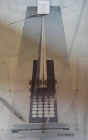
Moore, R. The 10 best. The Guardian. Manchester. 7th August 2015 Weilacher, U, "Between Landscape Architecture and Land Art". Birkhauser. Basel Berlin Boston 1999 I have gone back to 'Between Landscape Architecture and Land Art' to consider more of these artists and their work. The interviews recounted were followed up with further reading. Hannsjorg Voth is a German artist born 1940, who has according to one website: 'desire to investigate the elementary relationships in nature and their fundamental connections with man'. He is particularly known for the works he has created in the Moroccan Desert. 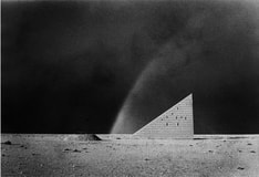 The first of these, 'Himmel Streppe' Sky Stairway, was built 1985-87. It has echos of ancient calendars and pyramids, and stands alone 'marking a place' in the desert and (according to Weilacher) linking the earth and the infinity of the sky. It is constructed of mud bricks and contains living quarters. There is a well nearby and seen on his wife's photograph' 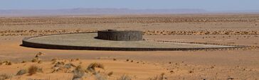 'Goldene Spirale' (Golden Spiral built 1993-97), can be seen from the first. It is 3m tall at the centre, but from there there is a staircase descending 27 steps to two areas for working and living, then a further 100 to a well on which floats a symbolic boat 'protected by a shrine' (p58), and 'immersed in meditative contemplation of the origin of life'
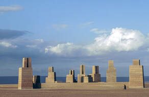
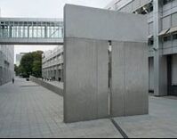
'Stadt des Orion' (City of Orion 1998 - 2003) is the 3rd of his major works in the desert, seen on the left as a plan, relating to the stars and completed (R). The towers are built in proportion to the size and brightness of the stars in Orion. Like the other two, it has a well so is of use to the local population. In contrast, Voth has also created urban public works . 'Zwischen Sonnentor und Mondplatz' (Between Gate of the Sun and Court of the Moon ) is in the street area linking the different parts of the European Patent Office. He was initially reluctant to accept the commission in Munich because it involved tailoring his design to a particular site and to a human scale. It is likely that without the title many passers by would appreciate it significance, but as street art it certainly seems to add quality to a previously dull space.
At noon the suns rays travel through the 'gate' across the pool of shallow water which contains representations of the phases of the moon. 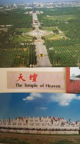 The work reminds me strongly of the Chinese Temple of Heaven seen in this image (taken as a photo of my postcard montage).
The Temple was built in the reign of the Yongle Emperor as a place of ritual animal sacrifice, where the Emperor as representative of the sun, twice a year implored the heavens for a good harvest. Voth uses ancient religious imagery and symbols from the Egyptians, Phoenicians and the Aztecs. He seems to be positioning the artist - and perhaps himself - in the position of a priest, intervening and interpreting for society. On page 65 of 'Landscape Architecture' Weilacher quotes him as saying "Art has basically -like religion- always been a means of overcoming fears. Abstract, not tangible things were given artistic form. The ensuing objects were used in rituals. Whoever was best able to give material form to these fears, was an artist. In other words artists only gave visual expression to what was culturally and essentially necessary for people . The interaction can be traced through the history of all religions. " He uses symbols which have spiritual meaning and and is disappointed when people do not understand. " I dont see why I have to provide a visual work with words of explanation" but if he submits work for a competition " I can understand if and explanation is required; the people who have to make the decisions usually use words....and what is purely visual is not very accessible to them" and " people can only understand art if they confront it continually" Hannsjorg Voth creates work which is between Sculpture and Land Art with themes which relate to the physical universe, but he still has something to offer to those operating on a more human scale. https://www.sensesatlas.com/territory/architecture/hannsjorg-voth-connecting-the-earth-to-the-stars/ Weilacher, U, Between Landscape Architecture and Land Art. Birkhauser. Basel Berlin Boston 1999 I came accros this 2016 BBC film while I was looking for background information on Land and Nature Art (see blog from 17/1/21). We discussed it during our informal student chat today (12 March). This blog post is based on the film, plus my other internet researches on the featured artists, and enriched by our discussion. Thank you all! The film is presented by James Fox, an Art Historian from Emanuel College, Cambridge. Dr Fox specialises in modern art. He discussed art made outside, of Nature, and from Nature. The range of topics was wide, provoking quite a bit of student discussion about the nature of Art. For instance:
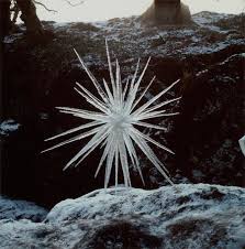
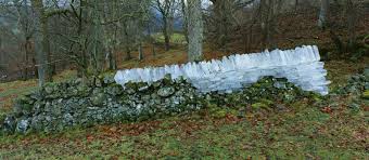
Back to Dr Fox: "the greatest Art makes the familiar seem unfamiliar and makes us look at the world in an entirely new way" The selected artists and artworks were all interesting. However, to my mind, not all of it really comes under the umbrella of "Land Art" or "Nature Art". We discussed how important (or not) these labels are; particularly as the categories can be a bit vague. I would suggest that they are useful in organising our thinking. Here is my previous diagram, with the addition of gardens as "Creative Gardening". 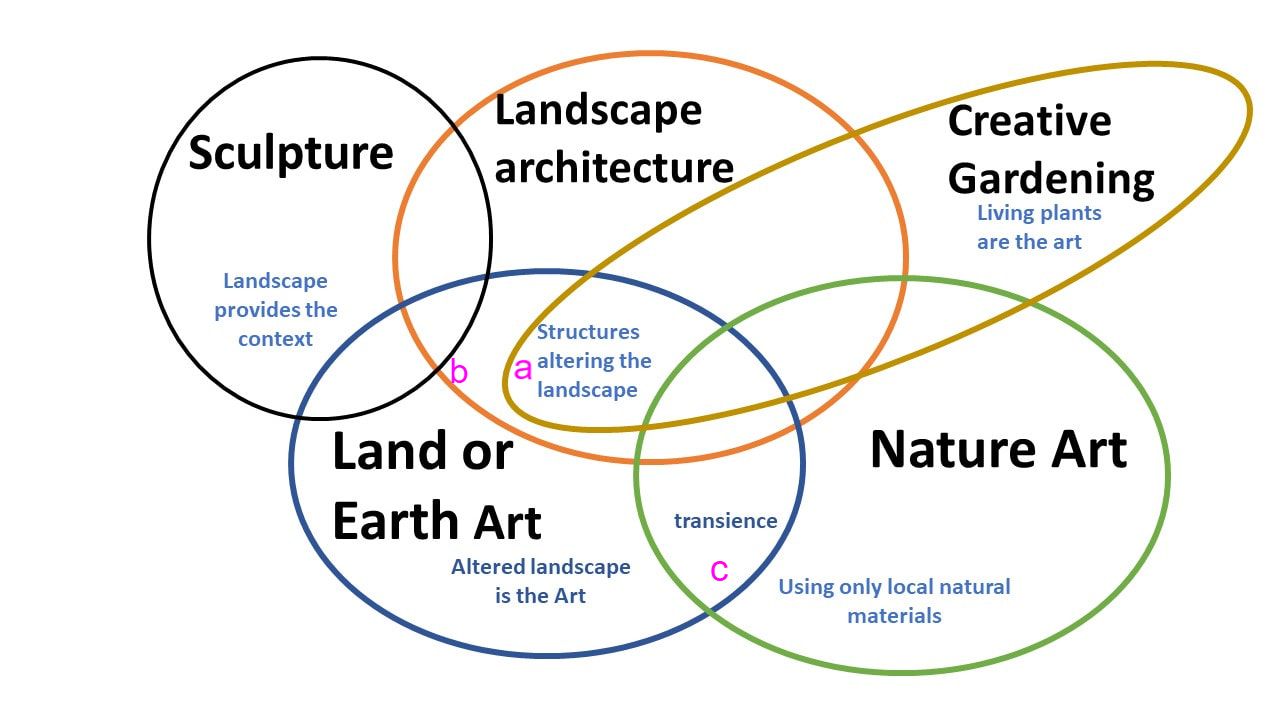 James Fox did include gardens; indeed, his introduction to the subject was in a traditional walled flower garden. However, the discussion focussed on Henry Hoare's Stourhead estate. Developed from 1744 onwards, that garden was thought to have been inspired by French landscape painting and to embody 'fantasy made real'. Fox states 'all gardens are worlds within worlds' and that they are our attempt to shape and posses nature. Fox also quoted Alexander Pope (1688 –1744) who asserted that "all gardening is landscape painting". In addition to being a poet and essayist, Pope was an authority on garden design, basing his style on what he understood of Classical gardens and architecture. His ideas must have influenced the garden at Stourhead, which includes altered landscape, architectural features and statues with allegorical meaning, perhaps belonging near 'a' on the plan above. Fox then went on to discuss 'the Garden of Cosmic Speculation' created by Charles Jencks, a Landscape Architect. I have not visited that garden, but have seen a number of images. To me, this is not so much a garden but more land art. It is outside, but the living elements are mainly grass. Almost the same effect could be produced by bare red clay (while also avoiding the mowing). The environment and nature are tightly controlled here; the 'stars' are the sculpted mounds and the way they interplay with light. I therefore think it belongs at 'b' in my diagram. In the film Jencks makes the point that these structures need to be bigger than people in order for them to have the effect, and we agreed that this was a place very difficult to judge through images -we should visit then assess. Both these gardens are attached to what are or were private houses and were created for the owners pleasure. However, neither really relate to the more domestic setting and scale that I am aiming my garden ceramics towards. 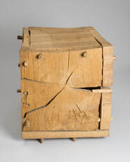 The film started with 'forest' and the work of David Nash. (see also 17th Jan). As a group we discussed the artist's other works, which are made from felled wood and which are subject to more immediate decay than 'Ash Dome'. Nash prefers to use rough hewn wood, and to allow natural processes to take their course, as in 'Cracking Box', which has shrunk and split as the wood dried out . The piece is displayed inside, and is more of a classical sculpture. Another well known work, 'Boulder' , is a nature art sculpture; carved from a large tree trunk it has been set free from its landscape to float towards the sea and disintegrate. Returning to the open air, Fox then focused on Andy Goldsworthy whose work is, I suggest, Nature Art or Environmental Art. He showed the 'Tilberthwaite Fold' and other sheepfolds rebuilt across Cumbria; each one re-using local stone to give new life and meaning to the structures. The artist was shown attempting to build a wall against a dead oak tree trunk -and not achieving it, as the wall collapsed on each occasion. For Goldsworthy at least, who talks about failing to make a work, completion of the art work however fleeting, is the important act, rather than the attempts. 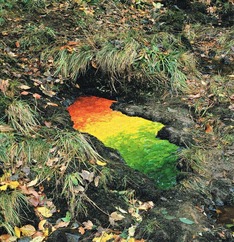 Some of Goldsworthy's work is intended to be much more transient than a wall. For example he has made sculptures in ice, nettle stems or this one made with leaves and petals. The themes appeared to vary widely. One, a wall that wandered on and off the boundary with a farmer so that they each were using 'each others' land, challenged 'ownership'. Another was the process of creating out of destruction, ('The Spire', a 90ft tower constructed from felled tree trunks in Golden Gate National Park), yet another was simply raising awareness of the wonderful colours all around us in natural woodland. Goldsworthy explained this in his illustrated Glenmorangie lecture, which is well worth a watch. Dr Fox (and his team!) took a trip to the Outer Hebrides to consider the fire stacks constructed by Julie Brook.(c) These may be unseen by anyone but the artist and prompted interesting discussions on 'does a performance need to be observed ? It was clear that although Fox knew about the fire stacks prior to filming, actually being present was very powerful. The camera crew captured some memorable images. 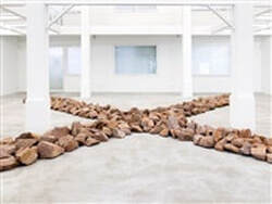 Another artist whose work is mainly in the creation is Richard Long (b1945). In addition to his 1967 work 'A Line Made by Walking' he has also made semi-permanent works in the landscape ('Tame Buzzard Line' 2001) and museum installations. Works such as this one, called 'Granite Crossing' are also for sale on Artnet. To quote a clip in the BBC film "its Art if Richard Long says it is" . The final artist to be featured was the American, James Turrell b1943, whose Quaker grandmother is reported to have told him 'Look within yourself and welcome the light'. Turrell's 'Skyspace' sculpture can be seen at the Yorkshire Sculpture Park. It is a frame through which to contemplate the sky. The plain frame may be land art, but the effect surely verges on mindfulness. The film tells us that James Fox was entranced and stayed for many hours, until the light faded. Maybe art is in the experience. Goldsworthy, A. The Glenmorangie Annual Lecture. National Museums of Scotland. 2012 Youtube
Parker, E POET AND… GARDEN DESIGNER? ALEXANDER POPE AT CHISWICK HOUSE AND MARBLE HILL History Uncovered. English Heritage Blog Post 19 May 2018  Deiniol is another potter who has been most generous with his time for us motley students. He gave us a zoom talk illustrated with powerpoint, leading us through his journey as a potter from boyhood in Wales, through college in Cardiff, University in Manchester, time in the Peak District and now a larger studio in West Yorkshire, where he can also teach - though not in lockdown!. He has made functional tableware, plain and printed tiles, and now is increasingly interested in artwork with cracks and holes - "letting the light come through" . Again, we watched a video of him preparing the clay and then throwing a piece, and then had the opportunity to ask questions.
For Deiniol, place is very important. It finds its way into his work both through materials and inspiration -often unconscious. For instance he said that after his move to Yorkshire he felt compelled to make the tall bottle shapes shown in the middle picture. He only became aware of the underlying motivational drive when in conversation with a customer he remarked on now being surrounded by industrial chimneys -and suddenly understood. More deliberately he has always been interested in using local materials to make the clays and glazes and now wedges into the clay stone inclusions that come from places that have personal meaning to him.
Deiniol described himself as 'happy to be a hermit'. He seems to manifest other characteristics of an enclosed life; he has chosen a mode of work which does not come easily to him and then made it more difficult by adding stone inclusions. He is in a "discourse with the clay" sometimes "battling with it". He commented that he was "wandering around with a half dead torch" and "in a shady boundary between art and craft". He is aware of his own tendency to obsessionaly test and to try and control, and explained that adding clay inclusions had forced him to loosen up his style and to adapt. Coversely he also enjoys and celebrates the "happy accidents" and is prepared to tolerate the large losses, even at greenware, that these methods entail. We had an interesting discussion with Deiniol about the merits of naming pieces or provinding a commentary. He compulsively numbers and catalogues but says he has moved away from giving titles (" they can get in the way"), though seems to feel under pressure to provide them. This not work I would wish to buy, but I now appreciate it much better and certainly empathise with the comments about his relationship with clay -and even doing battle with it! This class discussion was based around a performance art film of Grace Han. She is a South Korean potter who now lives in Canada. In the film she dresses in traditional Korean costume and makes a large Onggi pot using traditional methods. During the process she discards items of dress one by one untill she wearing a western style vest top and leggings. On completing the pot she destroys it - "it has done its job"
We had a good deal of discussion around cultural identity and restrictions, her expressed ambivilence about moving from Korea, and about what making a piece of ceramic means to us as individuals. Is it enough to make things simply to please yourself? Is it self indulgence? If making art is therapeutic, is therapy self indulgent? I am still thinking about that one and am prepared now to discuss at length! After discussing this short film we were signposted to another film of Grace Han, this time of her giving a 'First Friday' lecture as part of Mentoring Artists for Women's Art (MAWA) programme at the University in Winnipeg Manitoba. It became clear that she has not abandoned making Onggi pots following her move but that her ability to make these very large pots was raising questions in the Canadian cultural context, and that the ability of other women to do something similar was also met with sceptisism and curiosity. She conducted some structured interviews, did some basic analysis and drew on her own experience in her investigation, resulting in the presentation 'Women Strength and Clay. What were the messages from her investigation? They were that women are as able to make a good an Onggi pot as men because success depends on training, a good eye, technique, a good understanding of the material and the right tools. In order to carry on making such pots its good to be able to focuss on them, have sufficient studio space and to maintain the strength and skill. Women, because of lack of time, competing demands of family and cultural expectations are more likely to give up this type of ceramic practice, but its not inevitable. The following film on the website was 'the Art of Aging' which as a retired Geriatrician I had to watch! I will go back to that one. We were priviledged to have a seminar session with Stuart Carey as part of our lockdown online meetings. 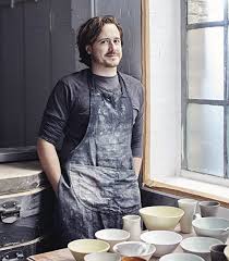 Stuart is a young potter who has had the most amazing portfolio career in ceramics. He makes functional ware (see below) - an area renowned to be difficult to make money in. He has sold through both large and smaller stores, undertaken commissions, but also recorded 'how to' videos, written books, and started membership ceramic studios. The Kiln Rooms in London was the second of these. We watched a video recording of a talk he gave at Ceramic Art London a few years ago and then were able to ask him questions. 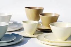 Stuart was very generous with both his time and his advice. It covered tricky areas such as how to pitch and price your work, the relationship with galleries and buyers, and how to build resilience in to your career. He also emphasised points made by others that we probably all need repeating regularly -do what you really want to do, insist on quality, look carefully at your work, review and learn.
I took lots of notes and now have no excuse! Thank you Stuart. . This was the first of a planned series of online seminars for the whole MA group whilst we are in lockdown 3. We were invited to read and discuss a paper by Robert Zimmer which had been submitted to the Royal Society in response to a call for a themed issue 'Abstraction paths from experience to concept'. This paper by Robert Zimmer ranges over a number of ideas, though the abstract of the paper as presented by the author says that you need to " abstract away from exactitude if we are to arrive at meaningful representations".. That makes perfect sense, and is beautifuly illustrated by Picasso's reply to a soldier presenting a wallet picture of his fiance as the 'perfect representation'; Picasso commented (recounted by Solso,1996) that the soldier's girlfriend was rather small. Zimmer argues that abstraction itself leads to increased perception, though I would contend (even having read the whole text) that the converse is equaly true, and that perception allows abstraction. Perhaps I am more sensitive to this as as a result of my prefessional training and as my own eyesight deteriorates with age. I am aware that it all too easy to misinterpret what you see if you dont see it clearly, or are unable to process it due to distraction or illness. This is often the basis for the hallucinations experienced by some in in delirium. There have been many visual artists who have perceived things differently - and have had their own significant visual disorders, from stereo blindnes( Rembrandt) to retinopathy (Degas) or cataracts (Monet). 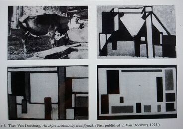 . In the group discussion of the paper we spent some time on Zimmer's pictorial example by Theo Van Doesburg published in 1925. This was a series of 4 images prgressively 'abstracted' from that of a photograph of a cow through to oblong coloured blocks. I and several others did not feel that he had arrived at a meaningful representation. I felt the example was in total conflict with with Hegels (1975) idea that abstraction allows (the painter) to capture the fleeting appearance of nature as something generated afresh by man. Hegel suggests that the process of abstraction to capture the 'essence' is itself manmade. I feel that the final image in the example demonstrates that by the process of reduction it is possible, though not inevitable , to completely loose that 'essence'; of cow or anything else. Maybe in that sense it is manmade. Indeed Zimmer goes on to point out that Van Doesburg himself felt that 'concrete'was a better description of his painting than 'abstract'. Having considered abstraction Zimmer goes on to discuss the psychology of art. He looks at three areas
The peak shift principle is based on the phenomenon observed in experimental animals, that they respond more strongly to exagerated versions of a training stimulus. Ramachandran and Hirstein suggest this principle works throughout all art creation and reception so that we are drawn to exageration. I will repeat the example quoted in Zimmers paper: 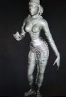 This figure of an Indian Goddess is about 1000 years old. Not only have various 'female' bodily characteristics been exagerated but also others that were thought attractive including the length of her arms and fingers and the small feet. Looking at this image led me to consider how the peak shift principle might apply to how a culture sees itself and even how fashion in clothes might operate. Why is it that different cultures develop very different ways of portraying human beauty? We are told that even a millenium ago there was considerable cross fertilisation of ideas and cultures along trade routes and through conquest both within Europe and in Asia. India and Japan are not so very far apart by sea but Japan has had long periods of political isolation and its art has developed very differently.  This picture of a Japanese Geisha aso exagerates aspects associated with femininity - the submissive angle of the head, abundant hair and the very small hands -but they are diferent from those of the goddess. In addition the very long oval face is not 'lifelike' but suggesting an ideal . Why did these two cultures develop different ideal forms? Was it simply chance or is it these features (flexible and expressive long fingers in India, an oval face in Japan) also help to mark out the geographical difference in bodily appearance, so the 'ideal' in a culture becomes the one least like the foreign one? Xenophobia is not new. Once accepted this ideal would be self perpetuating, as those individuals fortunate enough to resemble it would be more successful both geneticaly and financialy. They would conform to the long term cultural fashion in beauty. Closer to this day and age, fashions in dress tend to change quickly. What we considered very attractive and flattering ten years ago easily becomes dowdy and to be avoided. Yet when we see catwalk models displaying the latest creation from a fashion house, often we react with disbelief at the exagerated ideas. We mutter to ourselves that the clothes look horrible and we would never wear anything like it, even if we could afford to. Yet.....within a few years those exagerated lapels or outrageuos combinations of underwear ond outer clothing have crept into our wardrobes in a modified form. The 'norms' have shifted towards a different peak and now everyone follows them. This paper on abstraction was stimulating and provoking, in a good way, though many of the arguments about abstraction seemsed very unconvincing. The idea of the peak shift principle was very helpful, provoking reflections on fashion and cultural norms and also resonating with my new knowledge about Chevreul's observations on the perception of colour (see blog of 29/12/20). Zimmer, R. Abstraction in Art with Implications For Perception. . Phil. Trans. R. Soc. Lond. B (2003) 358, 1285–1291 Published on line on 8th May 2003.
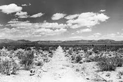
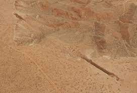
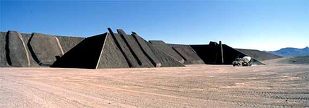
other references Hegel, G. W. F. (1975) Aesthetics, vol. 6 and 7. Oxford: Clarendon Press. [Translated by T. M. Knox.] Ramachandran, V. S. & Hirstein, W. (1999) The science of art. J. Consc. Stud. 6, 15-51 Solso, R. L. (1996) Cognition and the visual arts. Cambridge, MA: MIT Press One of the traps of online shopping, in this case from the Oxfam online second hand book shop, is that it can be difficult to gain a sense of the physical size and academic weight of your purchase.  I should have been alerted by the price. This soft back English language edition published in 1999 weighs almost 1.5 kilo. It is full of closely argued text and is 'weighty' enough to earn a forward by Professor John Dixon Hunt (English landscape historian. b1936). I took a deep breath and decided to read it rather than return. The book is proving interesting and has set me off researching more about Land Art and Nature Art, and some of the practitioners. The tome is presented as an overview "intended to make these art movements more accessible". It is is structured into a 40 page introduction entitled 'Art in Nature' then into chapters focussing on on the work of some of the artists the author has judged important. This blog is a brief summary of what I understand so far, with selected examples. One of the challenges to me as an outsider in these fields was the apparantly fluid nature of terms and lack of obvious boundaries between 'Landscape Architecture', 'Land Art' and 'Nature Art'. This point is discussed in the foreword by Hunt who suggests that there is a problem for Lanscape Architecture in having no agreed 'theory' though it increasingly responds to the surrounding landscape. Stephen Bann (Art Historian, b1942) in the second foreword goes further, and states (p9) that not only are there no clearly defined boundaries of Landscape Architecture but that 'great gardens are often created by people of other disciplines integrating their own practice into the creation ' Having studied the introduction I needed a diagram so constructed the one below. Ideally it should be a 3 dimensional model which would allow for an additional field: gardens with and without sculpture. Perhaps in a 2 dimensional plan gardens, both grand parks and domestic plots would fit best overlapping top right. Certainly in this diagram plants and the living element of landscape have almost no importance in the left hand categories but are the foundations of activity as we move to the right. 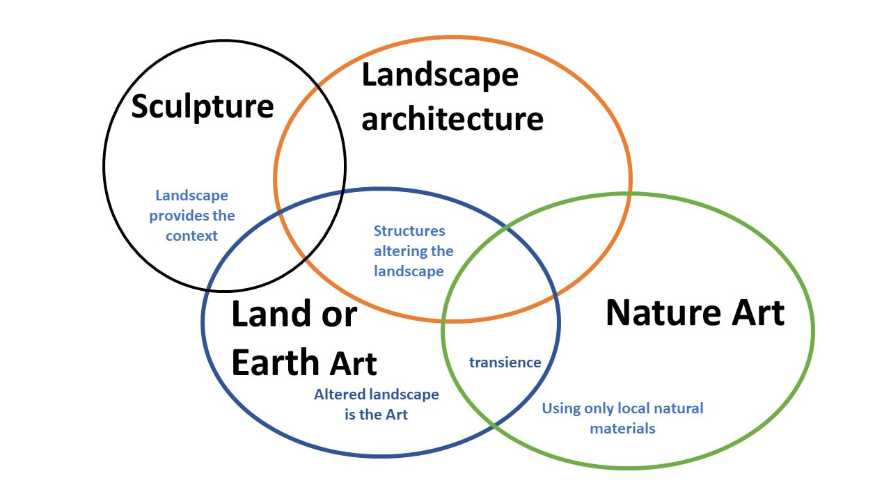 I learnt a good deal more of these modern movements than I had before. I was starting from a low baseline. Land Art was started in the late 1960's by sculptors in the USA wishing to reject the concept of a gallery, museum (or sculpture garden?) and to develop monumental projects far away from the commercial art market. Rather romantically they saw their work as being in a 'natural environment' such as the Nevada desert, (previously used to test bombs) which they then altered by removing or adding natural materials. The landscape was the sculpture. Examples include Micheal Heizer's 'Double Negative' (1969/70) where 240,000 tons of rock were removed from two places at the edge of an escarpment (below left) and 'City' (below right), both in the Nevada Desert.
 Another example is 'Las Vegas Piece' (1969) by Walter de Maria (left). This is said to evoke the 'first or last tracks of a human being who wanted to make a mark on an untrodden planet' (Weilacher quoting Kellein) Although many early Land Artists were rebelling against prevailing social norms and industry by going into 'pristine' areas, artists such as Sonfist, in the early 1960's engaged with the urban space to create public areas. It was a small park in New York with public involvement to increase understanding of nature-based existence and ecology. Initially this was seen as revololutionary. More recently (1982) Agnes Denes created a wheatfield in Manhatton. Land Art has also been created in old industrial sites, the places that have already been damaged and abandoned such as old quarries or opencast mines. Here the history of the location provides a backstory and part of the message. Hovever 'land recclamation as sculpture ' poses a danger of providing a 'green cosmetic treatment ' and a 'salve to environmental destitution''. In contrast to ' Double Negative' or 'Las Vegas,' Richard Long (British sculptor b1945) in his 1967 piece, 'A Line Made By Walking' hardly made a mark and intorduced the idea that the actual art piece can be the process of creating the art itself. Other works by Long have perhaps belonged better to the Nature Art (also known as the environmental art) movement, where something is constructed of natural materials within a landscape. Some of these sculptures may be durable, for instance stone walls, others last only moments such as the ice sculptures made by Andy Goldsworthy, and recorded in photographs.
Weilacher also quotes Winter and Schreier in their discusson of the Schuberg Project (in a German Forest): " structures which develop are dialogic, suitable not only to avoid the arbitrariness of the sculpture park but also tendencies towards a unified 'gesamkunstwerk' in the sense of the French or English garden. Here no all embracing idea imposes its will on the dialogue between the works and nature, or prescribes their inclusion or position.." He also quotes (p27) Ruth Falazik, who moved her contemporary art gallery outdoors to an agricultural landscape in the village of Neukirchen, as saying 'Art is to be understood as an integral part of the landscape' Both Land and Nature Art are made outdoors and are thus are profoundly affected by affected by weather over time. That awareness of transience/decay, the effects of natural phenomena and nature itself are an important part of their creators' motivations. All have sought to increase perception in the viewer, whether for instance of the majesty of their surroundings, of time, the colours and forms to be seen in nature or the experience of self. Weilacher criticises Landscape Architecture of having a persistent, impersonal academicism and production of the same 'correct' answers to landscape design which has banished the romantic in favour of rational and durable. He asks (p39) whether this new sculptural movement can offer new avenues? The acceptance of transience in Nature/Environmental Art is seen as a problem, but not for all. In his foreword Stephen Bann quotes Bernard Lassus (French Landscape Architect b1939) as saying 'Art and Landscape Architecture are the same thing for me' Of course this book is now at least 20 years old and thinking will have moved on. As of February 2021 Edinburgh University website defined Landscape Architecture as " a creative discipline that focuses on intervention in the landscape through imaginative design, strategic thinking and scientific precision. It analyses, represents and constructs landscapes as places with meaning". This seems very similar to the original intentions of Land Art. The difference may be that Landscape Architecture regards itself as profession, whose practitioners are commissioned to design -usually - large projects in public spaces. Artists are expected to provoke new ways of thinking and to create according to their inspiration, though may accept commissions as well as hoping to sell completed independently conceived works. In this blog post I have only reviewed the first 40 pages, forewords and introduction. Most of the subsequent 12 chapters are the result of personal interviews, whilst the first discusses the achievements of the Japanese American sculptor Isomo Naguchi (1904-1988) who may be regarded as the forerunner of these disciplines and 'who used the landscape as sculpture'. The practitioners he interviews don't fit in just one category, at least on more than one occasion. These people include Ian Hamilton Finlay and Bernard Lassus, together with others I had not come across. I am therefore going to take a bit more time and maybe put in blog entries for some. One big question has been in my mind whilst reading so far. Where do living plants, gardens and any garden sculpture fit into all this? One Nature Art piece that was created from living plants is in Wales on a private estate. 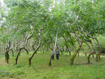 This picture is of 'the Ash Dome' planted by artist David Nash in 1977. There are 22 Ash trees planted in a circle, carefully trained over time to lean round and inwards. This picture was taken in 2004. Today, as a victim of ash dieback it will have changed radically, an aspect that the sculptor, interviewed in August 2019 for Apollo magazine, totally accepts. This work does not represent Nash's general output, which is chopped and carved from felled wood; more typical of the classical picture of a sculptor. Weilacher comments (p17): '...only a few artists work with living plant material other than grass...as a surface texture. The living plant often develops an unpredictable momentum of its own and actively alters its environment. Man has traditionally used gardening whenever it was a question of controlling this natural process of change. But in 1968 Robert Smithson asked "could one say that art degenerates as it approaches gardening?" Art critisism has, consequently, been unable to come to terms with creative gardening and sees a direct link between David Nash's Ash Dome of living ashes and traditional garden art. Does this gardening tradition of 'grooming ' provide an explanation for the infrequent use of living plants in Nature Art and Land Art ? or does art choose to steer clear of mediums which develop a momentum of their own?' Food for thought? Kellein, T. "Land Art- Ein Vorbericht zur Deutng der Erde" in Europa/Amerika Museum Ludwig Koln 1986
Weilacher, U, "Between Landscape Architecture and Land Art". . Birkhauser. Basel Berlin Boston 1999 Winter., G. Schreier C "Skulptur im Dialog" in Skulptur im Tal Kuntsverein Hasselbach. Hasselbach 1989 p53 another lockdown has been anounced just when we were expecting to get back in the UCLan studio!
Ah well more reading. |
AuthorI am indulging my passion for ceramics by undertaking studies for an MA at UCLAN Archives
August 2021
|
 RSS Feed
