|
Along with my Christmas gift shopping from a charity website, I also indulged in this book by Paula Pryke for myself. As its shorter and full of pictures it was the second of my recent purchases that I turned to after the Tile Book (which has more pictures and less text! ) This one provoked quite a bit more research. Living Colour is about flower arranging, with a particular emphasis on colour and colour themes. The author is a florist/floral designer with a practice that encompasses small domestic commissions to hotel contracts, so she does not stint on flower costs or appear to compromise on the exact flower variety or colour required. 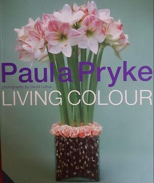 The book is full of inspiring examples which she describes in the kind of detail that might enable a keen student to try out the design at home. Before going into those practicalities, she has a section on colour theory and the impact of colour in nature, on mood and the use of colour in social settings. When talking about the colour wheel she points out that when working with nature its a bit more complicated than paint as very often the background, flower foliage (or garden ) provides a colour, usually green, and tone, against which the other elements are set. Some of her designs reduce the effect of this by being almost all flower, enhanced by the container, but she acknowledges that in traditional arrangements green foliage will provide the background and its structure, shape and tone will dictate the display. My interest is in coloured ceramic in the garden. Some gardens are almost devoid of green and might best be described as 'yards'. Sculpture Gardens may have plenty of green but are usually short of the other flower and foliage colours that we might hope to see in a garden for most of the year. Nature seems to usually get it right - so inspired by natures blooms I did a bit more reading on the 'net'. I was already aware that colour can have an effect on depth perception, with 'warm' colours such as orange appearing to advance towards one and 'cool' ones seeming to be further away. The effect of colour on mood is well recognised and is not confined to humans; bulls are aroused and attracted by red. People with mental illness can find the colour red very disturbing. Nearly 40 years ago I accompanied a psychogeriatrician to a patients house. As my role was to sit quietly and observe, with no medical 'hands on', I took the opportunity to wear my new suit. The lady was admitted to hospital and some weeks afterwards told me that she had suffered nightmares for weeks about that bright red suit. I never wore that suit again for work! These psychological effects of colour are now utilised in hospital design and dementia care, but are not new. Our association of colour with low mood (black and blue) or anger- 'seeing red' - has found its way into our language. This was before we had a full range of words to describe colours. For instance in mediaeval times 'red' was used to also describe orange, hence now having 'robin red breast' and 'red deer' when to a modern eye they are clearly not! Newton wrote on colour; not simply demonstrating the splitting of white light into its components colours using a prism, but also associating colours with musical notes. With Schiller, the poet Johann Wolfgang Goethe published in 1789 a colour wheel with the 'Rose of Temperaments' using colour to illustrate human occupations and character traits. He elaborated on this in his 1810 'Theory of Colours' describing the emotional and psychological impact of each colour in detail. 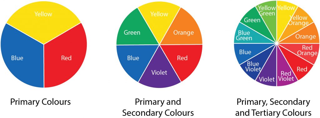 Colour wheels and more When I was at school, I learnt about the colour wheel. I was a bit surprised to find out there are different ones! I was at school long before the digital age and we focused on paint. I now learn that there are many colour wheels, and three main systems for classifying colour. The painters primary colours , red yellow and blue, from which all other colours we were told could be made, are termed subractive colours, and that in theory these colours should not work as the primary colours. They do so because colour depends on three main components of lightness, saturation and hue, and that coloured pigments have sloped absorbtion curves with pigments appearing different according to the degree of saturation. For instance a pigment may appear red in high concentrations but magenta at low ones. If this scheme is used in digital /ink context these colours are magenta yellow and cyan. The centre of the wheel is shown is usually shown as black. The next model springs from colour as wavelength : additive colours of red green and blue more appropriate mixing lights not pigments. The secondary colours in this model are magenta yellow and cyan. The centre of the colour wheel is white not black. The third system is the opponent process model, upon which is based the Natural Colour System. It is is also scientifically derived and the most useful of the three in constructing a colour scheme and for standardising colour in order to always recognise it - for instance in emergency exit signs. This is the model I knew least about. It was developed in Sweden just over 40 years ago The natural colour system is again based on a wheel but recognises 6 'elementary' colours: black and white, red and green, yellow and blue. 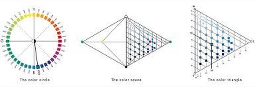 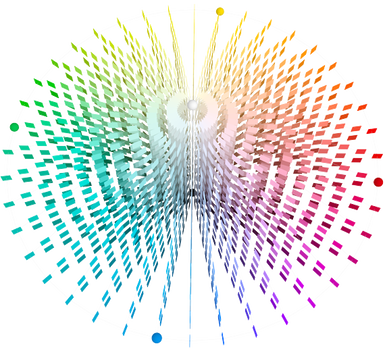 Colours are described with precise numbers to identify the hue (as on the colour wheel) but also the 'nuance' -blackness and chromaticness on the triangular chart (one triangle for each hue on the circle). This produces a 3 dimensional model as shown and a number for each colour which can be recognised accross borders, industries and disciplines. The website gives more detail, and includes a tutorial on how to use the system 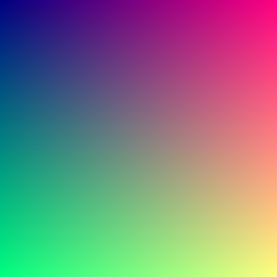 The Eye If this picture was expanded it would show over 16 million pixels, each with its own notation on the natural colour system. This is much more than the human eye which is said to be able to distinguish 10 million. The system aims to be 'natural' as seen and perceived -but when we look at light as picked up by the human eye its not quite as simple! As a reminder, the eye's retinal surface has two types of specialised light sensitive cells. Rods which have maximum sensitivity at a wavelenth around 500 nanometers, pick up the presence of light especially at low levels and contribute to greyscale colouring but have no role in distinguishing colour hue. Cones, which are concentrated at the fovea in the centre of the macula, detect light at wavelengths between 400 to 700 nanometers. At low light levels the colours we perceive best are also different; at dusk violet flowers seem to leap out whereas red, with the longest wavelength can be difficult to see. There are three types of cones with short medium and long wavelength peak sensitivities, but these peaks don't correspond directly to the blue green red model . The cones described as 'red', with the longest wavelengths, in fact have their peak sensitivity in the yellow/ green range. The visual system is not relying on a single cone; it takes information from a huge number and combines them to give us our colour perception. The anterior structures in the eye (cornea and lens) also play a part. I observed that when I started to wear glasses in order to see near objects my colour vision for distant ones was much clearer. Later, through a different mechanism, developing cataracts (opacities in the lens of the eye) resulted in everything having the the appearance of a brown wash. My vision was very interesting during the interval between my first cataract operation and that in the second eye a year later. The vision from one eye was all soft beige and the other gave me almost unpleasantly white and colourful images.
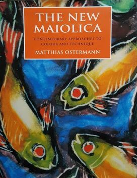
Using Colour Combinations The New Maiolica was first published in 1999, with the aim of being 'a workshop in print' for those interested in tin/zircon glazed earthenware. The first 100 pages are just that, with detailed advice on a whole range of decorative techniques, and is then followed by a discussion of the work of diverse 'contemporary' practitioners. In general this type of glaze decoration is known for a bold use of colour. The author devotes a whole chapter to colour; its emotional effect on us; our individual perception and colour theory. Of particular interest to me , he goes on to discuss the development of a colour palette and details how to obtain a range of glaze colours using ceramic stains. His basic stains, mixed with frit, are
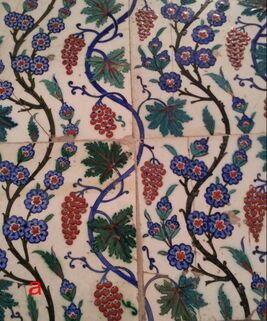
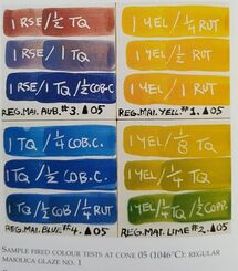 He also uses some oxides (cobalt copper and rutile) for some colours in his final palette of 14 hues. The use of turquoise and rose red were a surprise to me, schooled as I was in the primary 'painters' subtractive colour wheel, but now makes more sense and certainly his colour combinations are beautiful. His example (left) is also a good illustration of how colours change in character according to pigment saturation. 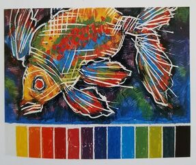 The image on the right is made from all the colours in his final colour palette. He says "....contrasting and complementary colours are at work here. To give further impact to the image, the fish was painted in predominantly warm colours, while the background recedes in cool tones." Ostermann states " colours are perceived by contrast and comparison and work through interaction with one an other" . He recommends a 1961 book, the Art of Colour by a Swiss painter, Johannes Itten, and includes a quote: 'Colour is life , for a world without colours appears to us dead. Colours are primordial ideas, children of the aboriginal colourless light and its counterpart, colourless darkness. As flame begets light, so light engenders colours. Colours are the children of light and light is their mother. Light, that first phenomenon of the world, reveals to us the spirit and living soul of the world through colours' Itten is likely to have been influenced but an earlier, but less poetic, colour theorist, Chevreul. Michel Eugène Chevreul (1786 –1889) was a chemist by training. He became the Director the Gobelin Tapestry works in 1824. He had been recruited because of dissatisfaction with the black dye used in designs which appeared a reddish tinge. He became interested in colour and formulated Chevreul's Law of Simultaneous Contrast, which states that: 'a colour will tend to appear to shift towards the complementary colour of its neighbour, both in terms of hue and darkness' Thus yellow on blue will appear orangey and black appears reddish if surrounded by deep blue/purple. The black dye was fine. Its surroundings were wrong. Chevreul published a book length discussion of his findings on colour in 1839. One of his statements is: 'It is almost always so, that that accurate yet exagerated colouring is found more pleasing than absolute fidelity to the scene' It is thought his ideas had a big influence on the pointelist painters Georges-Pierre Seurat (1859 –1891) and fellow Frenchman Paul Signac (1863-1935), and also on Van Gogh (1853 –1890), in his use of colour. Chevreul, M.E.,(1839) De la Loi du Contraste Simultané des Couleurs, Chez Pitois-Levrault, Paris, Avant-Propos,
Itten, J, (1961)The Art of Color, New York, The Natural Colour System. https://www.ncscolour.co.uk Ostermann, (1999) . The New Maiolica. A&C Black London. Pryke, P. (2001) Living Colour. Aurum Press London
0 Comments
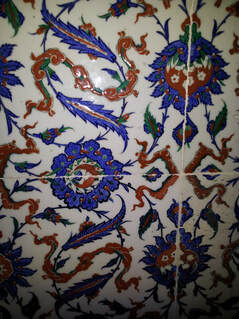
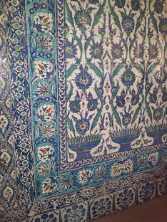
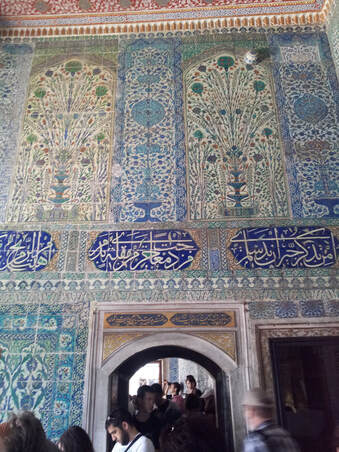
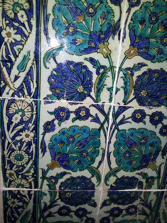
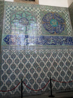
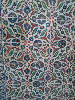
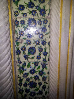
The recurrent and ongoing lockdowns have been an oportunity for a little online shopping and more reading at home. Earlier in the year I had aquired a (1986 not 1856!) copy of 'the Grammar of Ornament' by Owen Jones. This is very much a resourse rather than a reading book, but assuming that Jones was being rigorous about his research it provides a useful reminder of characteristic styles. There is a seperate book, the Grammar of Chinese Ornament. For a good while now I have interested in tiles and other decorative architectural features. Because of their small size and potential for repetition, tiles provide an oportunity to explore pattern as showcased in Jones's book.  While browsing offers at the V&A I noticed 'The Tile Book' published by Thames and Hudson and the V&A in 2019. Its a treasure trove! A mine of information it helped me to put some of my tourist snaps (see earlier blogs) and other reading into context. One disappointment was the dearth of information about more recent tiles in this 2019 book. There are only two examples after the 1980's, probably reflecting the book's origins in the Victoria and Albert Museum which of course as a museum tends to focus on historical objects . A 2018 abstract landscape tile panel from Egyptian artist Diaa el-Din Daoud is featured, but other decorative architectural ceramicists such as Lancastrian Maggie Berkowitz (d.2019) or Yorkshire based American ceramicist Jim Robison do not. Both produced/ are producing work on tiles which further develop the medium. The was no mention of even 'high end' commercial tiles such as those produced by Craig Bragdy in Denbeighshire, though these, by using bespoke tile shapes dictated by the design, are different again. 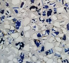 The other more recent example in 'The Tile Book' are the 2014 tiles from the Chinese company, Recycled China, established by two Americans, Thomas Schmidt and Stephen Miller. The pieces featured, made with blue and white fired fragments (detail shown) and with terracotta, were both made with recycled aluminium. Recycling and sustainability are the future! A local (Preston) company, Alusid, was established in 2015 following research by Prof Dave Binns and Dr Alisdair Bremner. They use not less than 98% recycled ceramic elements (no aluminium, which can be recycled again into other products) and are fired at a lower temperature than standard ceramic tiles. Some of their products look very similar to those of Recycled China. whilst others look like more conventional wall tiles. Talking of tiles in my holiday snaps, perhaps this is the opportunity to post some pictures? All of these are from a 2013 trip to Istanbul; from the Hareem of the Topkapi Palace (built from 1459 onwards) and the Blue Mosque built in the first few years of the 17th century. They were most likely made in Iznik, (originally called Nicea) about 110km South East of Istanbul
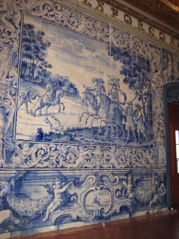
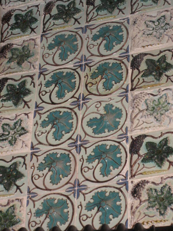
The following more recent tiles (late 17th C?) were photographed on an earlier trip to Lisbon. 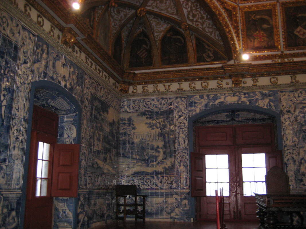
Tiles as status It good to see Rich Miller of Froyle Tiles as a judge on this latest series of 'The Pottery Throwdown', not merely appearing as the technician or as the hands doing that tricky business of deliberately collapsing a spinning pot. I am often very disparaging of 'flat' Fine Art especially when it is valued much more highly than ceramics, and I should not be. It should be judged on its merits. After all, tiles are - mostly - flat. Equally tiles seem to have acquired a lower status than other ceramics, when their range, artistry, skill and sheer beauty should again be judged on merit alone. Their very usefulness in providing a durable wipe clean decorative surface both in the home and in grander architectural schemes may have done them no favours. After all if a large number are needed to cover a surface each individual tile must be priced low enough to make them affordable. Of course in the days of mediaeval flooring and the Ottoman empire, wall and palace decoration tiles were status. Well what goes round comes round......
Victoria and Albert Museum. (2019) The Tile Book. Thames and Hudson. London |
AuthorI am indulging my passion for ceramics by undertaking studies for an MA at UCLAN Archives
August 2021
|

 RSS Feed
