|
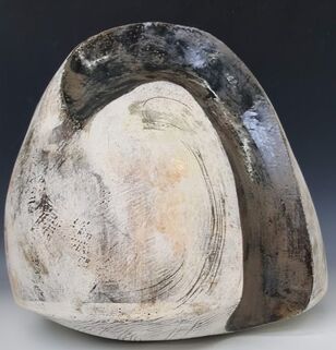
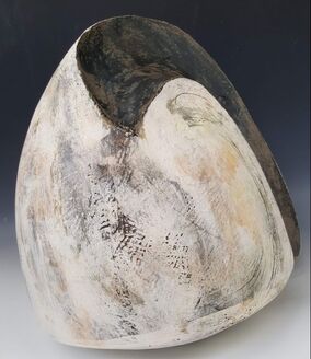
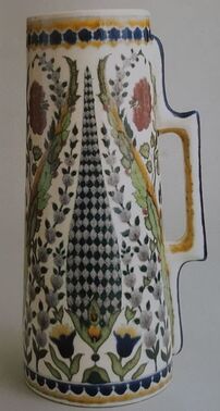
The good and the bad and what does this mean for my MA? Its all happened very suddenly. Ceramic Art London and Earth and Fire have both been cancelled, and now the University is closed. When this was announced it was for a few weeks only but it now seems as if it could go on for months. Fortunately I had a lift home on Monday so have been able to bring my smaller moulds and the ES40 clay home together with some tools, and now I have to tidy the garage so I can work there. We have been set up on Microsoft Teams so we can have remote seminars an tutorials. This mornings trial run was interesting. When we all got into the same meeting the visual and sound quality for me was very poor -and it seems I was not alone. Maybe everyone in the country is trying to do the same or maybe they are just watching films.... Well whats good? Everyone I know is well at present. I can do more gardening. Having a lift on Monday also enabled me to also bring home this piece I started at the Sculpture Lounge with James and Rebecca. It is 36 cm high by 38 wide and weighs 10.7 kg. I would have struggled on the train.
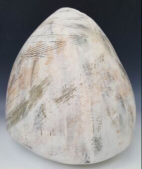 I am pleased with this. Its one of the largest things I have made so far, from many many slabs (I forgot to count) and all the joints have held through first a bisque then a cone 6 glaze firing. The making process helped to teach me about large curved slabs, using layers of slip for depth of colour, and has definitely improved my slab joining skills. This piece also has scrafitto, and glaze applied with both brush and sponge. I have another piece from the Holmfirth course, waiting for glaze at UCLAN. When I am (eventually ) able to work on it again I could use more coloured glaze as I will not have the challenge of a visible base. I went to foodbank on Wednesday. The organisers and most of the previous regular volunteers are well over the 'please go home and pull up the drawbridge' age, so there was a concern about whether we could carry on. Fortunately there were new volunteers, all under the age of 70. Going to foodbank is great antidote to worrying about clay. What are the downsides of the Covid 19 changes? The biggest ones are not having access to the workshop at UCLAN and the people. I did not bring the biggest moulds home because I did not feel I could manage them here and I am certainly not set up to create the glazes. If we not allowed back for many months it will be difficult to complete. Working at home is difficult - lots of distractions! There may be another Covid related challenge - I could get sick myself, I could be called in to the hospital to work, or both. I hope they identify more suitable people! Life is now a lot less predictable. We shall have to take it step by step.
0 Comments
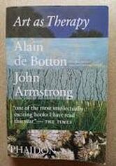 When in Manchester for the Halima Cassell Exhibition I went to the shop and bought ‘Art as Therapy’. I suppose it’s a typical Gallery book, and I bought it for what I suspect are typical Gallery reasons – to improve my knowledge of the ‘art world’ and because of the rave reviews on the cover and the recommendation of the girl on the till. The authors, Alain de Botton and John Armstrong (2013) discuss the function of ‘Art’. Their main examples are two dimensional artwork seen in a gallery or possibly purchased for the home, together with some architecture, sculpture, ceramics and furniture. They suggest that art has 7 main functions, some of which I had not considered before:
Ultimately their aim in this book is to help their readers (and society in general) live richer more fulfilled and happier lives in “a world where works of art have become a little less necessary”(p228). Can art really do this? What do I think? The role for art, in increasing our appreciation of the world around us and looking afresh, is the one I had encountered before. It will probably be most familiar to many people - perhaps along with beauty, marking social status and financial investment, aspects of which are covered only obliquely. The authors argue that art can go further than simply enabling us look “ with kinder and more alert eyes” (p55) to “recognise the worth of a modest moment” (p56) It invites us to notice what we have ignored and recalibrate what is important to us. The authors even claim(p56): "It lies in the power of art to honour the elusive value of ordinary life. It can teach us to be more just towards ourselves as we endeavour to make the best of our circumstances : a job we do not always love, the imperfections of middle age, our frustrated ambitions and our attempts to stay loyal to irritable but loved spouses. Art can do the opposite of glamourizing the unobtainable; it can reawaken us to the genuine merit of life as we are forced to lead it". Preserving or retrieving memory of a mood, experience or a person and providing a stimulus to reflection, is an important area. I think can be too easily confused with the idea of ‘providing a record’, now often done better in photography or video recording. There is of course controversy about whether photography is ‘art’. This was discussed (and left open) in Grayson Perry’s Reith lecture, recently re-broadcast. Sorrow, loss or grief, are often poorly articulated and accompanied by feelings of intense loneliness despite being universally experienced. De Botton and Armstrong suggest that art works can help us connect and feel that we are understood, sharing this with others. In ‘Growth’ they state (p44): "Engagement with art is useful because it presents us with powerful examples of the kind of alien material that provokes defensive boredom and fear and allows us time and privacy to learn to deal ….with it. …Its when we find a point of connection with the foreign that we are able to grow…..Maturity is the possession of coping skills: we can take in our stride the things that previously knocked us off our course(p52)" Museum curators are criticised for assuming people are already interested and simply need to have a few details explained to them, rather than helping make connections with ‘difficult’ pieces.(p46) Self understanding relates to ‘looking afresh’. The authors say (p39) “From time to time we encounter works of art that seem to catch on to something we have felt but never completely recognised clearly before”, “art objects…are the media we come to know ourselves” and that “art builds up self knowledge and is an excellent way of communicating the resulting fruit to other people”(p40). We say who we are by the kind of things we have. This is “more than just a desire for our guests to think we have good taste and enough money to do something about it”(p43). But is it??? ‘Rebalancing’ is a role explored in depth and is central to the book’s argument. The authors say that everyone has different psychological needs and that “we hunger for artworks that will compensate for our inner fragilities and help us return to a viable mean” (p32). Moreover(p38) “Art can save us time -and our lives – through opportune and visceral reminders of balance and goodness that we should never presume we know enough about already”. If this is about morality, the authors agree. They suggest (p34) that “ a lot of the best art….has been concerned with an explicitly moralistic mission….we can derive enormous benefit from works of art that encourage us to be the best versions of ourselves”. I found the section on hope the most interesting. It relates to a following section which considers what is ‘good’ art. De Botton and Armstrong discuss the argument that ‘pretty’ (and popular) pictures may encourage sentimentality, superficiality and lack of engagement with ‘real’ life and its problems. Art which is “cheerful pleasant and pretty…can be deeply troubling to people of taste and intelligence” (p12) and “leave us insufficiently critical and alert to the injustices surrounding us”(p13). ‘Idealized’ can be a term of abuse. They add “It is hardly surprising then if being ‘realistic’- the antidote to idealization – is judged a cornerstone of maturity”(p20). In contrast they suggest that when considering such ‘cheerful’ art: "these worries are generally misplaced. Far from taking a too rosy and sentimental view, most of the time we suffer from excessive gloom….optimism is important …..because many outcomes are determined by how much of it we bring to the task. This flies in the face of the elite view that talent is the primary requirement for a good life, but in many cases the difference between success and failure is determined by nothing more than our sense of what is possible and the energy we can muster to convince others of our due. We might be doomed… by an absence of hope…it is because the troubles of the world are so continually brought to our attention that we need tools that can preserve our hopeful dispositions.(p13)…Strategic examination of what is good can perform the critical function of distilling and concentrating the hope we need to chart a path through the difficulties of life." These arguments are on the same theme as the section on ‘rebalancing’. For a person who through constitution or circumstance takes a gloomy view of life or is oppressed by difficulties, then viewing art objects which are uplifting helps to counterbalance that negativity. The authors do not carry this argument to its conclusion. They should tell the critics of those who choose ‘pretty’ images to back off. The authors argue that art can help with mental well being and that this in turn affects physical health. In comparison to other factors, art must surely have a marginal role in health if basic needs are not met. The Health Foundation Creating Healthy Lives report of 2019 says: "This report argues for both investment in people’s health over the longer term and new mechanisms to embed a whole-government approach to creating good health. Action needs to be taken across the factors that have the strongest influence on people’s health, such as transport, education, social security, childrens’ services, housing and work." Perhaps if de Botton and Armstrong are serious about using art to influence population health they should place images on the buses or in the London underground. 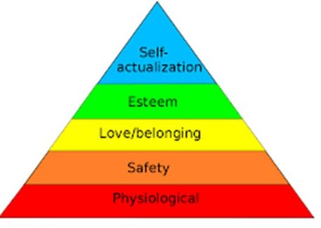 They may also be aware of Maslows hierarchy of needs. This generally accepted concept highlights the importance of the basic physiological needs for food, water and health. By contrast, art fits at the top in self actualization, or as this book argues, potentially contributing to love/belonging.
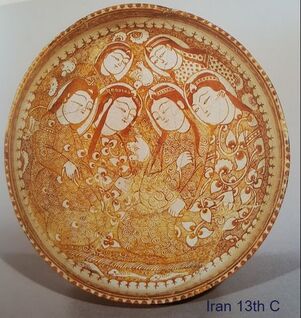
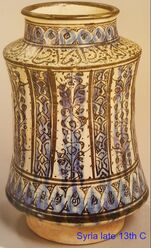
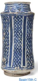
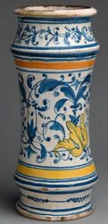
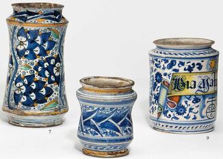
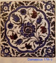
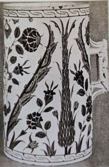
The British Museum exhibition I visited in January was called ‘Inspired by the East, how the Islamic world influenced western art’ so I made a special effort to attend. What I found was a focus on 'fine art' and Orientalist painting. It touched only briefly on other media or on how Islamic art could have influenced European art and design. The exhibition shop offered a catalogue entitled 'Beyond Orientalism How the West was won over by Islamic Art’ which I thought would provide more background. The cover image is of a ceramic tile, so I was hopeful. I read it in conjunction with two other much shorter and specialized books that I already had: Iznik Pottery by John Carswell (published by the British Museum in 1998) and Islamic Ceramics by James W Allan (Ashmolean Museum 1991). I have not been disappointed. 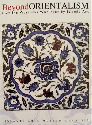 ‘Beyond Orientalism’ is published by the Islamic Arts Museum Malaysia (IAMM) and was written to accompany an exhibition of the same name in the IAMM in 2008. THIS was the exhibition I had wanted to see. The book covers a wide range of craft forms and geographical sources; is well written, and lavishly illustrated with pictures of the western pieces alongside the Islamic originals in metal, glass, textile, paper and ceramic it was thought had inspired them. The curators, editors and catalogue author make a great case for their argument that Islamic art and culture exerted huge influence in Europe and beyond over many thousands of years. It started early. King Offa of Mercia (he of Offa’s Dyke) who reigned from 757 to 797 AD had in his treasury at least one gold coin bearing his name together with Islamic script reading ‘There is no God but Allah. Muhammad is his messenger’. It is a copy of an Abbasid dinar dated 157AH (774 AD). Four hundred years later King Alphonso VIII of Castille (1158 to1214 AD) was still using Islamic style script on his coins, but whether by accident or design the calligraphy was unreadable. Not so the Bishop of Maguelone who was reprimanded by Pope Clement IV in 1266 for ‘having the title of Muhomet’ on his coinage. Venice, being a great trading state and close to the Arab lands, experienced strong Islamic influence both in female fashions and the crafts. In the 15th century a Milanese priest described Venetian women as ‘so completely covered up that I do not know how they can see to go along the streets’ and a 16th century nobleman called his city ‘the emporium of the whole world’. Vittore Carpaccio (1465 to 1520) included Islamic artefacts in his paintings suggesting that they were normal household goods; it is not clear whether the objects he depicted were the Islamic originals or the imitations Venice had started to produce. As well as copies the Venetians (and then other parts of Italy) created Islamic inspired wares that we now think of as typically Italian. Apothecary jars (Albarelli) were first made in Iran and Syria in the 13th century and sometimes decorated with lustre.
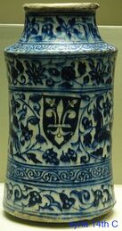
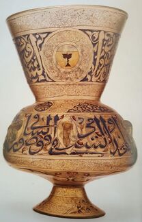
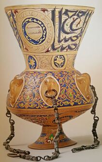
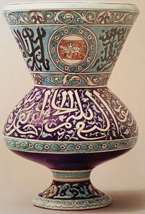
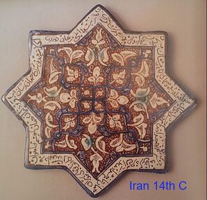
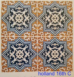
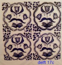
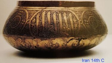
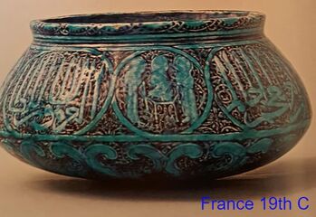
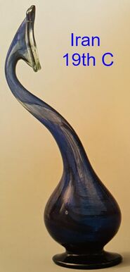
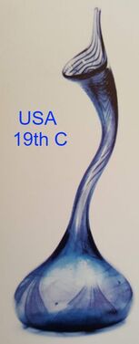
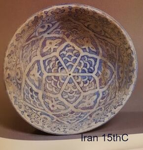
The classic 14thC mosque lamp (left) inspired 19th C European glass and ceramic versions, though the latter was probably intended as a vase. Similarly, Iranian Kashan star shaped lustre-ware tiles from the 13th and 14th centuries are echoed in the design of the 16th C Dutch delftware.
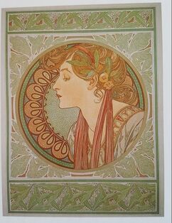
Islamic designs spread further. The Palace of Fontainbleau was restored in the 16th century, introducing what had become the Italian renaissance style to France, and with that many Islamic elements. By 1780, there was growing interest in the Islamic influence in Spain, further reinforced by Napoleon’s conquest of Egypt in 1798. Construction started on the Royal Pavilion in Brighton with its definite ‘Moorish’ architecture in 1897. ‘Tales from the Alhambra’ was published in 1829 further stimulating curiosity. Owen Jones (1809-74), Architect and Designer, visited the Alhambra in 1834 though it was not until 1842 that he published a book of his drawings, and in 1856, the ‘Grammar of Ornament’. William Morris and William De Morgan (R) were both greatly influenced by Islamic design, with the strong diagonals and ‘s’ shaped ‘saz’ leaves prominent on Iznik ceramics both being adopted into Art Nouveau style.
Subsequently Islamic designs in metalwork and ceramic were copied in Europe, notably by Theodore Deck, whose blue basin is so similar to the brass bowl from 14th C Iran that he was probably inspired by the original held in the Victoria and Albert Museum. In contrast to many, Deck took care that his inscriptions were correct.
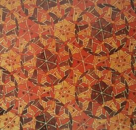
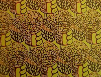
The author of the ‘Beyond Orientalism’ catalogue praises Morris and De Morgan who he says were influenced rather than simply copying designs; for sharing a love of nature and stylisation into 2D pattern. One of the other main characteristics of Islamic design is symmetry and complex repetition, echoed in the work of Escher(left), Matisse and even Charles Rennie Mackintosh (right)
In this wonderful and extensive account from IAMM, I think there are artists and design styles that could have had a further mention. The book discusses briefly the advent of Art Nouveau, and that although the influence of Japan (opened up to foreigners in 1854) was very strong, the Islamic style is still there. This can be illustrated in the work of Tiffany
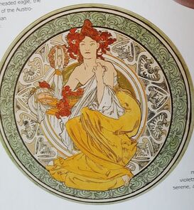
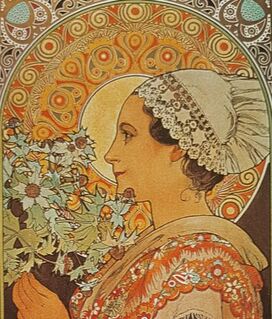
and of Mucha (who is not discussed). This Czech painter was also a classic Art Nouveau designer. On many of his biscuit tins and posters the female figure is set against a symmetrical rondel which could have been seen on an Iraqi 9th or 12th century bowl.
Similarly Vilmos Zsolnay in Hungary had been interested in the 1873 Vienna exhibition which had a strong Ottoman presence and in 1880 sent his son to the middle east to collect ceramics.
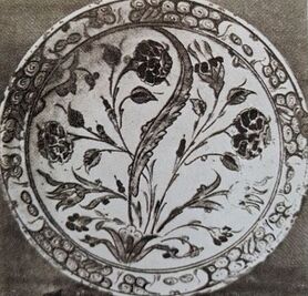
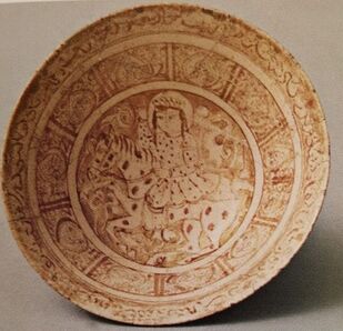
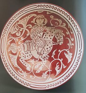
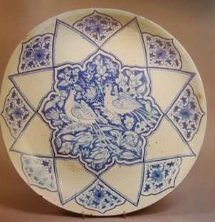
‘Beyond Orientalism’ makes passing mention of the influence other cultures may have had on Islamic styles. Although the Chinese are acknowledged as exporters of ceramic into the middle east, little is said beyond the adoption of blue and white colour schemes. 'Islamic Ceramics' from the Ashmolean Museum is less coy, showing evidence that Iranian potters at least adopted the Chinese shapes and may have copied designs. This second bowl from the early 18th C has a classic Chinese picture in the centre, within an Islamic surround..
 There may have been other influences, and certainly the lustre bowl from 13th century looks very unislamic. This book and my further reading certainly taught me many things and to appreciate more. There were 3 main learning points:
Bibliography
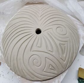
de Guise, Lucien.Beyond Orientalism How the West was won over by Islamic Art . Islamic Arts Museum Malaysia. 2008 Carswell, John. Iznik Pottery. British Museum 1998 Allan, James W Islamic Ceramics Ashmolean Museum 1991 Huszar, Zoltan Zsolnay Ceramics. Art Publications of Jannus Pannnonius Museum. 1988. I wanted to refine some of the colours so did yet more glaze tests. the grey /brown is better -no tendency to run shown, not quite so glossy so fitting in better with the others. the yellow has both tin and oxide added and is better. Definitely one to keep. the orange stain has oxide added but I am still not keen. the next one is rutile and tin - too dull and muddy. the last one is simply yellow ochre (an iron oxide) added to the base glaze. Its nice, but because its so pale it shows the carving less. 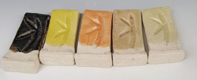 I have also tried some glaze combinations using the dotted pattern. 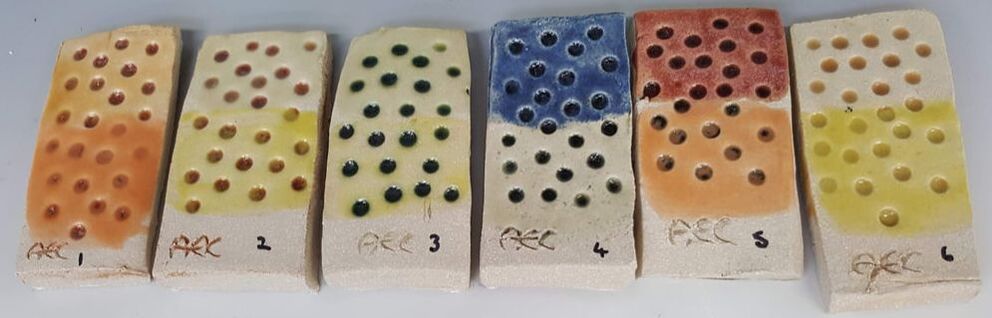 I have used red (tiles 1&2) green (3) grey (4&5) and toffee glazes as the base layer into the dots then wiped off. I then used two more on each tile in order to try the colour combinations. That pale yellow ochre has been used on several tiles; the top half of number 2 (over red) , 3 (over green ) 6 (over toffee) and the lower half of 4 (over grey). I think they all work well especially on 2&3 where the the base glaze colour has remained in the texture of the tile after wiping and gives the top glaze extra depth. I am now deciding on my final colour 'palette' bearing in mind which ones seem to work well together and are likely to work better in a garden setting. There is very little on the way of foliage around the university buildings at the moment so I am trying to get images from home to try the effect of my colour range. I want colours that will stand out from a distance and against a green background if it exists. They should be 'natural 'looking so as to echo flower colours. I have decided against the cobalt as its too harsh and fits in less well with the others. Although orange has worked well over an other glaze (tiles 1& 5 above) by itself it is too 'synthetic'. The tin and rutile glaze would be great if I wanted to imitate natural stone (and I don't with this project) and chrome/tin pink is too opaque. I will keep green in the range ( because its so nice ) and include toffee, yellow, turquoise/teal, yellow ochre (to go over other glazes on the dotted spheres), red, navy, lavender and the pale lime green. I may also use the grey/brown as a contrast if I make spacers, though the green could be a good alternative. The more colours I use the more choice -and too much choice is not always a good thing. Trying another base plate 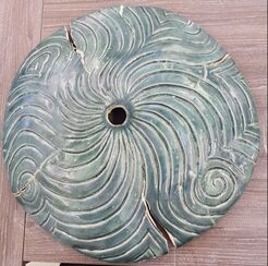 I am planning to have a base plate for both my totems and the water feature. For the latter its an essential part of the design in order to support the pieces above whilst protecting, and allowing access to, the pump below. My first attempt (L) was bisque fired on the former, and appeared to be OK. On glaze firing it had support only at the edges - disaster . I needed a different method of construction
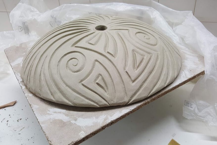
For this one i have rolled out 12.5 kg of Ashraf Hanna clay in one piece using the slab roller and draped over the bisque mould, trying not to distort it, then cut round to remove the excess. The centre point was identified by measuring.
Once the clay had firmed up a little padding was placed round the periphery, another board on top then it was 'flipped' so I could work on the base. Using thick coils of clay I built a circular supporting tube. It looked like a giant inverted mushroom with a hollow stem. Once that was leveled to the height of the circumference the piece was flipped back (the men who helped made it look easy) so I could carve the top. This one has been finished using new process -wipe at leather hard, then smoothing using wooden modelling tools. The piece was then loosely covered in plastic and left to dry slowly. Once it is glaze fired ( with no cracks I hope) it can be filled in with concrete. That should make it really robust - and a challenge to move around! |
AuthorI am indulging my passion for ceramics by undertaking studies for an MA at UCLAN Archives
August 2021
|

 RSS Feed
