|
I wanted to refine some of the colours so did yet more glaze tests. the grey /brown is better -no tendency to run shown, not quite so glossy so fitting in better with the others. the yellow has both tin and oxide added and is better. Definitely one to keep. the orange stain has oxide added but I am still not keen. the next one is rutile and tin - too dull and muddy. the last one is simply yellow ochre (an iron oxide) added to the base glaze. Its nice, but because its so pale it shows the carving less. 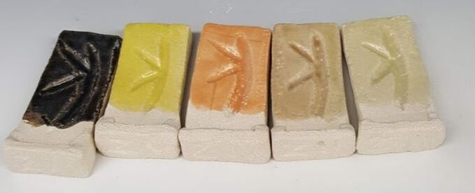 I have also tried some glaze combinations using the dotted pattern. 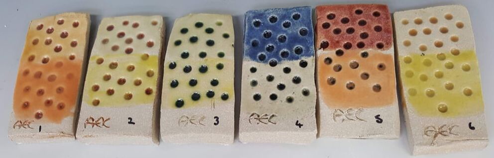 I have used red (tiles 1&2) green (3) grey (4&5) and toffee glazes as the base layer into the dots then wiped off. I then used two more on each tile in order to try the colour combinations. That pale yellow ochre has been used on several tiles; the top half of number 2 (over red) , 3 (over green ) 6 (over toffee) and the lower half of 4 (over grey). I think they all work well especially on 2&3 where the the base glaze colour has remained in the texture of the tile after wiping and gives the top glaze extra depth. I am now deciding on my final colour 'palette' bearing in mind which ones seem to work well together and are likely to work better in a garden setting. There is very little on the way of foliage around the university buildings at the moment so I am trying to get images from home to try the effect of my colour range. I want colours that will stand out from a distance and against a green background if it exists. They should be 'natural 'looking so as to echo flower colours. I have decided against the cobalt as its too harsh and fits in less well with the others. Although orange has worked well over an other glaze (tiles 1& 5 above) by itself it is too 'synthetic'. The tin and rutile glaze would be great if I wanted to imitate natural stone (and I don't with this project) and chrome/tin pink is too opaque. I will keep green in the range ( because its so nice ) and include toffee, yellow, turquoise/teal, yellow ochre (to go over other glazes on the dotted spheres), red, navy, lavender and the pale lime green. I may also use the grey/brown as a contrast if I make spacers, though the green could be a good alternative. The more colours I use the more choice -and too much choice is not always a good thing. Trying another base plate 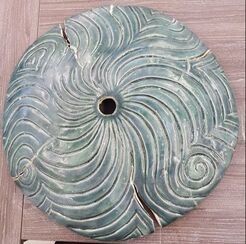 I am planning to have a base plate for both my totems and the water feature. For the latter its an essential part of the design in order to support the pieces above whilst protecting, and allowing access to, the pump below. My first attempt (L) was bisque fired on the former, and appeared to be OK. On glaze firing it had support only at the edges - disaster . I needed a different method of construction
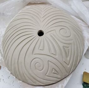
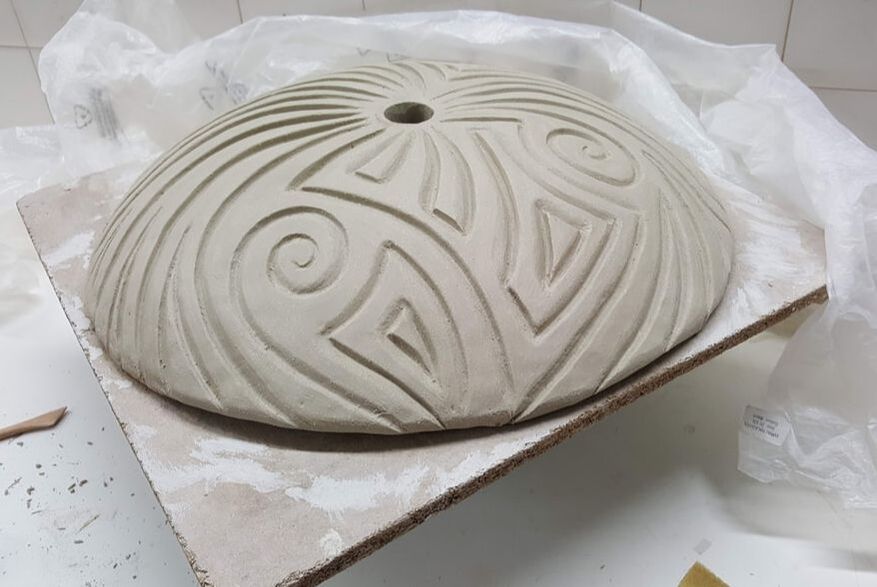
For this one i have rolled out 12.5 kg of Ashraf Hanna clay in one piece using the slab roller and draped over the bisque mould, trying not to distort it, then cut round to remove the excess. The centre point was identified by measuring.
Once the clay had firmed up a little padding was placed round the periphery, another board on top then it was 'flipped' so I could work on the base. Using thick coils of clay I built a circular supporting tube. It looked like a giant inverted mushroom with a hollow stem. Once that was leveled to the height of the circumference the piece was flipped back (the men who helped made it look easy) so I could carve the top. This one has been finished using new process -wipe at leather hard, then smoothing using wooden modelling tools. The piece was then loosely covered in plastic and left to dry slowly. Once it is glaze fired ( with no cracks I hope) it can be filled in with concrete. That should make it really robust - and a challenge to move around!
0 Comments
Leave a Reply. |
AuthorI am indulging my passion for ceramics by undertaking studies for an MA at UCLAN Archives
August 2021
|
 RSS Feed
