|
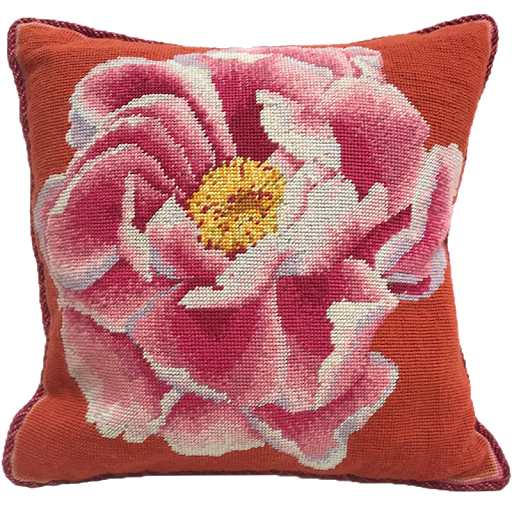
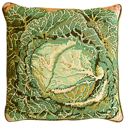
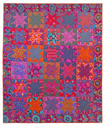
Yesterday I was at college in Preston, but for an hour or so put the mud to one side and watched a lecture by Kaffe Fassett. It was broadcast as part of the 'Festival of Quilts' but was purely about colour. He talked about colour contrasts within a 'palette' and being more adventurous about combinations, giving lots of examples. Ceramics can too often be beige and shades of brown; subtle and beautiful but dull. With textiles, where there is less scope for exploring form and texture, practitioners seem to get more exited about colour. Is this a fashion phenomenon, people influenced by peers ? Is it because its easier to play with colour when what you see in making, is you get? Is it because of a greater predominance of women? Certainly I experienced my visit to the Knitting and Stitching show (Harrogate, 2018) as being an endless sweetie shop of pleasure and inspiration, immersed in colour to the point that it was almost too much to take in. Like eating a whole cake. Potfests don't have quite the same effect; instead they induce a more meditative mood whilst making my fingers itch. With any experience there is, somewhere, a perfect balance for that person. Satiety without indigestion. Colour and colour combinations excite and nurture me. Plain neutrals by themselves can be negative. I first encountered Kaffe Fassett's designs when I started making wool cross stitch cushion covers about 40 years ago. The ones I made had a blank canvass and colour charts, with numbered skeins provided. Sort of tapestry by numbers without guide lines. Kaffe Fassett kits were more expensive and more difficult. His best known one was the cabbage. Even on that one and the restrained peony below, the details are exquisite and the colours pop.
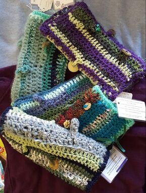
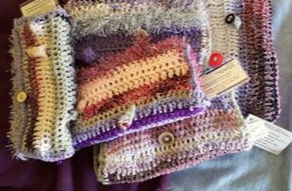
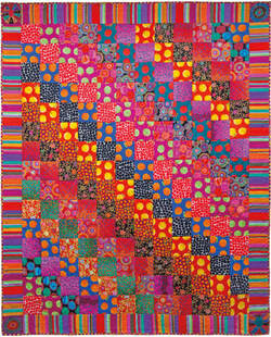 This quilt is an even more more vibrant example -and for me it has gone beyond rich to uncomfortable. Kaffe Fassett (b1937) must be one of the best known textile designers with a long and productive career. His bold use of colour and contrast, explained in the talk, has inspired so many. It has brought him commercial success too - endorsement of his ability to use colour to create a response in ordinary people. Over the last few years I have been learning more about colour combinations. I make 'twiddle muffs' for people with dementia who need to 'fiddle'. Its been a useful activity on the train to Preston! I use crochet and multiple yarns of different thickness and texture. As I make more I have found that the volume of colour is almost as important as the actual shade in creating a satisfying combination.
Back to ceramics!
Colour in glazes is a challenge, and I don't really want to expand my range, but I am tempted. I will try more and different combinations on the dotted pieces but using the same glaze range.
0 Comments
Leave a Reply. |
AuthorI am indulging my passion for ceramics by undertaking studies for an MA at UCLAN Archives
August 2021
|
 RSS Feed
