|
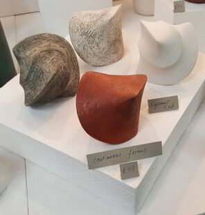
Looking for a good base glaze over July and August, my next trials were with 'Emmanuel Cooper Barium Matt' using the oxides recommended in Linda Bloomfield's book, and two of my high temperature stains, yellow and red, hoping to get yellow and orange glazes. Those tiles that looked a nice colour were pitted and runny , definitely not matt, whilst the stains fired out altogether. They had been fired in Test Kiln 6 set at 1245, so probably reaching 1260 with a 5 minute soak -so I have abandoned that glaze. The next trial was of another Emanuel Cooper recipe: Semi Stiff Clear Base Glaze, again with oxides and stains. The recommendation was to apply thinly but these were disappointingly dull and watery. 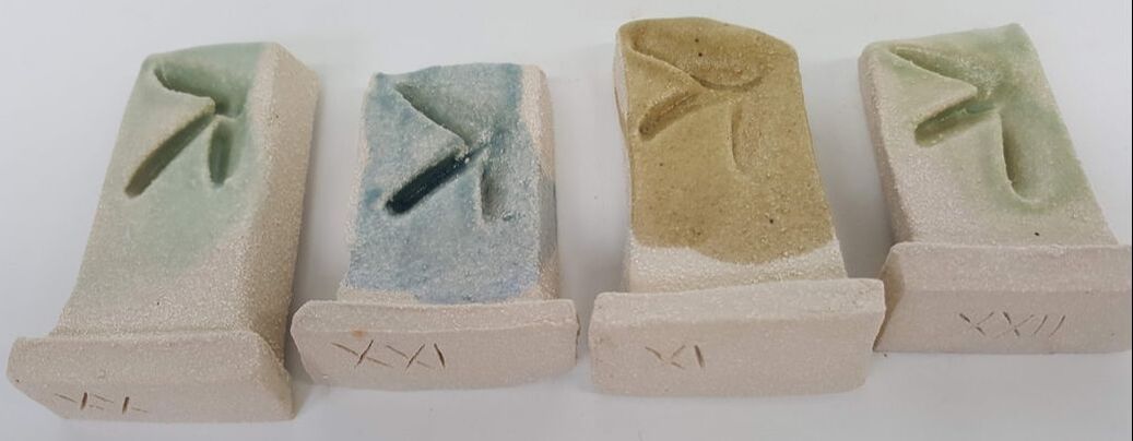 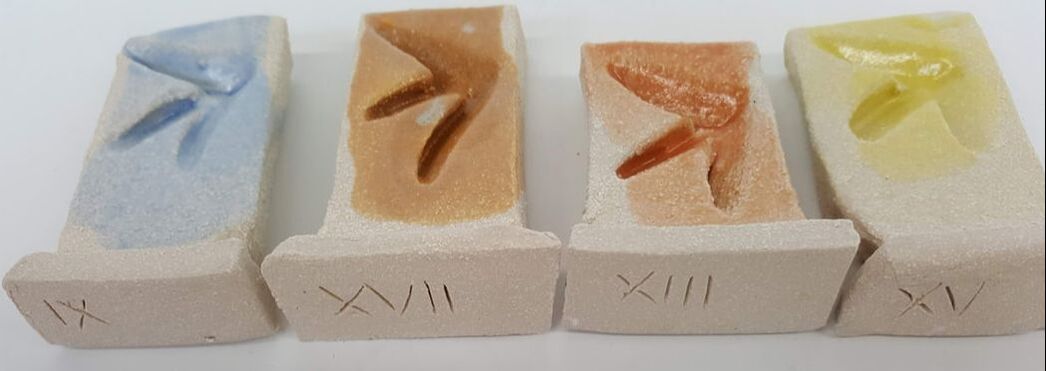 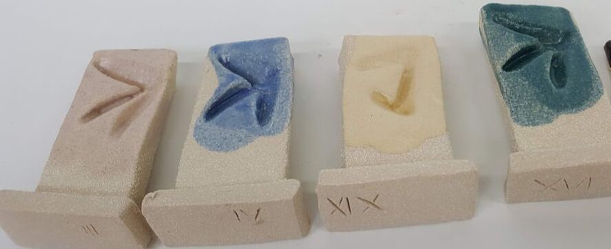 More thoughts on glazes! Just to recap, my ideal glaze range should
I reviewed the glaze tests done already and decided to try a modification of recipe suggested by Dave. The results were variable. The blues and greens were generally best but I am keen to have colours which contrast with the surrounding vegetation, to include oranges and red. I tried a series of oxides as well as the stains with the 'UCLan Transparent' recipe. The 'UcLan transparent ' glaze is 25 cornish stone 25 china clay 25 whiting 25 flint this recipe will fire as high as 1300 Having read that particle size can affect colour and not just evenness, I sieved the base glaze through both grade 60 and 100 sieves, and the test glazes through 80 and 120. They were all fired to cone 8. Some of them worked well, some not. In particular the ones with rutile were dull and pitted. I tried a further series of oxide combinations and we fired them higher to 1300deg C. Colours were brighter and better but they showed a tendency to run. Oh dear. I did some reading, took some advice, and tried a base recipe containing dolomite 10 and bentonite 3. It was horrible to make, clumping even after sieving through a 100 mesh, and the glazes were thin and flat even when fired again at 1290. I discovered the Glazy website! This is a free to use website where you must register and sign in. Potters post their glaze recipes and preferably a picture. It will act as a website library and a place to record your own recipes. The website analyses the recipe and will give both the amount of the molecular components and also where the glaze should sit on the Stull chart. You can then increase / decrease percentage components or add more and see whether and how its position on the chart changes -ie whether the change should make the glaze more glossy etc. Unfortunately I cannot yet work out how to factor in glaze firing temperatures. Next version of the glaze (UcA2) had less dolomite and no bentonite and was poured on to the tiles. The green (copper 4, cobalt 0.15) was nice but the other 9 were very matt and showed pitting and crawling . Was it because the glaze was too thick? The tiles dirty? Because I had used Ashraf Hanna clay? So I tried the glazes again, brushing onto Ashraf Hanna fragments and they did not crawl but were still unattractive.
More reading. The aim is for a glaze firing at cone 8 or below, as this puts less strain on the clay and the kiln, and thus is more sustainable . The next version has 5% talc which is predominantly silica and magnesium oxides with some calcium and aluminium. The CTM website stated that in amounts up to 5% it can improve maturity and melting of a glaze. They also advised that it should be thoroughly dispersed in water before adding to the glaze recipe.
Fingers crossed.
0 Comments
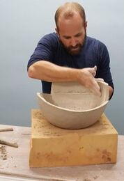
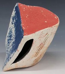
My plan is to make a range of ceramics for the garden - totems, water features, lights and cane toppers. Most of these items will need non ceramic components, for instance metal stakes, solar lamps, or a water pump. The fired diameters must be correct to fit, and I need to get to get to grips with some technical stuff, identifying the pumps, tubes, sealant etc that will work. My initial enquiries were at the water garden section of my local garden centres (-solar powered pump purchased but no good, mains electric seems more hopeful) but graduated on to the plumbers merchants and online metal tube suppliers. I bought soft rubber funnels from Morrisons supermarket. My latest visit was to B&Q where the staff, many of whom are in their second careers, were particularly interested in the technical challenge and impressed by my diagrams !. I came away with 3 meters of copper pipe (cut into two) and plumbers hose ditto, connectors, a length of soft 8mm tubing (to go inside the central pipe), and encouragement to come back with at least photos of the finished pieces. I also bought a spirit level and found that although I had thought I had fixed the problem of getting 2 holes to line up on the vertical, the outcomes were not consistently accurate.  I had an informal review with my tutors Dave and Rob at the beginning of the month. We discussed some of my technical concerns, particularly around the strength of the base plate and the difficulties in ensuring that the central tube is well anchored and vertical. Rob came up with a brilliant idea - concrete! This will allow me to make a base plate which is more deeply carved ( to match in with the other pieces) yet when filled and reinforced with concrete after firing will also provide a stable channel to hold the vertical post. I will still need a reservoir with an anchoring point to hold the base of the tube, but this is not a design problem, just a task! We also agreed that I should make more small pieces so I can use them as glaze tests. The whole project is beginning to look a little less daunting. Life in the garden What about light? Its presence or absence is highlighted by shadows -again manifest on the carved forms. I am also making light sources - lamps - as stand alone pieces, carved through as I have described before. Should I try to incorporate these forms in the totems? The central copper supporting pipe would be visible.The other component of a garden which is not essential but for me important is colour. Tones can be muted, Monochrome can be calming and attractive but bright colours lift the spirits and convey energy. In a garden colour is usually supplied by blooms but increasingly people use hard landscaping and garden structures such as glazed planters and painted fences to augment the plants, particularly for the duller winter months. I have tired of my off -white clay. We need some colour on these ceramics!
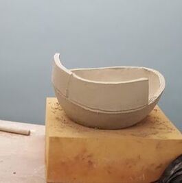
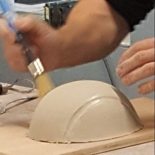
At the end of October, Mary and I took the opportunity to go on a 5 day slab building and decorating course with James Oughtibridge and Rebecca Appleby. The course is held in the Sculpture Lounge, a converted mill which now houses studios for artist makers in ceramics, metal, stone, and more. Many of these talented people run courses -so check out the website! Both James and Rebecca use firm slabs in Ashraf Hanna clay to make large hollow forms, but their style and approaches are different, which makes their course a very affirming experience - there is no one 'right way'.  Rebecca's sculptures are designed for indoors but James's are not. What about the weather proofing? James only fires to around 1200 but then treats the surface with stone sealant to reduce mould/algeal growth and improve weather resistance. He is also prepared to return to purchased sculptures and give them a good scrub. That's a little warning about ceramics left outside!  James may colour the clay body and in the past has used a coloured surface finish (though not glaze). He aims for continuous curves but makes them from slabs which have been dried in curved plaster formas then cut for construction, so that there may be as many as 50 pieces joined in a sculpture like this one. Not surprisingly the teaching laid major emphasis on how to join slabs! James opens the joins then reinforces both inside and out with coils before smoothing off.
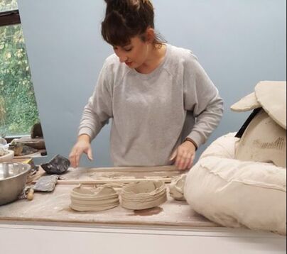 Rebecca is also a painter. Her sculptures are freer; also large and curved, but with flat planes and angles, texture and colour. After the initial hand building she may beat and alter the form, cut into it and even add wire. She uses very little glaze, but lots of coloured slip and underglazes. Although the clay is very pale in colour, she will cover the piece in black and then white to get the effect she wants. She demonstrated some texturing and printing techniques, and how she would make a torn edge.  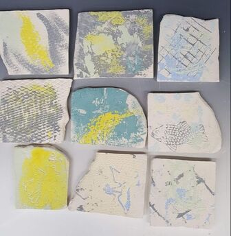 We tried these printing methods on tiles. These bisque fired slabs have slips and underglaze applied in the muted tones available. Of course these colours will be stronger if fired to stoneware temperatures. Rebecca will do lots of drawing before she starts on a sculpture; James draws directly onto a piece. Both will use 3D maquettes to try out ideas and that's what we did too -not least because its easier and quicker to work small. These are my three macquettes:
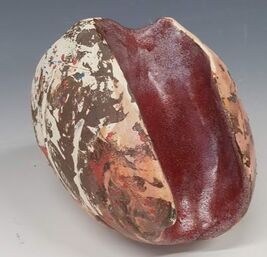
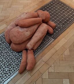
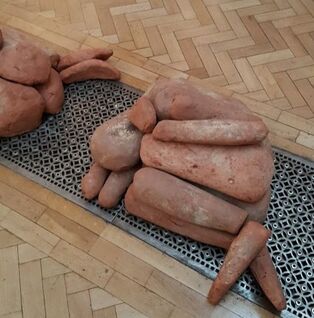
Deciding how to decorate was more of a challenge. The black then white base layers went on most areas but I decided to omit the white where I had definite plans to apply a darker slip or glaze. The first two have also had coloured slip added after my return to Preston, and the first some coloured glaze too. The red slip has cracked and flaked in places -perhaps because it is a thick layer and the slip not made with the same base clay. The third one is still green ware with the two layers of slip. I made one large piece to take away and fire, together with several components with which I could make another. All were still quite soft so I had to remake the base and lower front of the largest on return to Preston but, armed with my new confidence in dealing with large slabs, this was a nuisance not a problem.
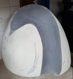
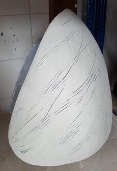
Here it is, still as greenware, as is the one below. I have taken the opportunity to scratch through. The piece with definite base will be easy to glaze (or not). All the macquettes however look best laid tilted on a curved plane.I now see why neither Rebecca nor James routinely use glaze to decorate.
These pieces are part of my skills development and not really part of the MA work, but I will post pictures once they are finished.
This exhibition is now closed- but I managed to visit 2 days before it did. Contrary to the title this was not a gourmet trip but covered many of the aspects of how /what we eat and in particular recycling, re-use and new uses for by products. This was the most predictable (and conventionally ceramic) one.  This is a terracotta home composting system for households in Calcutta, a city where food waste (along with everything else) tends to just accumulate on the streets.  .There were some more surprising items, such as these dining essentials all made from dung- together with a pair of dung toilets. 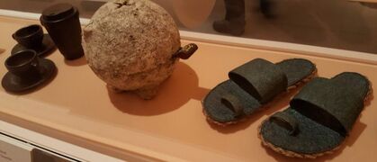 The cups are made with compressed coffee grounds but there were all sorts of other items and textiles made from by-products or food waste.
It was a stimulating and enjoyable visit but it did not make me look at my project in any new way. I visited the Royal Academy Gormley exhibition on the 18th. This man is so creative! I had seen his work before but the only one even semi duplicated here was that showing figures like those in Crosby but projecting from the walls ceiling and floor of the very grand Royal Academy galleries. Some of the pieces were from very early in his career, and others created apparently created specifically for the exhibition. Most appeared to be exploring the relationship between the human body and the space around it. As the catalogue put it 'the artist invites you to engage with the spaces around you'. The installation I thought least successful (Host) was a complete departure from this theme - a gallery turned into a shallow pond of mud and stagnant seawater. For me, the most interesting installations /sculptures were these:
Made out of loose dried clay lumps these unnamed pieces were very evocative; provoking (in me, at least) feelings of protection and sympathy. They also demonstrated the sculptor's intimate knowledge of the human form.
More interesting and enjoyable for me were two pieces about the spaces we inhabit
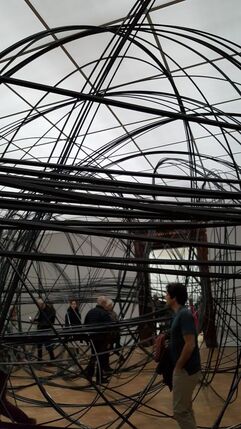
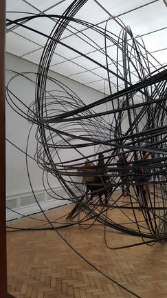
Eighty kilometres of square cross section tubing was coiled up, taken into a gallery and allowed to uncoil, filling the space. ('Clearing V11') Visitors who wished to get to the gallery beyond had to pick their way through. Each one became a participant in the work and may have been more aware of their own bodies (will I get safely through that gap?) and the total space. “I’m trying to activate the space itself in such a way that the viewer’s body becomes activated,” says Gormley, quoted on the Royal Academy website
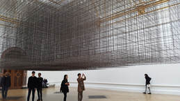
Like the coiled installation above, a large part of this welded piece's visual interest was the way the visuals changed according the to viewers position - their viewpoint. Again from the RA website: 'The magic happens in the moment of human attention. The "perceptual maze” of Matrix III is formed in the act of walking around, and if you wish, underneath.' “It is very difficult to distinguish between the foreground, mid-ground and background of the work, because there are all of these conflicting perspectives.” (Gormley 2019).
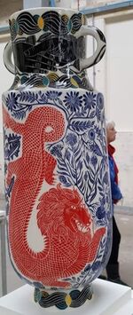
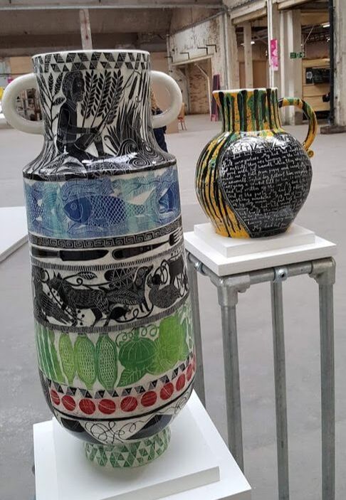
A class trip out! The BCB has been held alternate years in the China Halls of the old Spode factory, as well as other venues around Stoke on Trent. It was good to go with other Ceramics MA students to share and discuss differing reactions. I had attended in previous years but it would have been easy to miss this one as it runs for a shorter time in 2019. here are just a few photos:
 This photo does not really do the glaze justice; I can only describe it as luscious. The pots below use slips and sgraffito to tell a story in words and apparently non related images. I liked the use of colour, the intricate carving of patterns and images and the way they related to the pots themselves.
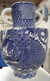
 These moon jars also use the pot as canvas. They tell a story about the pottery industry in Stoke but are much less explicit. A smaller version of the series (the macquettes?) was among the assembly of 'pots from the famous' forming a mini exhibition gallery with guide prices and available to purchase through auction.
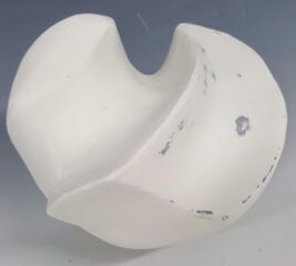
As far as i know none of our group felt able to bid......... One of the interesting exhibits was that made of of sitting figures done by school children. It reinforced my determination to include an element of participation into my MA work. Not to ask my audience and purchasing public to make my individual pieces but to give them choices as to how they are assembled together thus proving a final 'say' in the artwork. 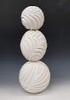 I have been looking again at carved pieces, placed one on top of each other as they will be as totems or a water feature and was unhappy about the appearance where they abut; in particular the carved areas where they meet and leave visual gaps. Should I insert ceramic ( or even rubber ) washers between the pieces? If so should these be of a standard size when the main components are not, and can be placed in any order? Should the carved pieces alternate with plain spheres, introducing a design constraint? In addition these irregular ridges are unstable especially during firing when they are free standing in the kiln, without the stabilising central post that will be present when assembled. Further more they worsen the glazing challenge. A few weeks ago, Annie Peaker also made some helpful observations about globes and pointed out that true spheres resting on a surface look wrong; they look better slightly flattened at the base -and are more stable too. Light bulb moment ...... I am making each of these carved altered spheres with a standard sized hole through which a pole will go. I am using a plastic sellotape roll innard and the see through top of a pressurised can to impress onto the clay to give me the limits of this standard hole. The revised plan is to make each with a standard diameter flat area top and bottom. This area will be unglazed, reducing the firing and propping problems and will be hidden by the next piece with its standard size flat ring going on top. 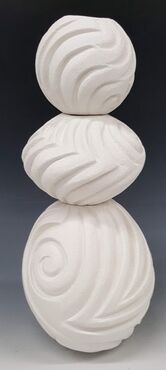 You will notice that the top one of this stack is flat - but not level. I have found it really challenging to get the two holes lined up exactly opposite, even when I measure from the join line. I will need to get a spirit level. I no longer use a damp sponge to smooth off and even out the surface and have abandoned steel wool. I now use those green scrubbing /scouring pads on the dry clay (whist wearing a mask and under the extractor fans). They leave a scoured rather than the gritty surface left by the sponge and the residue is easier to remove.. I am still concerned about stability. though the new 'flat ended ' design is an improvement. At Postfest in the Park Wendy Lawrence's totem had a significant lean. I plan to stick the central pole of mine well into the ground, but I can't use this method for a water feature as there would be problems of leakage if the central pole went through the bottom of the reservoir.
The other concern relates to weight. If a totem or water feature reaches six foot in height there will be a considerable force on the lowest piece. Again not a major problem for a totem, but a water feature will have the water reservoir and pump below a supported canopy. More thinking. I have been concerned about finding a glaze that will be semi translucent, a strong bright colour, and wont drip off the piece sticking it to the kiln shelf. Metal stilts and ceramic triangles keep the pot off the shelf but are designed for earthenware, not high temperature stoneware firings. Props can only go so far -and sometimes no further as previously demonstrated by this piece:- 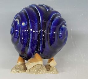 Part of the problem is that I put the glaze on too thickly and part that it runs too much, so although I did not damage the kiln shelf there is no realistic chance of removing these props. Should the base be completely unglazed? I want to avoid that. Whilst at the Park and Pens Postfests I discussed this problem with a number of people and also thought further about the design. I was advised to try ceramic wadding - not something I had come across. Dave later showed me how to make and use it. You need equal quantities of alumina, china clay and flour, made up into a fairly stiff, almost dry dough like paste. This is formed into little balls on which to rest the piece during firing . These little balls become friable and (fairly easily) chipped or ground off. 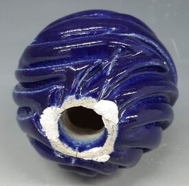 The next problems are design, getting the right glazes and glaze application.
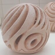
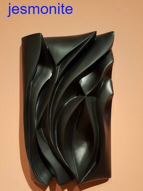
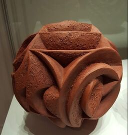
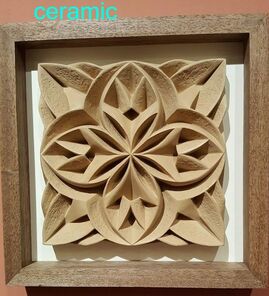
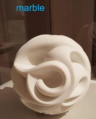
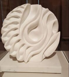
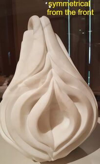
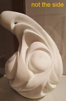
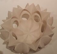
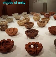
This one was spray glazed and fired with wadding. There are no 'potters tears' on this piece. Although the colour is similar the glaze recipe is different and the glaze is applied in a thinner layer - both may be a factor. It did however prove difficult to spray the glaze into the carved grooves. Even with directional spraying the glaze in some is really thin. I have not solved the glaze recipe problem. Although this one has not run, and is a nice colour others in the range were not. It was a joy to meet Halima Cassell in person when she came and gave a take to the design MA students early this year. I had read articles about her in Ceramic Review and had been to see her show in Kirkby some years ago. She showed images during her talk, some dating back to her BA and MA courses at UCLAN, so when I went to her show in Manchester Art Gallery I was comfortable that there would be big differences between her work and what I am aiming to do. Of course there is - she started with clay but now works with multiple materials : clay, wood, glass, (as I had seen in Kirkby) marble and Jesmonite. Her ceramics are unglazed, though many are for display outside and of course hers are stunningly precise. I had expected to see sharp edges and rounded deep hollows on her deeply carved forms; perfect symmetry and predominantly geometric shapes. She has now developed rounded crests and some movement away from symetry. Her 'virtues of unity' series started some time ago utilises the same basic dish form for each, using clays from, and trying to express the characteristics of, different countries. She demonstrates the almost endless variety that can be achieved with a similar basic shape and style. Her newer work goes beyond those boundaries. In her own words she has 'loosened up' with flowing lines, rounded external shapes and ridges but with symmetry never far away. I have chosen a few images to demonstrate the variety of form and materials she has used and that now characterize her work
Even Halima Cassell has had her disasters, as when her 'Torso' piece blew up in the kiln 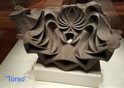 .....but she turned it into a success and exhibited anyway.
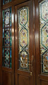
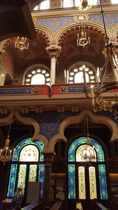
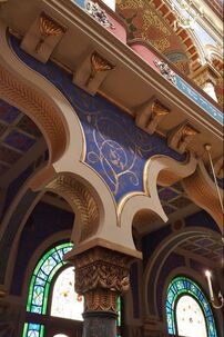
I came away from this exhibition in Manchester realising I had been influenced more by Halima Cassell than I had previously acknowledged. I was reassured that although her work is now freer in style there are still very significant differences between her sculptures and the garden forms I aim to produce. it was also reassuring, looking at her Japanese thrown and carved pots, that she too had areas of weakness and had had to move on from them. Also her carving technique is flawless and I need to improve mine! No, this Synagogue is not in the Middle East but on Jerusalem Street in Prague. It is the most recently built, about a hundred years old and outside the old Jewish quarter. It seems to reflect the optimism of a new state, released from the Austro-Hungarian Empire to create its own path. The interior is covered in a riot of pattern in slightly competing styles. The decorators had fun.
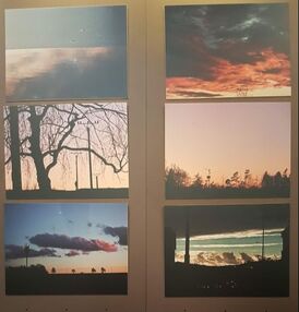
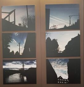
When I visited in June, the synagogue was hosting a photographic exhibition by Marek Bouda, entitled 'Event Horizon' - he described the horizon as a 'a border line beyond which we do not see and do not know what will happen.' The images were dominated by contrast , light and shade. This is a theme that I have also been thinking about as it is the shadows that define my carved decoration and create the interest on individual pieces.
 I had been given advice to change my test tiles to ones which would better resemble my final pieces. I have now moved on to tombstones: they are more carefully measured(10x5cm); much thicker in order to reflect my final pieces and carved out rather than slashed. Initially I did these test tiles 'wet roughened' as this was the treatment I had given to the forms. Micaela's comment in the semester one assessment, questioning whether this was necessary or desirable started a process of reflection about the surface of the clay. By carving with wooden tools on softer clay I had found that the protruding areas were vulnerable to damage. When the clay was firmer the shape was more secure but the process hurt my joints. Moving to metal turning tools there was a contrast in texture between the original surface and the carved walls, and it was difficult to achieve the flowing rounded edges I was aiming for. The action of wiping down with a damp sponge evened out the texture over the form, took off remaining 'burrs' and smoothed the curves. The downside was that I had to dry the piece even more slowly and I was uncertain the the very grogged texture would be an advantage in holding the glaze, and how attractive it would be. I did test tiles to match. Dave then suggested that instead of a damp sponge, I use fine grade steel wool on a very dry form (under extraction of course). I tried this and found it worked on the shape though not as well as the damp sponge, but did leave a smoother surface. I used a lot of steel wool for the two pieces I tried it on, and also found that the steel wool was too heavy to be easily sucked up even when using a brush to loosen the detritus. I dont know how any remaining bits of steel wool will affect glaze. My sponged test tiles were dried, fired and glazed, but meanwhile I have been working on progressively firmer clay (when I can control the impatience) and on developing my technique so that I am required to do less smoothing off. A new surface needs new test tiles! When Halima Cassell came to give her excellent talk to the MA design students in the spring, she answered further questions when she came back to the Ceramics department. Not only had she recommended that we "use just one tool and learn to use it well" but also said that she carved "tiny bits at a time" off clay that had dried "beyond leather hard". Sometimes we have to learn the hard way.
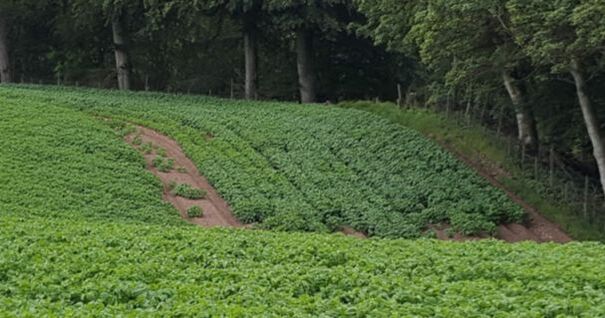
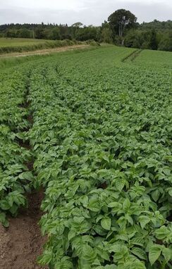
On holiday with the family in June i was surrounded by potato fields. The plants were at the stage of being big enough to merge along the (roughly parallel) rows but not between. The rows curved and danced over the contours so that as you passed there was a continuously changing perspective. The hills themselves formed folds and shadows, and there was magical light through the trees.....
I had not meant to go to Lincoln but two of us tagged on to a business trip and went sightseeing.
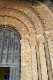
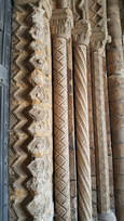
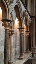
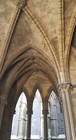
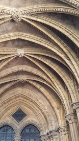
Lincoln cathedral was amazing. The first part of the building was up by 1068 -two years after the Normans arrived and while they were still trying to consolidate their grip on England. The stone carving demonstrated how a solid mass can convey visual lightness and how shadows can bring a place to life. Repeating curves provide gentle movement and the soaring ceilings lift the spirit (and the voice). The cathedral had additions and repairs over the centuries, each with their own style, but the result is a cohesive whole. Its a gem. I generally try and go to a Potfest. This year I managed to get to both Potfest in the Park and the Pens and enjoyed them both. There were lots of great things to see (and buy!) but one potter at each really caught my eye.
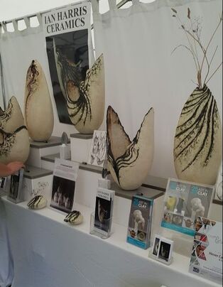
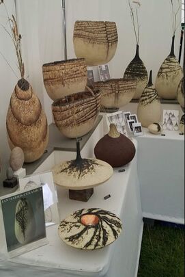
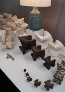
Carolyn Marr exhibited in the Pens. She too uses unglazed clay but not, at this event, the vessel shape. Her pieces are small enough to pick up comfortably and invite your fingers to explore the curves and 3D relationships.
 This lantern is the same basic sphere, tapped down to create a flat base then carved. I then cut the base off as smoothly as I could, including a locator notch. There is a small hole at the apex through which to thread a chain and loop as I expect the lantern itself will become too hot to handle once a a tea light has been burning inside. This lantern is in craft crank, made prior to my decision only to use ES40 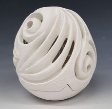 Version 2 This is a similar design in ES 40 clay. It has 3 notches to match up top to base. In practice these are difficult to match first time, so although they give a more stable fit than one, this design is less practical. 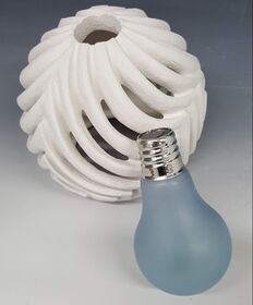 Version 3 has an open base (visible through the cut out areas) large enough to accommodate a hand and solar light bulb, and an opening at the top into which the light bulb fits. The light bulb would be glued in and cut out if a replacement were needed. The hole looks too large now but will be smaller after glaze firing. Learning points!
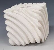
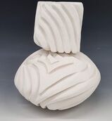
trying that cube
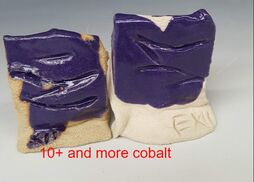
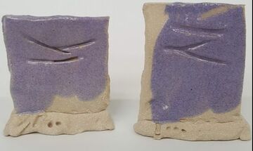
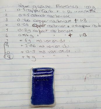
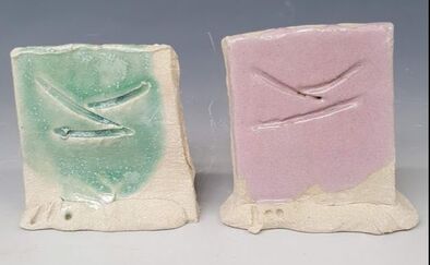 I have tried out two more glazes from Linda Bloomfields book: Chrome tin pink (1260 in oxidation) and Micheal Bailey's sea green crystalline matt also fired at the same temperature. I also tried both glazes with cobalt carbonate 1% and 2% added. I like the lilac/purple glaze and will probably use it for my final range. Unfortunately the sea green is a little too translucent and runny.
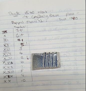
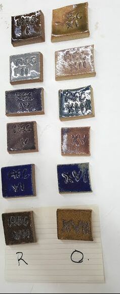
After the talk on glazes we were tasked with making test tiles with single ceramic materials. My share was to look at the primary fluxes. I made a set of standard 10x5cm test tiles in Ashraf Hanna clay, which were bisque fired. Each of these 5 flux materials were simply mixed with water to form as suspension and poured onto the tile. here are the tiles: 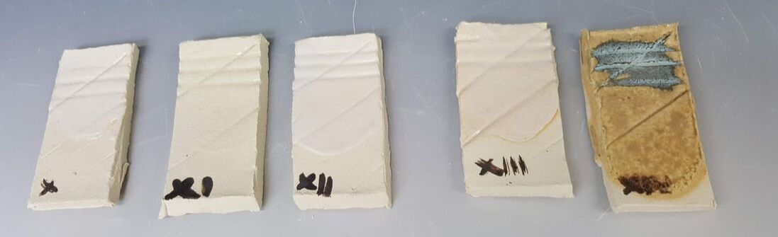 In order these are:
X potash feldspar XI soda feldspar XII cornish stone XIII nephtheline syenite XIV wood ash (sieved but unwashed) I have subsequently left a suspension of the mixed wood ash to soak for 2 weeks and poured off the liquid, replacing it with fresh water and retesting  Last Friday, the 17th, we first years had our first formal assessment of practical work. We had to submit the latest learning agreement, a short summary of where we have come from and are aiming for, and practical work to be assessed. We therefore got to see the others' work to date (I am the only one who works solely in UCLAN ) though obviously all the assessments themselves were private. Dave as tutor did the assessments with Micaela as second opinion. I had a few test tiles and a glazed sphere hot out of the kiln and still to be photographed. I had glazed the small carved sphere by dipping in a new batch of 'DBG' with 5% cobalt. Horrible. The glaze went on too thick but still left bare patches, possibly due to air pockets; and ran, though not as far as the kiln shelf. Spraying the glaze on might work better. We discussed shapes and how they might relate to each other. I have been persuaded to carve a cube in the same style. We also agreed I should stick to ES40 clay, try working on less runny and glossy glazes ( as the light reflections can distract) and work further on the patterns. All very helpful and will give me lots to record in this blog... ,Dave encouraged me, right from the start, to be bolder and for the carved pieces, go deeper. Fine, where I had a good depth of clay to go into. Unfortunately on the latest 'flying saucer' shape I did not pack enough clay into the mold towards the edges, so when I carved I went through. As this is not a good shape for a lantern, I could not use it as an advantage, so the only option was to patch from behind. Time will tell if this has caused problems.  I cut out a shape from the piece, added more clay from behind as far as I could reach where it felt thin and replaced the patch. 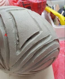 The repaired hole is indicated by my finger on the photo above, and by the ^ on the picture here. I have wrapped the piece and left it to settle before carving more and finishing it off Unfortunately, for the lanterns I appear to have made the walls very thick, so although that's made them stronger even deep carving does not go through to make nice holes, so I have had to carve from inside too. Lots more clay to recycle!
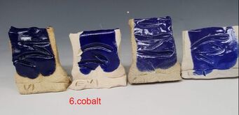
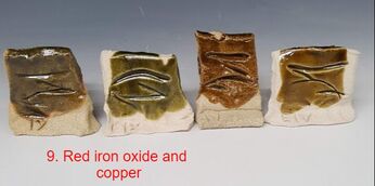
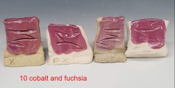
The UCLAN ceramics department transparent recipe for stoneware is very simple: Cornish stone 25 China clay 25 Whiting 25 Flint 25 Have stains, will test...... 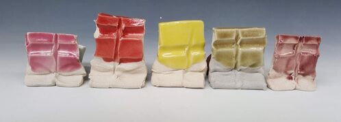 from L_R these have 6g fuchsia 5g intense red 5g yellow 5g tangerine 5g intense red and o.2 g cobalt these were all fired 1280 deg C in reduction which will have affected the colours, so I am redoing the glaze tests in oxidation too. Claycrafts magazine has been publishing articles by Linda Bloomfield with glaze recipes, so I have tried a couple of these too. Both are fired in oxidation . The left hand pair are 'David Leach Satin Matt Purple' but I suspect I made it up incorrectly. 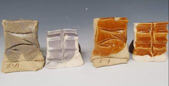 the right hand pair are from a recipe by Jeannine Vrins called tangerine, and should be fired cone 6-8. The instructions say that for pink, you omit iron and that if the zinc is <10% the recipe will make brown. I like this toffee colour but will try the recipe with a little more zinc (11 or 12, not 10%) to see if this is more tangerine. ( PS it was not) 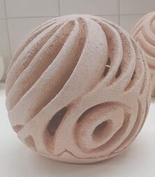 I have tried out a lantern shape, basically a squashed sphere to hold a tealight. It is designed with a small hole in the top for a metal hanging chain and loop so that it can be lifted easily off the separate base. The base has a location lug.
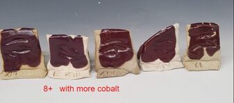
The lantern is made in craft crank and in retrospect I realise that I should have coated the inside in white slip to make it brighter. Now I have the glaze challenge.... I will try this concept in different shapes, in ES40, and a variety of glazes. I will also adapt for solar lighting. I was not completely happy with the Greg Daly glaze as a base for the range of oxides. Perhaps I was asking too much; it was after all designed for iron. I asked an expert, and Dave suggested an altered recipe (now known to me as 'Daves Base Glaze' which I have tried out with various oxides and some stain added on both ES40 and Craft Crank in oxidation (1260) and reduction (1280 degrees C). Here are the results:
 some of these with both oxide and stain are a bit spotty. I have learnt three things: 1. some stains act as an 'antiflux' (probably not the correct term!) and 2. I should sieve after the stains /oxides are added. 3. I have not found all the colours I want yet More tests! I want bright glazes for these garden pieces and so have been trawling the books....
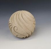
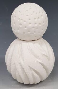
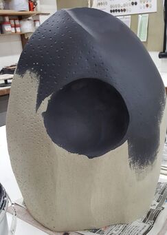
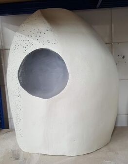
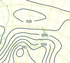
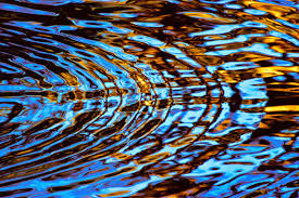
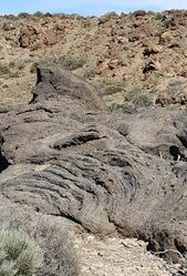
I have already tried one base glaze from Greg Daly's book, with different oxides and stains. Some of these crazed on the ES40 and Ashraf Hanna clays, so Dave suggested a different recipe with Potash Feldspar replacing the nephthelene syenite and frit, but with more kaolin. I have tried this too. Then I went on to a transparent stoneware glaze recipe with added stains only for yellow, orange and red. Looking back at some earlier issues of ClayCraft magazine, to articles by Linda Bloomfield, I read them with the new eyes of interest in glazes. I have culled recipes for satin matt purple (David Leach) and Tangerine (Jeannine Vrins). The test tiles have joined their cousins on the shelf and in the kiln waiting for firing. Not long now!  Semester 2 on the UCLAN course has involved a series of weekly practitioner lectures from designers. Naturally the most engaging one for me was from Halima Cassell who also came back to the department afterwards to answer further questions and do a mini book signing. Many of the other talks were really interesting and potentially applicable to all of us, whether studying ceramics, textiles or illustration; some were seriously dull. We have to write up learning from these lectures together with our findings from four external practitioners relevant to our chosen field. I have been to see Dee Stewart (a garden designer), Gordon Cooke and Karin Hessenberg (ceramicists) and Patrick Mills (Garden Centre Proprietor). Many thanks to all these lovely people who so generously gave their time and advice. I have also had more useful discussions with Dave (Professor Binns, course tutor) and fellow students. I have decided to leave behind the ideas of growth / bursting seeds for outside work as the surfaces would be too vulnerable to damage and the concept less easy to adapt to a range of garden ceramics than the carved pieces. So now, the new plan. A series of spheres and other curved shapes symmetrical in at least two dimensions, made in moulds, for lanterns, totems and water features. Most will be carved with deep repetitive curved grooves. The patterns will recall weather maps, water eddies, Polynesian facial tattoos, lava flows (as seen in Tenerife) and doodling. ....
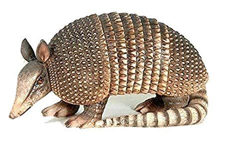
 They will be slightly undercut, like the SECC in Glasgow. The building is known as the armadillo, for obvious reasons.
This one is carved and biscuit fired but not glazed. For contrast, in some of the pieces will have impressed texture in low relief. I will also try some forms with hands either holding the pieces or cupping the water flow. These ideas have had a mixed reception, as have the early attempts, so I need to do quite a bit of development on this. I am still working on developing a series of suitable glazes and am waiting for the glaze test results.
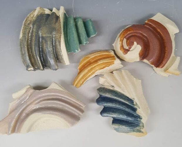
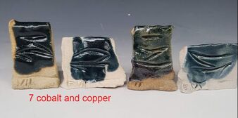
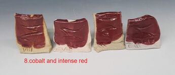
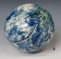
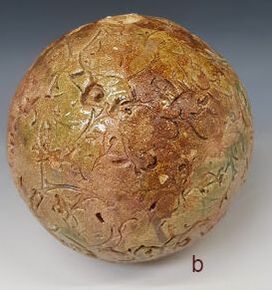
I have also used the early spheres as 'tests': a) is made from ES40 and carved, the glaze coloured with cobalt and copper. b) is craft crank and impressed with a printing block. I have used number of different test glazes; those shown here are mainly copper and iron
these have been sponged on and fired to 1260 in the electric kiln (oxidation). the results are pretty patchy, partly because of the difficulty getting good cover into the texture with sponging.
Next time, while I am in the process of trying things out I will experiment with brushing. This method has always served me well with commercial glazes containing a thickener, but may not work so well without. |
AuthorI am indulging my passion for ceramics by undertaking studies for an MA at UCLAN Archives
August 2021
|

 RSS Feed
