|
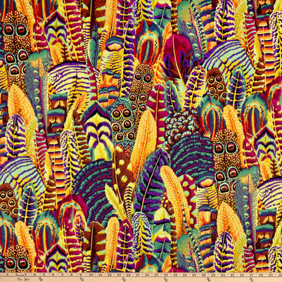
Along with my Christmas gift shopping from a charity website, I also indulged in this book by Paula Pryke for myself. As its shorter and full of pictures it was the second of my recent purchases that I turned to after the Tile Book (which has more pictures and less text! ) This one provoked quite a bit more research. Living Colour is about flower arranging, with a particular emphasis on colour and colour themes. The author is a florist/floral designer with a practice that encompasses small domestic commissions to hotel contracts, so she does not stint on flower costs or appear to compromise on the exact flower variety or colour required. 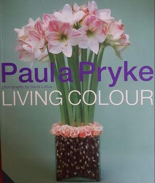 The book is full of inspiring examples which she describes in the kind of detail that might enable a keen student to try out the design at home. Before going into those practicalities, she has a section on colour theory and the impact of colour in nature, on mood and the use of colour in social settings. When talking about the colour wheel she points out that when working with nature its a bit more complicated than paint as very often the background, flower foliage (or garden ) provides a colour, usually green, and tone, against which the other elements are set. Some of her designs reduce the effect of this by being almost all flower, enhanced by the container, but she acknowledges that in traditional arrangements green foliage will provide the background and its structure, shape and tone will dictate the display. My interest is in coloured ceramic in the garden. Some gardens are almost devoid of green and might best be described as 'yards'. Sculpture Gardens may have plenty of green but are usually short of the other flower and foliage colours that we might hope to see in a garden for most of the year. Nature seems to usually get it right - so inspired by natures blooms I did a bit more reading on the 'net'. I was already aware that colour can have an effect on depth perception, with 'warm' colours such as orange appearing to advance towards one and 'cool' ones seeming to be further away. The effect of colour on mood is well recognised and is not confined to humans; bulls are aroused and attracted by red. People with mental illness can find the colour red very disturbing. Nearly 40 years ago I accompanied a psychogeriatrician to a patients house. As my role was to sit quietly and observe, with no medical 'hands on', I took the opportunity to wear my new suit. The lady was admitted to hospital and some weeks afterwards told me that she had suffered nightmares for weeks about that bright red suit. I never wore that suit again for work! These psychological effects of colour are now utilised in hospital design and dementia care, but are not new. Our association of colour with low mood (black and blue) or anger- 'seeing red' - has found its way into our language. This was before we had a full range of words to describe colours. For instance in mediaeval times 'red' was used to also describe orange, hence now having 'robin red breast' and 'red deer' when to a modern eye they are clearly not! Newton wrote on colour; not simply demonstrating the splitting of white light into its components colours using a prism, but also associating colours with musical notes. With Schiller, the poet Johann Wolfgang Goethe published in 1789 a colour wheel with the 'Rose of Temperaments' using colour to illustrate human occupations and character traits. He elaborated on this in his 1810 'Theory of Colours' describing the emotional and psychological impact of each colour in detail. 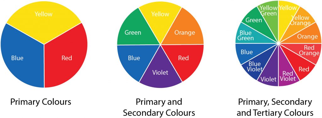 Colour wheels and more When I was at school, I learnt about the colour wheel. I was a bit surprised to find out there are different ones! I was at school long before the digital age and we focused on paint. I now learn that there are many colour wheels, and three main systems for classifying colour. The painters primary colours , red yellow and blue, from which all other colours we were told could be made, are termed subractive colours, and that in theory these colours should not work as the primary colours. They do so because colour depends on three main components of lightness, saturation and hue, and that coloured pigments have sloped absorbtion curves with pigments appearing different according to the degree of saturation. For instance a pigment may appear red in high concentrations but magenta at low ones. If this scheme is used in digital /ink context these colours are magenta yellow and cyan. The centre of the wheel is shown is usually shown as black. The next model springs from colour as wavelength : additive colours of red green and blue more appropriate mixing lights not pigments. The secondary colours in this model are magenta yellow and cyan. The centre of the colour wheel is white not black. The third system is the opponent process model, upon which is based the Natural Colour System. It is is also scientifically derived and the most useful of the three in constructing a colour scheme and for standardising colour in order to always recognise it - for instance in emergency exit signs. This is the model I knew least about. It was developed in Sweden just over 40 years ago The natural colour system is again based on a wheel but recognises 6 'elementary' colours: black and white, red and green, yellow and blue. 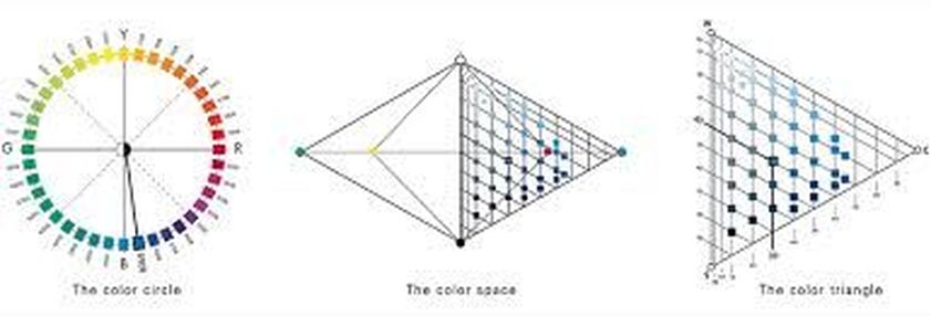 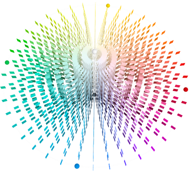 Colours are described with precise numbers to identify the hue (as on the colour wheel) but also the 'nuance' -blackness and chromaticness on the triangular chart (one triangle for each hue on the circle). This produces a 3 dimensional model as shown and a number for each colour which can be recognised accross borders, industries and disciplines. The website gives more detail, and includes a tutorial on how to use the system  The Eye If this picture was expanded it would show over 16 million pixels, each with its own notation on the natural colour system. This is much more than the human eye which is said to be able to distinguish 10 million. The system aims to be 'natural' as seen and perceived -but when we look at light as picked up by the human eye its not quite as simple! As a reminder, the eye's retinal surface has two types of specialised light sensitive cells. Rods which have maximum sensitivity at a wavelenth around 500 nanometers, pick up the presence of light especially at low levels and contribute to greyscale colouring but have no role in distinguishing colour hue. Cones, which are concentrated at the fovea in the centre of the macula, detect light at wavelengths between 400 to 700 nanometers. At low light levels the colours we perceive best are also different; at dusk violet flowers seem to leap out whereas red, with the longest wavelength can be difficult to see. There are three types of cones with short medium and long wavelength peak sensitivities, but these peaks don't correspond directly to the blue green red model . The cones described as 'red', with the longest wavelengths, in fact have their peak sensitivity in the yellow/ green range. The visual system is not relying on a single cone; it takes information from a huge number and combines them to give us our colour perception. The anterior structures in the eye (cornea and lens) also play a part. I observed that when I started to wear glasses in order to see near objects my colour vision for distant ones was much clearer. Later, through a different mechanism, developing cataracts (opacities in the lens of the eye) resulted in everything having the the appearance of a brown wash. My vision was very interesting during the interval between my first cataract operation and that in the second eye a year later. The vision from one eye was all soft beige and the other gave me almost unpleasantly white and colourful images.
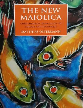
Using Colour Combinations The New Maiolica was first published in 1999, with the aim of being 'a workshop in print' for those interested in tin/zircon glazed earthenware. The first 100 pages are just that, with detailed advice on a whole range of decorative techniques, and is then followed by a discussion of the work of diverse 'contemporary' practitioners. In general this type of glaze decoration is known for a bold use of colour. The author devotes a whole chapter to colour; its emotional effect on us; our individual perception and colour theory. Of particular interest to me , he goes on to discuss the development of a colour palette and details how to obtain a range of glaze colours using ceramic stains. His basic stains, mixed with frit, are
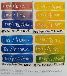 He also uses some oxides (cobalt copper and rutile) for some colours in his final palette of 14 hues. The use of turquoise and rose red were a surprise to me, schooled as I was in the primary 'painters' subtractive colour wheel, but now makes more sense and certainly his colour combinations are beautiful. His example (left) is also a good illustration of how colours change in character according to pigment saturation. 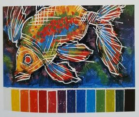 The image on the right is made from all the colours in his final colour palette. He says "....contrasting and complementary colours are at work here. To give further impact to the image, the fish was painted in predominantly warm colours, while the background recedes in cool tones." Ostermann states " colours are perceived by contrast and comparison and work through interaction with one an other" . He recommends a 1961 book, the Art of Colour by a Swiss painter, Johannes Itten, and includes a quote: 'Colour is life , for a world without colours appears to us dead. Colours are primordial ideas, children of the aboriginal colourless light and its counterpart, colourless darkness. As flame begets light, so light engenders colours. Colours are the children of light and light is their mother. Light, that first phenomenon of the world, reveals to us the spirit and living soul of the world through colours' Itten is likely to have been influenced but an earlier, but less poetic, colour theorist, Chevreul. Michel Eugène Chevreul (1786 –1889) was a chemist by training. He became the Director the Gobelin Tapestry works in 1824. He had been recruited because of dissatisfaction with the black dye used in designs which appeared a reddish tinge. He became interested in colour and formulated Chevreul's Law of Simultaneous Contrast, which states that: 'a colour will tend to appear to shift towards the complementary colour of its neighbour, both in terms of hue and darkness' Thus yellow on blue will appear orangey and black appears reddish if surrounded by deep blue/purple. The black dye was fine. Its surroundings were wrong. Chevreul published a book length discussion of his findings on colour in 1839. One of his statements is: 'It is almost always so, that that accurate yet exagerated colouring is found more pleasing than absolute fidelity to the scene' It is thought his ideas had a big influence on the pointelist painters Georges-Pierre Seurat (1859 –1891) and fellow Frenchman Paul Signac (1863-1935), and also on Van Gogh (1853 –1890), in his use of colour. Chevreul, M.E.,(1839) De la Loi du Contraste Simultané des Couleurs, Chez Pitois-Levrault, Paris, Avant-Propos,
Itten, J, (1961)The Art of Color, New York, The Natural Colour System. https://www.ncscolour.co.uk Ostermann, (1999) . The New Maiolica. A&C Black London. Pryke, P. (2001) Living Colour. Aurum Press London
0 Comments
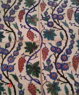
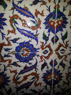
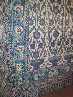
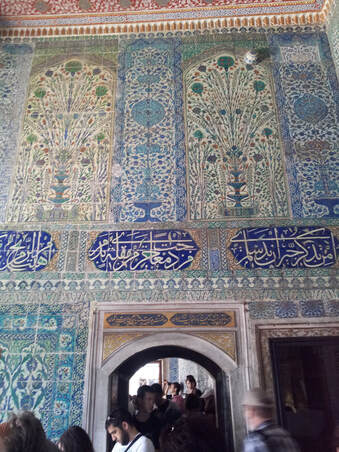
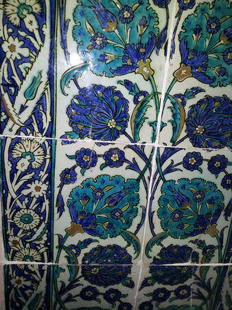
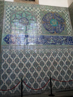
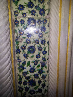
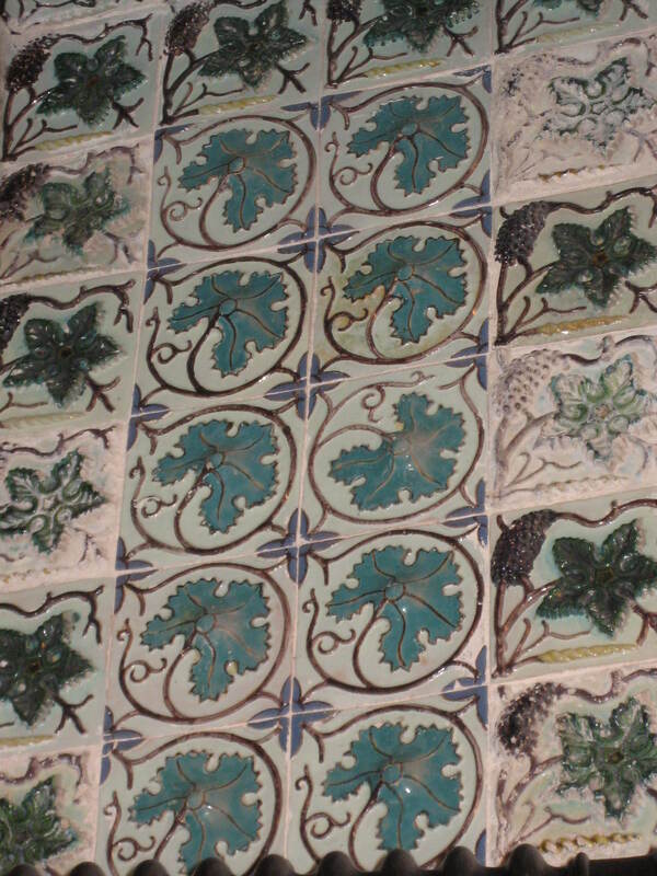
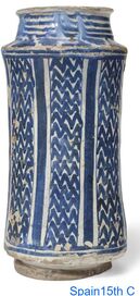
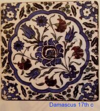
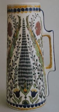
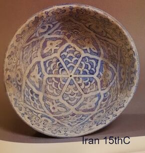
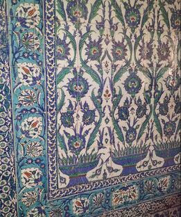
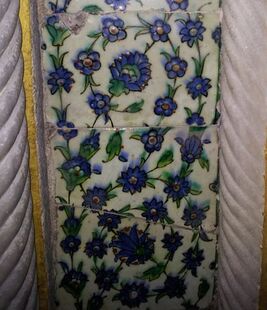
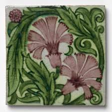
The recurrent and ongoing lockdowns have been an oportunity for a little online shopping and more reading at home. Earlier in the year I had aquired a (1986 not 1856!) copy of 'the Grammar of Ornament' by Owen Jones. This is very much a resourse rather than a reading book, but assuming that Jones was being rigorous about his research it provides a useful reminder of characteristic styles. There is a seperate book, the Grammar of Chinese Ornament. For a good while now I have interested in tiles and other decorative architectural features. Because of their small size and potential for repetition, tiles provide an oportunity to explore pattern as showcased in Jones's book. 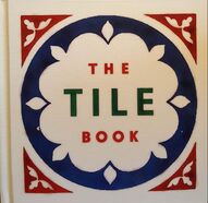 While browsing offers at the V&A I noticed 'The Tile Book' published by Thames and Hudson and the V&A in 2019. Its a treasure trove! A mine of information it helped me to put some of my tourist snaps (see earlier blogs) and other reading into context. One disappointment was the dearth of information about more recent tiles in this 2019 book. There are only two examples after the 1980's, probably reflecting the book's origins in the Victoria and Albert Museum which of course as a museum tends to focus on historical objects . A 2018 abstract landscape tile panel from Egyptian artist Diaa el-Din Daoud is featured, but other decorative architectural ceramicists such as Lancastrian Maggie Berkowitz (d.2019) or Yorkshire based American ceramicist Jim Robison do not. Both produced/ are producing work on tiles which further develop the medium. The was no mention of even 'high end' commercial tiles such as those produced by Craig Bragdy in Denbeighshire, though these, by using bespoke tile shapes dictated by the design, are different again. 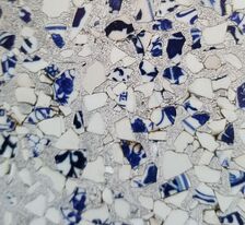 The other more recent example in 'The Tile Book' are the 2014 tiles from the Chinese company, Recycled China, established by two Americans, Thomas Schmidt and Stephen Miller. The pieces featured, made with blue and white fired fragments (detail shown) and with terracotta, were both made with recycled aluminium. Recycling and sustainability are the future! A local (Preston) company, Alusid, was established in 2015 following research by Prof Dave Binns and Dr Alisdair Bremner. They use not less than 98% recycled ceramic elements (no aluminium, which can be recycled again into other products) and are fired at a lower temperature than standard ceramic tiles. Some of their products look very similar to those of Recycled China. whilst others look like more conventional wall tiles. Talking of tiles in my holiday snaps, perhaps this is the opportunity to post some pictures? All of these are from a 2013 trip to Istanbul; from the Hareem of the Topkapi Palace (built from 1459 onwards) and the Blue Mosque built in the first few years of the 17th century. They were most likely made in Iznik, (originally called Nicea) about 110km South East of Istanbul
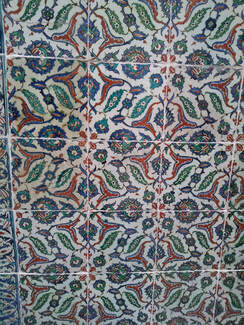
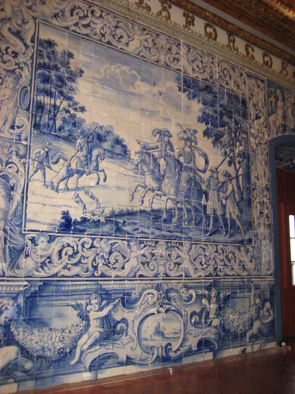
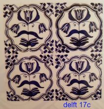
The following more recent tiles (late 17th C?) were photographed on an earlier trip to Lisbon. 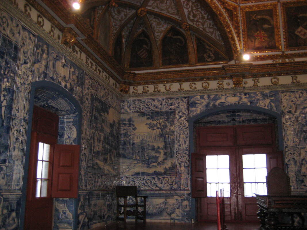
Tiles as status It good to see Rich Miller of Froyle Tiles as a judge on this latest series of 'The Pottery Throwdown', not merely appearing as the technician or as the hands doing that tricky business of deliberately collapsing a spinning pot. I am often very disparaging of 'flat' Fine Art especially when it is valued much more highly than ceramics, and I should not be. It should be judged on its merits. After all, tiles are - mostly - flat. Equally tiles seem to have acquired a lower status than other ceramics, when their range, artistry, skill and sheer beauty should again be judged on merit alone. Their very usefulness in providing a durable wipe clean decorative surface both in the home and in grander architectural schemes may have done them no favours. After all if a large number are needed to cover a surface each individual tile must be priced low enough to make them affordable. Of course in the days of mediaeval flooring and the Ottoman empire, wall and palace decoration tiles were status. Well what goes round comes round......
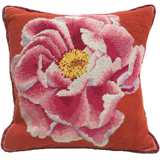
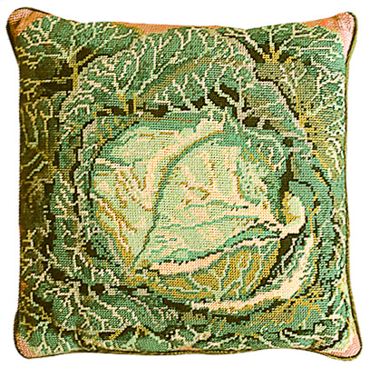
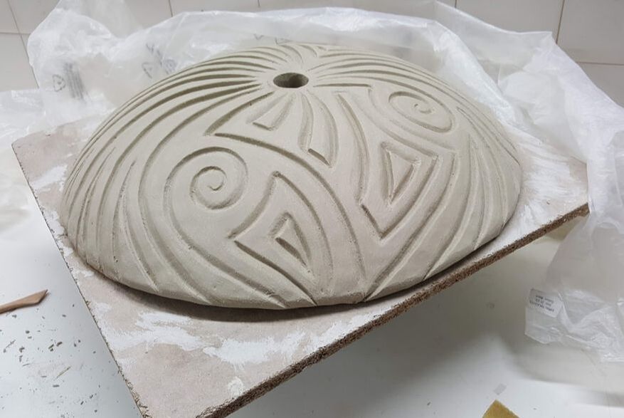
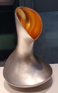
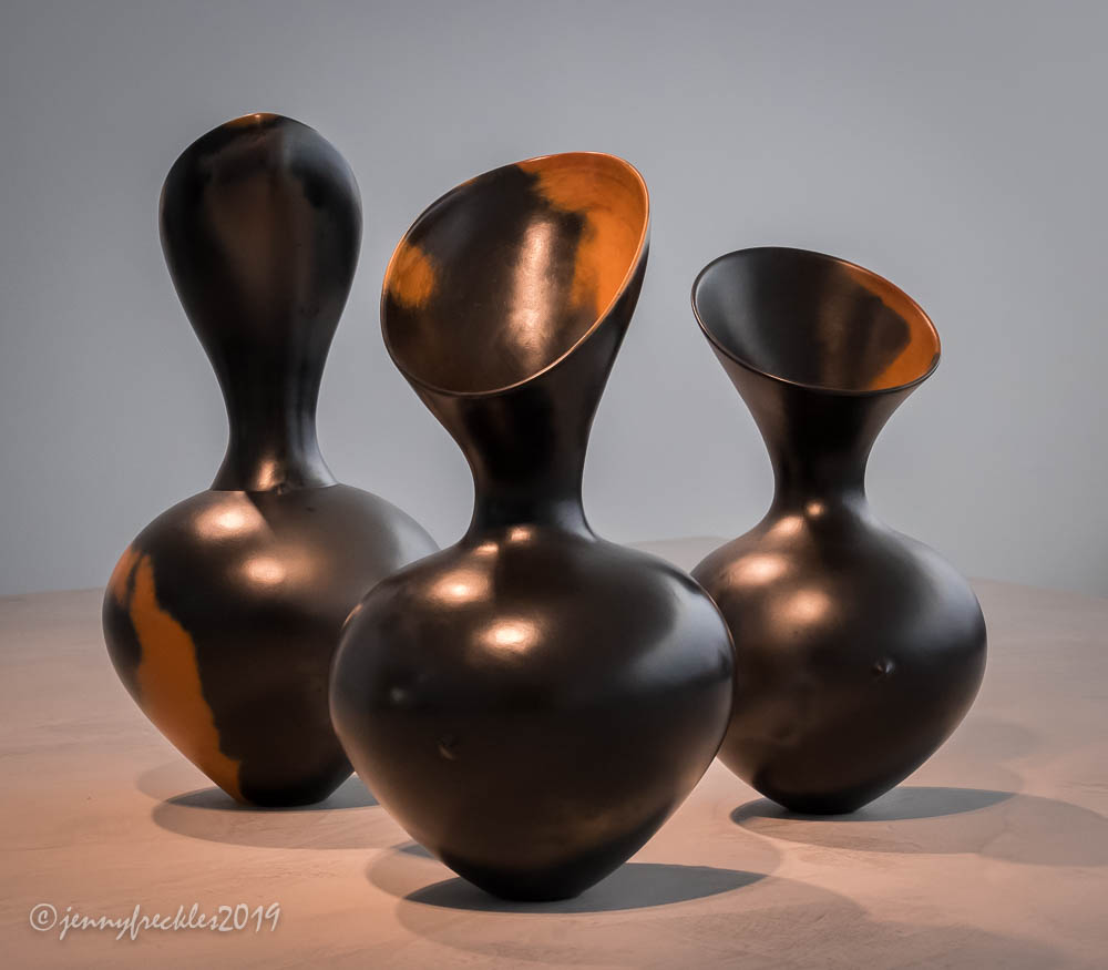
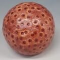
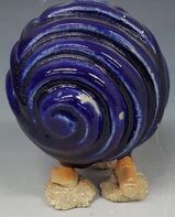
Victoria and Albert Museum. (2019) The Tile Book. Thames and Hudson. London The end of our course seems very close - delayed because of lockdown in March we are now due to have our final MA show in May, with set up at the end of April. By the time you take out Christmas and Easter that does not leave many studio days... In the meantime we are being asked to contribute to both a 'virtual ' show on line and a physical show on the mezzanine of the PR1 Gallery in January. Both of these, we are assured, will be to showcase 'work in progress' but need quite 'finished' things like artists statements. I suppose its all good practice! For the physical show on the mezzanine I intend to show the stages of making a small dotted sphere from mould to glazed piece. I have also made sure I have enough spare tools to leave with them. I visualised an expanded version of something like this: 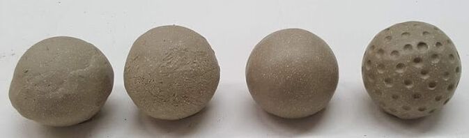 My 'Artists Statement' is quite short: Ann Capewell. Ceramics for the Garden I am inspired by curved forms, especially those which repeat and evolve; ‘armadillo’ architecture, potato fields, carved stone drapery and ripples in water. My tools waltz on the clay, reflecting garden elements: breezes, movement and growth; water and light. Soil and nurture are represented by the dotted forms where my stamp has hopped on the surface. Sound is created by water cascading down a piece or wind on ceramic. My range includes water features, totems, bird baths, lights and planters. I use handbuilding techniques and my own range of coloured glazes to create physically and visually strong pieces to enhance the garden and inspire the soul. The 'virtual' show is now finished and online, with Robs help. He took some nice pictures to supplement my rather amateur efforts. the link to my work is https://uclanspot.org.uk/author/aecapewell/ You can find us by searching for UclanTalent. The virtual show includes people in other disciplines who really have graduated and are looking for work. It is very interesting to see what my fellow ceramics students have published. We are all so different and our personalities and approach to ceramics really come through. It also makes it seem as if 'jobs done' but we all feel we are far from ready for that final show. Yesterday I was at college in Preston, but for an hour or so put the mud to one side and watched a lecture by Kaffe Fassett. It was broadcast as part of the 'Festival of Quilts' but was purely about colour. He talked about colour contrasts within a 'palette' and being more adventurous about combinations, giving lots of examples. Ceramics can too often be beige and shades of brown; subtle and beautiful but dull. With textiles, where there is less scope for exploring form and texture, practitioners seem to get more exited about colour. Is this a fashion phenomenon, people influenced by peers ? Is it because its easier to play with colour when what you see in making, is you get? Is it because of a greater predominance of women? Certainly I experienced my visit to the Knitting and Stitching show (Harrogate, 2018) as being an endless sweetie shop of pleasure and inspiration, immersed in colour to the point that it was almost too much to take in. Like eating a whole cake. Potfests don't have quite the same effect; instead they induce a more meditative mood whilst making my fingers itch. With any experience there is, somewhere, a perfect balance for that person. Satiety without indigestion. Colour and colour combinations excite and nurture me. Plain neutrals by themselves can be negative. I first encountered Kaffe Fassett's designs when I started making wool cross stitch cushion covers about 40 years ago. The ones I made had a blank canvass and colour charts, with numbered skeins provided. Sort of tapestry by numbers without guide lines. Kaffe Fassett kits were more expensive and more difficult. His best known one was the cabbage. Even on that one and the restrained peony below, the details are exquisite and the colours pop.
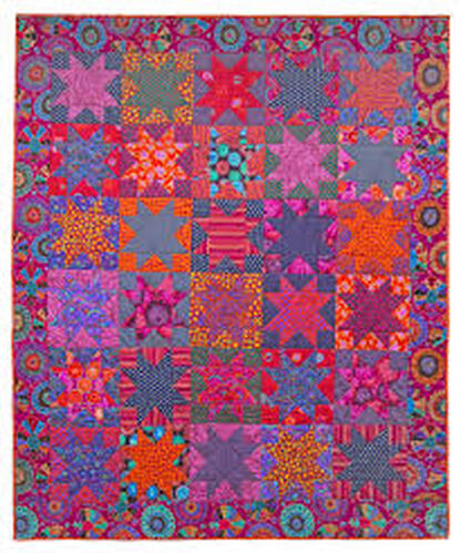
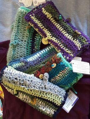
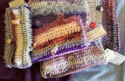
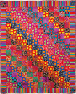 This quilt is an even more more vibrant example -and for me it has gone beyond rich to uncomfortable. Kaffe Fassett (b1937) must be one of the best known textile designers with a long and productive career. His bold use of colour and contrast, explained in the talk, has inspired so many. It has brought him commercial success too - endorsement of his ability to use colour to create a response in ordinary people. Over the last few years I have been learning more about colour combinations. I make 'twiddle muffs' for people with dementia who need to 'fiddle'. Its been a useful activity on the train to Preston! I use crochet and multiple yarns of different thickness and texture. As I make more I have found that the volume of colour is almost as important as the actual shade in creating a satisfying combination.
Back to ceramics!
Colour in glazes is a challenge, and I don't really want to expand my range, but I am tempted. I will try more and different combinations on the dotted pieces but using the same glaze range. I have been keen to make some more plaster moulds, both to improve on what I have and to have a wider range of shapes available. A flatter elipse could look good though I would be concerned about strength so would need to insert struts inside. One of my larger 2 part spherical moulds is not spherical; it was made around a childs' ball, over several days. As the 1st half plaster dried it contracted, squeezing the ball so the second half plaster was around a larger form. OK but not good. In addition my carved shapes generate a lot of clay to be recycled so I needed a plaster batt too. So far, so straight forward, except that all the plaster in the department had been purchased before lockdown. Potters plaster comes with best before dates as it has a short shelf life. It absorbs atmospheric water and 'goes off'. All of the available plaster was almost a year past date. I tried making up a small test quantity and it seemed fine - smooth, no lumps, setting at a manageable speed.
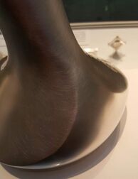
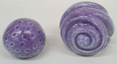
I decided to make a batt. I got advice from Rob. I found the boards, put them on a base, plugged all the gaps, soaped the boards and measured out 10 litres of cold water . So far, so straightforward. Ten litres is a lot of plaster and takes a while to add then stir. As with clay, it seems that when you double the size you quadruple the difficulty. The small 'test' was not a realistic indication. Instead of a smooth plaster box I ended up with an interesting mountain range. I made more and thinner plaster to smooth it out but still needed to carve it flat. Never mind, I have a smooth and usable side for wedging when it eventually dries. I have ordered more plaster to make new moulds. While my carved pieces evoke the movement of wind and water in the garden. The dotted, impressed ones represent the soil and all its varied organic and trace element constituents. They also recall the celestial orbs - our sun, planets and moon that have such an influence on earthly garden plots. Both the carved and dotted forms are burnished after the joins have been strengthened and the shape refined. Impressing the dots does not result in widespread micro holes and so far the glaze had not crawled on these except when too thick or I tried dipping not brushing. 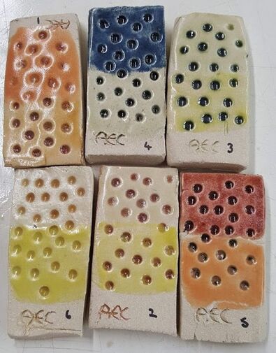 I had tried combinations of my glaze samples on dotted test tiles with the first layer wiped off, but not these combinations on the 'real thing'. Time to try on a few small cane toppers. Although I have designed the glazes not to run and these have flattened bottoms from which I will wipe the glaze, there is still a concern they will stick to the kiln shelf. I want good colour coverage and no obvious white base when they are elevated on a stick. I needed to test these on the dotted cane toppers, so made up some more glaze and applied. I used different thicknesses and layers of glaze, marked each piece, made careful records and waited for the fired results. 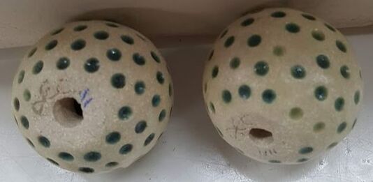 Slight hitch. I used blue underglaze crayon to mark them on the base where the hole was too small to do it inside the hole. I thought this was a really good idea, until I saw them after cone 6 firing and THE MARKS HAD DISAPPEARED!
these two retained a hint of the mark which has been touched up; the rest I have had to work on a guess. This is no good where there are so many little similar pieces. The glaze crayon worked fine where I had been able to mark inside the hole, but for these I will need to move on to using manganese in suspension. I have quite a few carved pieces that have micro surface holes but which are otherwise good shapes with parallel tops /bases and threading holes which are sufficiently large to accommodate my chosen pipes. They are far too good to waste and I only need so many 'tests' so how do I rescue them? Slip, officially not allowed on bisqued ware but described on previous blog, or engobe? Lets start with the engobe. Well, when re bisqued it's cream not white, which is a disappointment, but it may fire white at full stoneware temperatures. It was more difficult to apply than the slip when I was aiming to fill all the micro holes, so I thinned it, then thinned again. When I thought I had filled the holes with the (admittedly thicker) engobe some reappeared on firing. The engobe also remained chalky and powdery, likely to be a problem with glazing, but if I fire above 1200 C will it hold the glaze?  PS I fired to 1080 C in case that was enough. The surface was no longer chalky but it was crazed. Not looking promising.  This one had been taken straight to stoneware glaze temperatures. Engobe (as found in the UCLan department) has been tested and found wanting. Time to abandon it. What about decorating slip? I have tried it on a bisqued piece and refired. White, and no sign of flaking seen so far, maybe because of the flint content acting as a flux There were some remaining micro holes so I will try again with thinner slip. 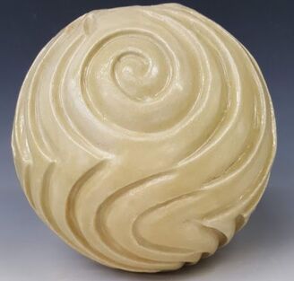 This is glaze UCLan 4/ 23; my final base glaze with yellow ochre added and fired to 1260 in oxidation. The piece had been slipped post bisque, refired then one thin layer of glaze then two thicker ones brushed on.
The piece has problems with cracks but the actual surface is much better so slip, on greenware of if necessary on bisque seems to be the solution' Even if some holes remain, putting a thin layer of glaze on first before two of standard thickness seems to be helpful. Rob and I reviewed some of the pieces I had glazed prior to lockdown. There were the ongoing problems of pinholing and crawling in addition to the glazes being patchy and not turning out quite the colours I expected from the tests. Perhaps not too bad from a distance... 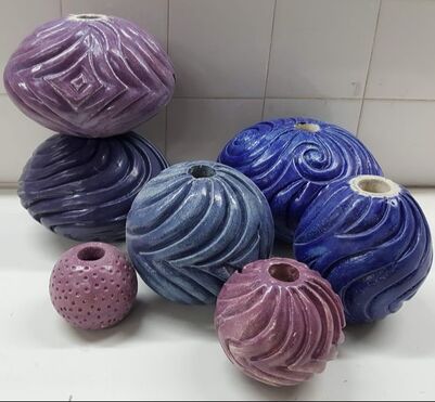 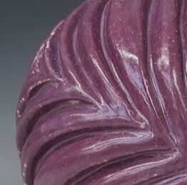 But close up - no! Rob suggested some of the problems might stem from dust or oil from hands, and that I should give them a wash and brush up before glazing. I will also retest the bigger batches of glaze after I make them. For some colours, for instance the pale purple / lavender above very small differences in cobalt composition and thickness make a difference to colour. Position in the kiln may do too; I will have to make more notes. 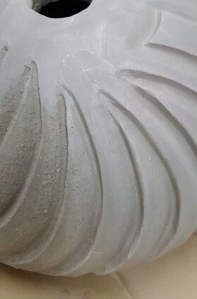 We also discussed a different surface treatment: applying white decorating slip to the freshly carved pieces rather than sponging down, in order to fill the micro holes created by movement of grog. It certainly creates a smoother surface. Even with quite this slip, seived through a 100 lawn mesh, the slip is difficult to get into all the holes, needing a little firm rebrushing. I have put on 2 layers and hope that when fired it is sufficiently smooth and even. I will have to check whether the holes have reappeared. This picture shows the difference made (from right to left) by one layer of slip applied with a firmish brush. The white decorating slip recipe I've used is 50 ball clay 50 china clay 10 flint which will create a whiter surface on the ES40, making the glaze colours brighter. I also emailed Valentines Clay regarding a slip recipe for this clay; Alan replied suggesting 75% ball clay 25% china clay I will try this if the 'fit' is poor on my pieces For those pieces already bisque fired Rob had advised that I should apply white engobe then refire. The results are on the next blog!
 The Covid 19 pandemic is not over but after 6 months we are now back at UCLAN with new rules and precautions
-it feels so good! During our lockdown /course interruption /exile from our ceramics MA home I did some smaller pieces in ES40 clay and bisque fired them. I was able to develop some new ways of working and a new surface pattern trying to avoid the 'golf ball' look. There were failures too; shapes that 'blew' or cracked; times when life at home was too much of a distraction and I left pieces too long to get too dry. What did I learn or do differently?
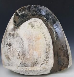
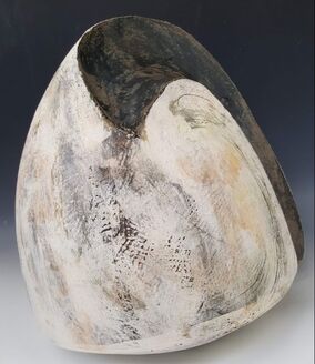
There were other changes in UCLAN during lockdown. Professor David Binns has retired (you can see his smile on an Instagram post!) and our lovely full time technition, Geoff, has taken redundancy. This leaves Rob Parr (3 days a week ) with the technical support of a recently well qualified MA Graduate Cath Criscenti (one day per week) for effectively 3 years of MA students at once due to the covid interruptions. We will have to try and nurture and support them, as best we can, as the scarce and treasured resource they have become. In the meantime how can we provide a socially distanced 'thank you' to Dave and Geoff? The good and the bad and what does this mean for my MA? Its all happened very suddenly. Ceramic Art London and Earth and Fire have both been cancelled, and now the University is closed. When this was announced it was for a few weeks only but it now seems as if it could go on for months. Fortunately I had a lift home on Monday so have been able to bring my smaller moulds and the ES40 clay home together with some tools, and now I have to tidy the garage so I can work there. We have been set up on Microsoft Teams so we can have remote seminars an tutorials. This mornings trial run was interesting. When we all got into the same meeting the visual and sound quality for me was very poor -and it seems I was not alone. Maybe everyone in the country is trying to do the same or maybe they are just watching films.... Well whats good? Everyone I know is well at present. I can do more gardening. Having a lift on Monday also enabled me to also bring home this piece I started at the Sculpture Lounge with James and Rebecca. It is 36 cm high by 38 wide and weighs 10.7 kg. I would have struggled on the train.
 I am pleased with this. Its one of the largest things I have made so far, from many many slabs (I forgot to count) and all the joints have held through first a bisque then a cone 6 glaze firing. The making process helped to teach me about large curved slabs, using layers of slip for depth of colour, and has definitely improved my slab joining skills. This piece also has scrafitto, and glaze applied with both brush and sponge. I have another piece from the Holmfirth course, waiting for glaze at UCLAN. When I am (eventually ) able to work on it again I could use more coloured glaze as I will not have the challenge of a visible base. I went to foodbank on Wednesday. The organisers and most of the previous regular volunteers are well over the 'please go home and pull up the drawbridge' age, so there was a concern about whether we could carry on. Fortunately there were new volunteers, all under the age of 70. Going to foodbank is great antidote to worrying about clay. What are the downsides of the Covid 19 changes? The biggest ones are not having access to the workshop at UCLAN and the people. I did not bring the biggest moulds home because I did not feel I could manage them here and I am certainly not set up to create the glazes. If we not allowed back for many months it will be difficult to complete. Working at home is difficult - lots of distractions! There may be another Covid related challenge - I could get sick myself, I could be called in to the hospital to work, or both. I hope they identify more suitable people! Life is now a lot less predictable. We shall have to take it step by step.  When in Manchester for the Halima Cassell Exhibition I went to the shop and bought ‘Art as Therapy’. I suppose it’s a typical Gallery book, and I bought it for what I suspect are typical Gallery reasons – to improve my knowledge of the ‘art world’ and because of the rave reviews on the cover and the recommendation of the girl on the till. The authors, Alain de Botton and John Armstrong (2013) discuss the function of ‘Art’. Their main examples are two dimensional artwork seen in a gallery or possibly purchased for the home, together with some architecture, sculpture, ceramics and furniture. They suggest that art has 7 main functions, some of which I had not considered before:
Ultimately their aim in this book is to help their readers (and society in general) live richer more fulfilled and happier lives in “a world where works of art have become a little less necessary”(p228). Can art really do this? What do I think? The role for art, in increasing our appreciation of the world around us and looking afresh, is the one I had encountered before. It will probably be most familiar to many people - perhaps along with beauty, marking social status and financial investment, aspects of which are covered only obliquely. The authors argue that art can go further than simply enabling us look “ with kinder and more alert eyes” (p55) to “recognise the worth of a modest moment” (p56) It invites us to notice what we have ignored and recalibrate what is important to us. The authors even claim(p56): "It lies in the power of art to honour the elusive value of ordinary life. It can teach us to be more just towards ourselves as we endeavour to make the best of our circumstances : a job we do not always love, the imperfections of middle age, our frustrated ambitions and our attempts to stay loyal to irritable but loved spouses. Art can do the opposite of glamourizing the unobtainable; it can reawaken us to the genuine merit of life as we are forced to lead it". Preserving or retrieving memory of a mood, experience or a person and providing a stimulus to reflection, is an important area. I think can be too easily confused with the idea of ‘providing a record’, now often done better in photography or video recording. There is of course controversy about whether photography is ‘art’. This was discussed (and left open) in Grayson Perry’s Reith lecture, recently re-broadcast. Sorrow, loss or grief, are often poorly articulated and accompanied by feelings of intense loneliness despite being universally experienced. De Botton and Armstrong suggest that art works can help us connect and feel that we are understood, sharing this with others. In ‘Growth’ they state (p44): "Engagement with art is useful because it presents us with powerful examples of the kind of alien material that provokes defensive boredom and fear and allows us time and privacy to learn to deal ….with it. …Its when we find a point of connection with the foreign that we are able to grow…..Maturity is the possession of coping skills: we can take in our stride the things that previously knocked us off our course(p52)" Museum curators are criticised for assuming people are already interested and simply need to have a few details explained to them, rather than helping make connections with ‘difficult’ pieces.(p46) Self understanding relates to ‘looking afresh’. The authors say (p39) “From time to time we encounter works of art that seem to catch on to something we have felt but never completely recognised clearly before”, “art objects…are the media we come to know ourselves” and that “art builds up self knowledge and is an excellent way of communicating the resulting fruit to other people”(p40). We say who we are by the kind of things we have. This is “more than just a desire for our guests to think we have good taste and enough money to do something about it”(p43). But is it??? ‘Rebalancing’ is a role explored in depth and is central to the book’s argument. The authors say that everyone has different psychological needs and that “we hunger for artworks that will compensate for our inner fragilities and help us return to a viable mean” (p32). Moreover(p38) “Art can save us time -and our lives – through opportune and visceral reminders of balance and goodness that we should never presume we know enough about already”. If this is about morality, the authors agree. They suggest (p34) that “ a lot of the best art….has been concerned with an explicitly moralistic mission….we can derive enormous benefit from works of art that encourage us to be the best versions of ourselves”. I found the section on hope the most interesting. It relates to a following section which considers what is ‘good’ art. De Botton and Armstrong discuss the argument that ‘pretty’ (and popular) pictures may encourage sentimentality, superficiality and lack of engagement with ‘real’ life and its problems. Art which is “cheerful pleasant and pretty…can be deeply troubling to people of taste and intelligence” (p12) and “leave us insufficiently critical and alert to the injustices surrounding us”(p13). ‘Idealized’ can be a term of abuse. They add “It is hardly surprising then if being ‘realistic’- the antidote to idealization – is judged a cornerstone of maturity”(p20). In contrast they suggest that when considering such ‘cheerful’ art: "these worries are generally misplaced. Far from taking a too rosy and sentimental view, most of the time we suffer from excessive gloom….optimism is important …..because many outcomes are determined by how much of it we bring to the task. This flies in the face of the elite view that talent is the primary requirement for a good life, but in many cases the difference between success and failure is determined by nothing more than our sense of what is possible and the energy we can muster to convince others of our due. We might be doomed… by an absence of hope…it is because the troubles of the world are so continually brought to our attention that we need tools that can preserve our hopeful dispositions.(p13)…Strategic examination of what is good can perform the critical function of distilling and concentrating the hope we need to chart a path through the difficulties of life." These arguments are on the same theme as the section on ‘rebalancing’. For a person who through constitution or circumstance takes a gloomy view of life or is oppressed by difficulties, then viewing art objects which are uplifting helps to counterbalance that negativity. The authors do not carry this argument to its conclusion. They should tell the critics of those who choose ‘pretty’ images to back off. The authors argue that art can help with mental well being and that this in turn affects physical health. In comparison to other factors, art must surely have a marginal role in health if basic needs are not met. The Health Foundation Creating Healthy Lives report of 2019 says: "This report argues for both investment in people’s health over the longer term and new mechanisms to embed a whole-government approach to creating good health. Action needs to be taken across the factors that have the strongest influence on people’s health, such as transport, education, social security, childrens’ services, housing and work." Perhaps if de Botton and Armstrong are serious about using art to influence population health they should place images on the buses or in the London underground. 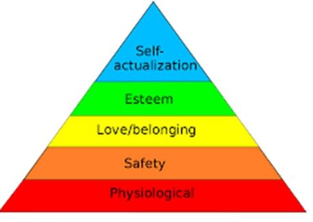 They may also be aware of Maslows hierarchy of needs. This generally accepted concept highlights the importance of the basic physiological needs for food, water and health. By contrast, art fits at the top in self actualization, or as this book argues, potentially contributing to love/belonging.
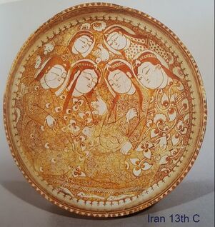
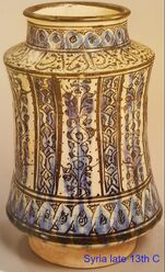
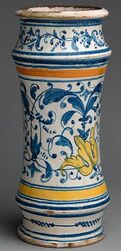
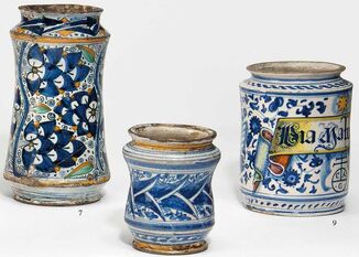
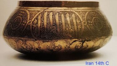
The British Museum exhibition I visited in January was called ‘Inspired by the East, how the Islamic world influenced western art’ so I made a special effort to attend. What I found was a focus on 'fine art' and Orientalist painting. It touched only briefly on other media or on how Islamic art could have influenced European art and design. The exhibition shop offered a catalogue entitled 'Beyond Orientalism How the West was won over by Islamic Art’ which I thought would provide more background. The cover image is of a ceramic tile, so I was hopeful. I read it in conjunction with two other much shorter and specialized books that I already had: Iznik Pottery by John Carswell (published by the British Museum in 1998) and Islamic Ceramics by James W Allan (Ashmolean Museum 1991). I have not been disappointed. 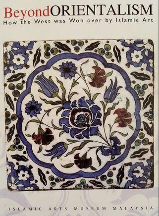 ‘Beyond Orientalism’ is published by the Islamic Arts Museum Malaysia (IAMM) and was written to accompany an exhibition of the same name in the IAMM in 2008. THIS was the exhibition I had wanted to see. The book covers a wide range of craft forms and geographical sources; is well written, and lavishly illustrated with pictures of the western pieces alongside the Islamic originals in metal, glass, textile, paper and ceramic it was thought had inspired them. The curators, editors and catalogue author make a great case for their argument that Islamic art and culture exerted huge influence in Europe and beyond over many thousands of years. It started early. King Offa of Mercia (he of Offa’s Dyke) who reigned from 757 to 797 AD had in his treasury at least one gold coin bearing his name together with Islamic script reading ‘There is no God but Allah. Muhammad is his messenger’. It is a copy of an Abbasid dinar dated 157AH (774 AD). Four hundred years later King Alphonso VIII of Castille (1158 to1214 AD) was still using Islamic style script on his coins, but whether by accident or design the calligraphy was unreadable. Not so the Bishop of Maguelone who was reprimanded by Pope Clement IV in 1266 for ‘having the title of Muhomet’ on his coinage. Venice, being a great trading state and close to the Arab lands, experienced strong Islamic influence both in female fashions and the crafts. In the 15th century a Milanese priest described Venetian women as ‘so completely covered up that I do not know how they can see to go along the streets’ and a 16th century nobleman called his city ‘the emporium of the whole world’. Vittore Carpaccio (1465 to 1520) included Islamic artefacts in his paintings suggesting that they were normal household goods; it is not clear whether the objects he depicted were the Islamic originals or the imitations Venice had started to produce. As well as copies the Venetians (and then other parts of Italy) created Islamic inspired wares that we now think of as typically Italian. Apothecary jars (Albarelli) were first made in Iran and Syria in the 13th century and sometimes decorated with lustre.
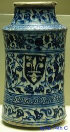
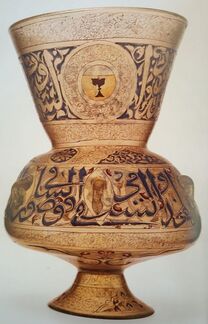
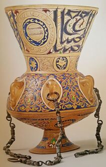
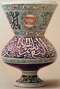
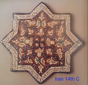
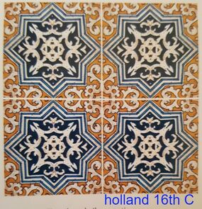
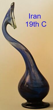
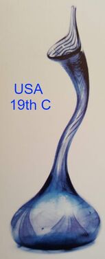
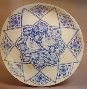
The classic 14thC mosque lamp (left) inspired 19th C European glass and ceramic versions, though the latter was probably intended as a vase. Similarly, Iranian Kashan star shaped lustre-ware tiles from the 13th and 14th centuries are echoed in the design of the 16th C Dutch delftware.
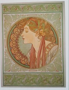
Islamic designs spread further. The Palace of Fontainbleau was restored in the 16th century, introducing what had become the Italian renaissance style to France, and with that many Islamic elements. By 1780, there was growing interest in the Islamic influence in Spain, further reinforced by Napoleon’s conquest of Egypt in 1798. Construction started on the Royal Pavilion in Brighton with its definite ‘Moorish’ architecture in 1897. ‘Tales from the Alhambra’ was published in 1829 further stimulating curiosity. Owen Jones (1809-74), Architect and Designer, visited the Alhambra in 1834 though it was not until 1842 that he published a book of his drawings, and in 1856, the ‘Grammar of Ornament’. William Morris and William De Morgan (R) were both greatly influenced by Islamic design, with the strong diagonals and ‘s’ shaped ‘saz’ leaves prominent on Iznik ceramics both being adopted into Art Nouveau style.
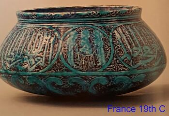
Subsequently Islamic designs in metalwork and ceramic were copied in Europe, notably by Theodore Deck, whose blue basin is so similar to the brass bowl from 14th C Iran that he was probably inspired by the original held in the Victoria and Albert Museum. In contrast to many, Deck took care that his inscriptions were correct.
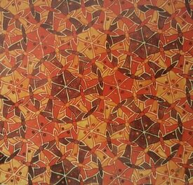
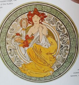
The author of the ‘Beyond Orientalism’ catalogue praises Morris and De Morgan who he says were influenced rather than simply copying designs; for sharing a love of nature and stylisation into 2D pattern. One of the other main characteristics of Islamic design is symmetry and complex repetition, echoed in the work of Escher(left), Matisse and even Charles Rennie Mackintosh (right)
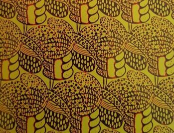
In this wonderful and extensive account from IAMM, I think there are artists and design styles that could have had a further mention. The book discusses briefly the advent of Art Nouveau, and that although the influence of Japan (opened up to foreigners in 1854) was very strong, the Islamic style is still there. This can be illustrated in the work of Tiffany
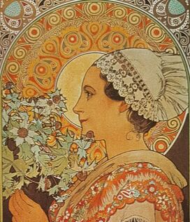
and of Mucha (who is not discussed). This Czech painter was also a classic Art Nouveau designer. On many of his biscuit tins and posters the female figure is set against a symmetrical rondel which could have been seen on an Iraqi 9th or 12th century bowl.
Similarly Vilmos Zsolnay in Hungary had been interested in the 1873 Vienna exhibition which had a strong Ottoman presence and in 1880 sent his son to the middle east to collect ceramics.
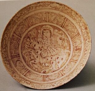
‘Beyond Orientalism’ makes passing mention of the influence other cultures may have had on Islamic styles. Although the Chinese are acknowledged as exporters of ceramic into the middle east, little is said beyond the adoption of blue and white colour schemes. 'Islamic Ceramics' from the Ashmolean Museum is less coy, showing evidence that Iranian potters at least adopted the Chinese shapes and may have copied designs. This second bowl from the early 18th C has a classic Chinese picture in the centre, within an Islamic surround..
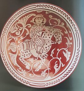
 There may have been other influences, and certainly the lustre bowl from 13th century looks very unislamic. This book and my further reading certainly taught me many things and to appreciate more. There were 3 main learning points:
Bibliography
de Guise, Lucien.Beyond Orientalism How the West was won over by Islamic Art . Islamic Arts Museum Malaysia. 2008 Carswell, John. Iznik Pottery. British Museum 1998 Allan, James W Islamic Ceramics Ashmolean Museum 1991 Huszar, Zoltan Zsolnay Ceramics. Art Publications of Jannus Pannnonius Museum. 1988. I wanted to refine some of the colours so did yet more glaze tests. the grey /brown is better -no tendency to run shown, not quite so glossy so fitting in better with the others. the yellow has both tin and oxide added and is better. Definitely one to keep. the orange stain has oxide added but I am still not keen. the next one is rutile and tin - too dull and muddy. the last one is simply yellow ochre (an iron oxide) added to the base glaze. Its nice, but because its so pale it shows the carving less. 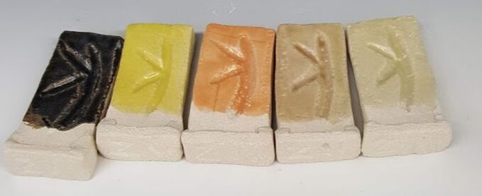 I have also tried some glaze combinations using the dotted pattern. 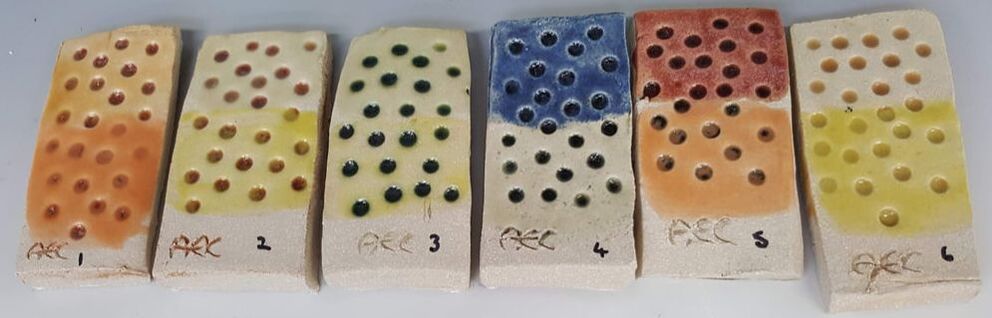 I have used red (tiles 1&2) green (3) grey (4&5) and toffee glazes as the base layer into the dots then wiped off. I then used two more on each tile in order to try the colour combinations. That pale yellow ochre has been used on several tiles; the top half of number 2 (over red) , 3 (over green ) 6 (over toffee) and the lower half of 4 (over grey). I think they all work well especially on 2&3 where the the base glaze colour has remained in the texture of the tile after wiping and gives the top glaze extra depth. I am now deciding on my final colour 'palette' bearing in mind which ones seem to work well together and are likely to work better in a garden setting. There is very little on the way of foliage around the university buildings at the moment so I am trying to get images from home to try the effect of my colour range. I want colours that will stand out from a distance and against a green background if it exists. They should be 'natural 'looking so as to echo flower colours. I have decided against the cobalt as its too harsh and fits in less well with the others. Although orange has worked well over an other glaze (tiles 1& 5 above) by itself it is too 'synthetic'. The tin and rutile glaze would be great if I wanted to imitate natural stone (and I don't with this project) and chrome/tin pink is too opaque. I will keep green in the range ( because its so nice ) and include toffee, yellow, turquoise/teal, yellow ochre (to go over other glazes on the dotted spheres), red, navy, lavender and the pale lime green. I may also use the grey/brown as a contrast if I make spacers, though the green could be a good alternative. The more colours I use the more choice -and too much choice is not always a good thing. Trying another base plate 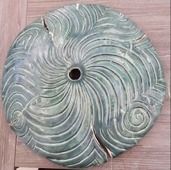 I am planning to have a base plate for both my totems and the water feature. For the latter its an essential part of the design in order to support the pieces above whilst protecting, and allowing access to, the pump below. My first attempt (L) was bisque fired on the former, and appeared to be OK. On glaze firing it had support only at the edges - disaster . I needed a different method of construction
For this one i have rolled out 12.5 kg of Ashraf Hanna clay in one piece using the slab roller and draped over the bisque mould, trying not to distort it, then cut round to remove the excess. The centre point was identified by measuring.
Once the clay had firmed up a little padding was placed round the periphery, another board on top then it was 'flipped' so I could work on the base. Using thick coils of clay I built a circular supporting tube. It looked like a giant inverted mushroom with a hollow stem. Once that was leveled to the height of the circumference the piece was flipped back (the men who helped made it look easy) so I could carve the top. This one has been finished using new process -wipe at leather hard, then smoothing using wooden modelling tools. The piece was then loosely covered in plastic and left to dry slowly. Once it is glaze fired ( with no cracks I hope) it can be filled in with concrete. That should make it really robust - and a challenge to move around! We have a class trip to the International Ceramics Centre at Kecskemet in Hungary for two weeks starting 27th March -Covid 19 permitting. Deposits paid, excitement building, ordering bubble wrap to protect work we are shipping out to fire... The centre has a wood firing and soda kiln as well as the standard gas and electric. None of us are very familiar with using these so we are taking stoneware bisque fired pots to glaze there and test out the Hungarian glazes and kilns before we make and fire more pieces there. Dave and Rob made some press moulds for table ware so we could all quickly produce some plates and bowls to take. 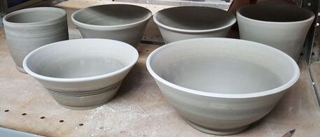 I have also thrown some bowls and planters, first time on the wheel for a year. I am reasonably pleased, but had originally intended to make a lidded serving bowl for my daughter and family. Maybe later. These are all extremely plain. I was thinking functional ware but also wanted to provide a blank canvas for glaze testing. Dave (informed by a lifetime of experience) then made a very grogged clay by mixing standard stoneware, a little terracotta (to warm the tone) and gritty feldspar for press moulding. He used it himself to throw a series of beakers but I understand his hands were bleeding afterwards. He explained this clay should react well with the glaze in the wood firing to produce great effects. Well maybe its good that I have done something plain for contrast!
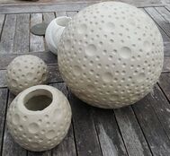
Dave also suggested I take some of 'reject' handbuilt forms. Well I have plenty in craft crank which might be interesting to fire as I have not yet fired them all at home. Only downside is that they weigh up to 2Kg each. What do I leave out of my luggage? The 'pinholing' in my glazes on the carved pieces is a concern. Pinholing is usually seen as glaze problem. Harry Fraser (in Ceramic Faults and Their Remedies 2nd edition 2005 published by A&C Black) details both ceramic body and glaze problems that cause pinholing. They range from poor clay preparation, contaminants on or in the body through to constituents in the glaze (including glaze thickener) glaze application and firing technique. Fortunately I do not have to consider every single one of these possibilities. These two pairs were made of the same clay, bisque fired to the same temperature and glazed at the same time with exactly the same glaze, brushed on with the same brush.
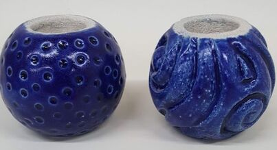
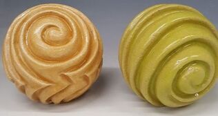
Pinholing does not appear to happen on the 'dotted' spheres, only the carved ones. The glaze seems a little thinner on the carved pieces but enough to cause the problem? During brush glaze application is was often had to get the glaze into the dots and this may have resulted in more layers going on each area. On the other hand I had to take care to get the glaze into all the carved channels which would have had a similar effect. The glaze seemed to leave small gaps on the carved forms . Was this due to the surface? The dotted ones have been burnished prior to impressing. The carved ones, by the action of dragging a tool across and through the surface, had linear scratch marks and holes where the grog had been lifted out. 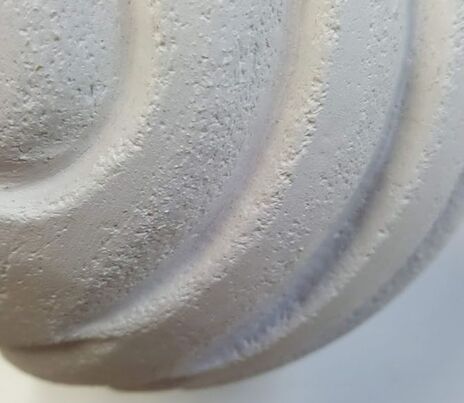 Reviewing earlier spheres, where I had 'smoothed' with a wet sponge (creating slip on the surface), there were no micro holes - but instead a more gritty surface as some of the slip had been removed leaving the grog standing proud. Glaze however mostly smoothed them over, even on craft crank as on this example. 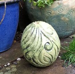 this piece did have a very thin layer of copper carbonate slip brushed over and re-bisqued prior to glazing with yellow. What are the possible remedies? Comments and concerns
I could 1.coat with slip and refire. adding slip at this stage can be a problem, though used successfully by Annie Peaker. 2.spray the piece or even dip it water to make it less absorbent prior to glazing. Tried this, did not work. 3.try burnishing the surface at leather hard. Time consuming and difficult to do all over 4.damp wipe at leather hard, taking care not to lift the grog. May not be enough unless really wet 5.wet wipe as before on dry greenware then slowly dry. Concerns expressed that doing this previously contributed to cracks 6.put a thicker layer of glaze on the carved forms. Does not appear to help the pinholing 7.trying a very thin base layer of glaze before main glazing hoping to fill the holes. This helps but does not eliminate the problem and may need a combination - perhaps 4 then 3 and 7. Testing is required. am I a glaze addict? or just never satisfied? Well, whatever, I did another 10 tests using the same base glaze ('UcA4') in order to refine some colours, and try some new. 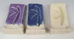 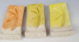 I am fairly happy with these and now have a good range from which to select my final 'palette' of glazes, though would like a slightly lighter grey and to explore refining the yellow /cream colours a little more, using more oxide less stain. 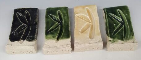 I also rechecked my UcA4 glaze on two small scale pieces each:   These glazes were all brushed on. They were fired in the same kiln at the same time, made from the same grogged ES40 clay.
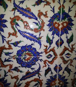
The difference is that the carved forms have been smoothed off using a green washing up scrubber, the dotted ones burnished with a rib then impressed with the end of a tool. I had noticed, when brushing the glaze on, that it was difficult both to get the glaze into the dotted holes and into the little microholes on the carved forms. I hoped that if I put more glaze on the little pinholes would 'heal over' in the firing so I went ahead and glazed more before going on holiday. As seen the carved ones are covered with multiple pinholes, not what I wanted. I will need to think about this. II have always liked the curvy patterns which predominate in Islamic art, so was keen to go to see the exhibition at the British Museum. i was a bit disappointed but it was my own fault - I had failed to realise that the show was not really about the influence of Islamic art on British culture; rather that it focused on how the Islamic world inspired Victorian 'Orientalism' and its influence on painting styles. As a side issue it also briefly considered interior decoration. I did come away with a better understanding of the context of William de Morgan's tiles and ceramics. They displayed some original Islamic ceramics 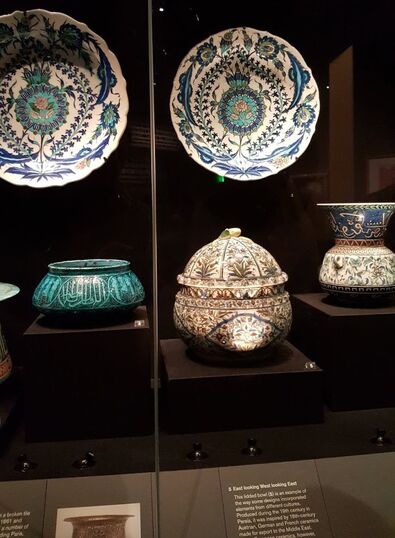 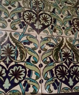 along side these de Morgan tiles. I like these and would love to be able to design them. However, along side the original tiles which probably inspired him, (still to be seen in Istanbul, Lisbon and other previously Islamic predominant areas), they seem a bit too controlled, too regular. Am I being hypercritical of William de Morgan's designs ? Here are two more of his 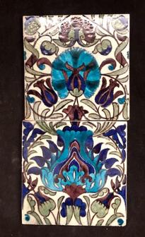 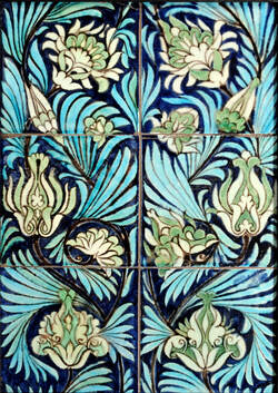 For comparison here are some pictures I took in Istanbul in 2013. They are less 'finished ' but a lot freer - and of course a lot older (400 yrs?), being originals in the Topkapi Palace.
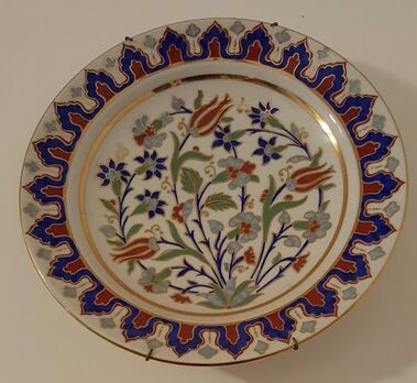
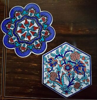
These below are contemporary pieces - a plate from Ismir given to us as a present and potstands bought in the Istanbul Souk. Again, I prefer these to the William de Morgan example perhaps because of the asymmetry.............
 In the permanent exhibition galleries...
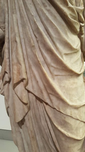
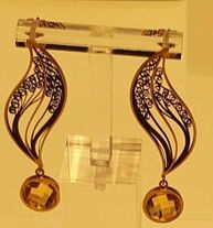
there were lots of examples of early Athenian and Roman art. I particularly liked the carving on this small Italian image of Isis, an Egyptian goddess associated with fertility and motherhood. It was made in about AD 120-150 in marble. Now I am trying to carve clay I have a new appreciation of the skill and artistry required! 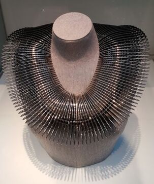 I go past the Goldsmiths Centre in Farringdon at least twice a year and usually pop in to see their latest exhibition. This time award winners in various categories were on show and their work was stunning. There were no prices on display; many of the pieces were 'master pieces' by apprentices and would not be for sale, so there were no distractions from a knowledge I could not afford to buy. From a personal point of view I am interested in jewelry. 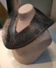 This item provided the poster image for the exhibition. It does not look too comfortable, and you would not dare to drop food when eating, but its a real show stopper. Part of its fascination is seeing the constituent pieces and their shadows from different angles. There are a few diamonds scattered down the front as well, but they are tastefully discrete - nothing more than a standard engagement ring size!
My favourites, however, were from the different discipline of silversmithing - beating and 'chasing' the precious metal. 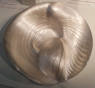 this Amesiella Dish by Jessica Jue won a ' Silver Award in Chasers - Junior'
 though the design of the other side of his 'Gin Carafe' was more distinctive. 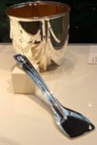 Finally, does this silver bucket and spade show where art departs from utility?
This years assessment was on 17th January, With Dave Binns and Rob Parr. We were asked to present progress since the last formal assessment in May. My developing thoughts had been set down in an updated learning agreement, a power point presentation (prepared primarily for my peers in class), sketches, and of course a display of representative samples of my work. It was also an opportunity to assemble and test my water feature.  I set up in a borrowed waste bin, propped up the base plate with bags of clay, supported my central copper pipe (encasing the water supply pipe) with more clay, added bisqued pieces to make up roughly the correct height and turned on the power! As you see, water is flowing over the surface and down the carved channels from the 8mm diameter plastic pipe which reaches to the top. The pump has been turned to 'minimal', so with greater power, and a cone shaped reservoir in the top piece, it should flow nicely down several sides. With greater power still it should drop from layer to layer, creating the sounds as well as visual effect. The flow and the visual effect should be enhanced when I have the coloured glaze on. This assessment was timed only a few weeks after I had developed a satisfactory glaze, so I had only a few coloured forms (some of them very experimental ) to put together to demonstrate a totem and cane toppers. Here they are anyway.  Our detailed discussion focused on spacers, a better design for the base plate, and how these pieces could be presented in the MA show. I made lots of notes. Why a better design for the base plate?  Well, a closer inspection than in the first photo above shows some pretty catastrophic cracks.
It needs some built in support on the back. I am also proposing to build the next one with rolled slabs, joined together using James Oughtibridge's method and carved when much drier. These adjustments should allow me to make a plate with a much more even edge and thickness, saving both time and clay.  I have not been happy about the results of using wadding to support the forms during glaze firing. The wadding has left marks that I cant file off, and although they may be hidden when the pieces are stacked, they extend surprisingly far and would be more visible if on the upper surface. My tests so far have been with relatively light pieces , so this problem is likely to be worse with the larger ones. As I wish to leave the construction flexible, allowing the purchaser to decide what order the pieces go on the stack, and which way up they prefer, I want to avoid any marks at all.  Because the glaze does not appear to run (flux) at my cone 8 firing temperatures, and because I now incorporate a flat ring in my design, I may not need a prop to keep the glazed form off the kiln shelf. There is an alternative option, that of using a bisque fired stand. Here is an example I made whilst on an Annie Peaker course. Once the prop is covered in a generous layer of batt wash the supporting edges are not so sharp and the system will need testing with a real glaze firing 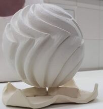 The arrival of my glaze stain order from CTM allowed me to try out another colour. I had only two remaining test tiles. I reviewed previous tests, decided on quantities and went for it. Here are two more glazes for my UcA4 range 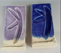 I am very happy with these two. The first has fuchsia stain and cobalt and the dark blue is cobalt alone. I had been trying to make a lavender colour by adding cobalt to chrome tin pink and although that works, it seems a less predictable option and the glaze is very opaque, out of keeping with the rest of the range, so I will stick to this stain/oxide combination. The next test was to try these glazes on the actual forms. I used my 'test pots' but with more glaze binder added, then brushed on 3 coats.
I was pleased with the results;. the glaze has not run, though might if it were thicker. Also, with these semi transparent glazes I do not think any underglaze is needed to emphasize the dotted texture. 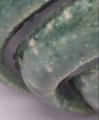 Though this was with a glaze that had worked perfectly as a test and had not been changed, some pitting developed. I had tried to clean up the bisque ware before glazing, using a brush, under extraction but there may still have been some dust.
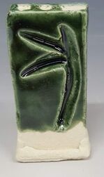 I have tried a number of base glazes now, together with a couple of specific ones like Jeanine Vrines' orange. I started by going through books by Greg Daley and Linda Bloomfield, articles in Ceramic Review and Clay Craft, trying glazes suggested by senior colleagues and later using the Glazy website to get an idea of the effect of changing components of a glaze recipe. Information from ceramic material suppliers such as CTM and Potclays was also very helpful. My fifteenth glaze (UcA 4, a 4th adaptation of the UcLan transparent recipe, this one with Talc added ) appears to be the most promising yet. I have added glaze binder and applied three coats with a brush, then fired to 1260 in oxidation. This test tile is on Ashraf Hanna clay, but I tested UcA 3 on both ES 40 and Ashraf Hanna, and there was no appreciable difference in colour or fit. This green glaze has copper carbonate 4% and cobalt carbonate 0.15% added to the base recipe, plus twice as much of the glaze binder than those below. There are no bubbles so I will continue in my next attempts with more binder. 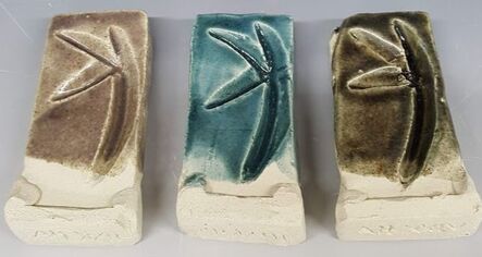 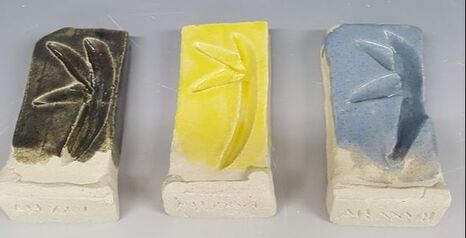 Not all the oxide / stain combinations were good in this test series and some adjustments are needed, but at last I am hopeful, and feel I can progress from test tiles to trying them on the carved pieces. 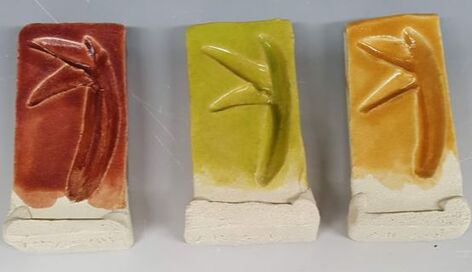 When I came back from the Christmas break I inspected my experiment with glaze binder. Wonder of wonders the lumps appear to have dispersed and I had one pot full of set jelly and another of runny honey. I made some more glaze tests, (using a slightly adapted recipe I have called UcA4) and a pot of 1Kg glaze with Copper Carbonate 40g and Cobalt Carbonate 1.5g added, together with 100g of my thinner thickener. I do not, of course, know the weight of granules that made this up, but did not want to use more of my glaze binder for the moment.
Fingers crossed.
By this time I had phoned CTM about ordering stains and asked advice...
and I did some more reading around. I found out there are both inorganic and organic glaze binders, and that both can help with suspension of the glaze as well as application Inorganic binders are especially useful to improve glaze suspension and include
The downside however that being organic they decompose, leading to the recommendation that they should be added to glaze as it is needed or a preservative added too. I could find no mention of what that preservative might be, though presumably it goes into the commercial brush on glazes I have used in the past. The recommendations were to use 2-5% (>5% organic glaze binders can burn out leaving bubbles on firing) to the dry weight of glaze, and that the glaze binder should be made up in water the day before you use it. I was being too impatient. I went away for Christmas and New Year. Pehatine looks expensive at £12 plus VAT diluted 1 part Pehatine to 2 parts water then added one to one with glaze. My granules are likely to be cellulose glaze binder, no longer visible on the Potclays website.
Brushing
+ no need for a spray booth + less waste - can be patchy - requires at least 3 coats - best with giaze thickener time to try a glaze thickener... |
AuthorI am indulging my passion for ceramics by undertaking studies for an MA at UCLAN Archives
August 2021
|


 RSS Feed
